Saturday, April 28, 2018

Dahlia Card

I wanted to try my hand again at coloring the, what I call, Dahlia flower from Unity’s March 2015 KOTM. I decided to pattern and coordinate the flower after flowers in the Bo Bunny pad I had. You can see a small piece of the paper in the first photo.

I used my Misti to stamp the image a few times in Watering Can Archival ink. This time, to color the image, I wanted to try some pens I picked up at the Expo I attended in March. I used 2 pink Spectrum Noir Glitter pens and 2 Zig watercolor pens (a pink one and green one). The good news...my flower is very sparkly! They were all very pigmented. However, for me, I didn’t feel I had enough control over color hue, tone and tint. I used a marker to help darken the middle and shaded areas and a white pen for accent. Once completed, I added a little wash in pink and green using oxide inks and a grey shadow using Kuretake paints.

To stamp the sentiment from the Kindness Like Yours kit, I used my Misti and the same archival ink. I diecut the paper with a Penny Black Die. I pulled the card together using paper from the same Bo Bunny pad, added the image, a ribbon bow and some embellishments gifted to me from an ATC swap group member.

Thank you for visiting my blog. Any suggestions for improving either my craft or blog are always welcome! Happy crafting!


Friday, April 27, 2018

You Deserve Card

After picking up Prima’s Cherry Blossom paper pad, I decided I wanted to try to make a cherry blossom tree branch with blossoms, sort of mirroring the paper design. In searching through images on the Web it looked like I needed a 5 blossom flower. I found a Unity kit, You Deserve..., I thought I could try using, that had the flowers, and, in addition, the houndstooth corner stamp that could frame what I created.

To begin, I stamped the flower stamp onto a masking sheet and cut out the flowers. I then placed my watercolor paper into my Misti and stamped the flower stamp a couple times, and then masked the flowers, changed positioning and stamped them again. Finally, I added a 3rd flower at the bottom. I used Magenta archival ink with the flowers.

I then stamped, with brown ink, the corner pieces and the sentiment, ensuring I aligned them with the grid lines on the Misti top glass piece.

To color the flowers,I used my Kuretake inks in the red and brown range. I colored in a background as well to make the white flowers pop. I then added “branches”. I added pale pink to the corners and the word You. I used a white pen to brighten the flowers in spots, and to add dots in the flower centers and surrounding the flowers.

To pull the card together, I used a marble paper from the pad as the base, and added another partial sheet with brown ribbon offset. I added the image backed with brown paper, some some fussy cut butterflies and crystal dots. I did add a little color to the butterflies to match my painting. 

I have not added any sparkle yet, but I could see adding a little to the butterflies later, we’ll see. This was a good exercise, as in my painting class I had to try to paint the negative space and I haven’t tried that since then. Hope you like this card!


Thursday, April 26, 2018

What Really Matters and Let Love Grow ATCs

Sent these 2 ATC’s to another swap group for April. The first one, What Really Matters was fun to create. I first added watercolor to the cards and dried them. I added a second layer and then dried that. I then took a circle stencil and using a wet wipe removed a layer of circles to expose the initial light orange. I then used a Tim Holtz eye chart stencil with burlap oxide to add a few letters to relate to “seeing what really matters”. I then used a TCW stencil to add a partial frame around the bird part of the card using Aged Mahogany Oxide. Using my Misti, I then embossed the bird image from the 10/11 KOTM (not sure if still available, was cancer related kit. I picked it up in a swap.) and the sentiment from 3/18 KOTM. Love the 2 stamps together!

To finish the card I colored the bird with a light watercolor wash to deepen the color to emphasize it and used a clear Spectrum Noir Glitter pen on it. I then used a gold one, I believe on the clocks and feet! I also used my Posco pen to add some white dots. I, then added, with staples, a rick rack ribbon with green twine, meant to tie back to the burlap color and simulate a branch. I then popped a black crystal on the bird’s eye and 2 other spots. I was rather pleased with the results on this one and the sentiment is so true!


My favorite ATC this month (that I made) is the next one. Everyone reading this already knows, I presume, I love vintage looks. I had to pick up the 2/13 KOTM because of this seed stamp...I just love it! I then started playing around with it and decided I wanted to make it into a tag. I decided the colors I wanted to use from a piece of scrapbook paper I wanted to take advantage of.  I then decided I would mount the tag on that paper, but first it needed a background stamp. It occurred to me the accounting stamp from the Vibes kit was perfect. In fact, once stamped the paper reminded me of old green accounting ledger paper and could work as a seed “inventory”...sorry, my imagination just takes off sometimes. 

I then turned to stamping the seed packet image in the same oxide ink. I took my Prismacolor pencils and a white gel pen, colored the flower part and highlighted some other areas and then faux distressed the edges using pencil. I then took an Elizabeth Craft die that forms the top of the tag and once the top was cut, proceeded to cut the rest of the tag. I antiqued around  the tag edges using Distress ink.

Now the fun part, I won a Crop-a-Dile tool in January and this is the first time I had ever used it. I cut out the holes in the tags, added a little green hole strengthener and cropped on an eyelet. Woo hoo...it worked! I then stamped and clear embossed the sentiment from the same KOTM onto vellum using green archival ink. Since it was hard to see, I cut a green tag to go behind the vellum tag and punched holes in both. Then passed string through them and added it to the tag. Now I was done. I think this ATC turned out pretty cute, in a vintage way! Till next time, happy crafting!


Embrace the Journey and Being Yourself ATCs

Posting today the 2 ATCs I swapped in April. The first, Embrace the Journey, was created using 4 different Unity kits: 12/10 KOTM (dotted box), 3/18 KOTM (sentiment), 12/12 KOTM (heart butterfly), and {...with her OWN WINGS}. I used distress oxide inks to color the backgrounds. I then used a TCW stencil to create foliage in the background, then stamped the butterflies. I stamped and colored the hearts using the same inks and added crystals. I took plain paper, stamped the dotted “box”, used my Misti to stamp and emboss the sentiment on both sides, cut the box in half and watercolored the edges. Pulled it all together, adding the fancy string.


To create the second ATC, i used stamps from I used the smooshing technique and used 2 different oxide colors and a Tattered Angel green to create a variation in color light to dark top to bottom and then darkened the bottom with brown ink. I then stamped the vintage foliage from 6/17 KOTM in archival ink. I then took the sentiment from the 10/15 KOTM and stamped and embossed it. I then added green ribbon. Hope you enjoy these ATC’s!


Wednesday, April 25, 2018

Magazine Paper Girl Card

I’ve been trying to make my way through stamping magazines I’ve bought recently and I discovered a really pretty designer paper I had to try using. I think it was a Stamping Sampler mag (or related). It only had the 1 sheet in it. I decided to use the girl from Unity’s April 2018 KOTM, paper piecing her, and the sentiment from the February 2018 KOTM. I also picked up new paper packs and a new stencil yesterday and tried a couple of those that seemed to work. I must admit I am just like a kid... as soon as I get a new toy, I have to try it out ASAP! 

I took a page from the DIY Shop paper pad that I thought matched the paper. I then took my new stencil and added the words using a green Memento Chalk ink thinking I’d frame girl with the words.

I then stamped the girl using Memento London Fog on old stationary. I experimented using Brea Reese Glitter ink on the paper as it is not watercolor paper and it worked. Although this ink can be combined with watercolor, but is not pure watercolor and it didn’t move on me. But it is so beautiful and sparkly in person. I used my yellow and blue ink, and then combined them to make green paint. I stamped the dress onto one of the papers, fussy cut it and glued it to the image. I then took my pencils and some pens and colored the rest of the image and fussy cut it out. I then stamped the image again with potting soil archival ink onto the shiny designer paper offset a bit and then glued the image onto it.

For the sentiment, I used the same paper from above and stamped first in green chalk ink and then again in Potting Soil. The green hadn’t been dark enough, but I like the shadow effect. If I had thought in advance, I would have used my Misti, but freehand didn't work out too bad.

I cut all the pieces to make them fit, backed the sentiment from the scraps, added ribbon and crystal dots and called it done. I must admit...I whited out the line down the middle of her nose as it was too jarring for me. I am in love with these colors and I think the paper turned into a pretty card! Hope you like it! Thanks for visiting and have a great day!


Sunday, April 22, 2018

Large Rose Card

Received this rose in a swap this week and had an urge to watercolor it, in orange tones, matching a paper I recently picked up (which is backing the rose and sentiment).  The rose stamp came from Unity’s 12/16 KOTM and the sentiment from the 4/17 SMAK kit.

I started by pulling a lightweight watercolor paper out and lightly coloring the corners and spattering the paper. I then used my Misti to stamp the rose using Archival Tea Rose ink, I used my tube paints to watercolor the rose as I have more control in matching and mixing colors. I spattered the paper again masking the rose with the stamp. I then stamped the sentiment using Iced Spruce Oxide; I was going to use the orange oxide and ended up passing on that.

I cut the paper using a postage die and ended up backing it with paper cut with a Kat Scrapiness die. I backed the sentiment with the same paper and used the same die. I finally pulled the card together using scraps of paper, washi, gold sticky strips and stick-on crystals. It’s not professionally put together (as that is not my strong suit!), but I like my rose and the colors! Hope you do too! Till next time, happy crafting!


Saturday, April 21, 2018

Embrace Today Sentiment Card

Cased another Unies card today, using the sentiment from Unity’s Layers of Life Embrace Today kit and leaves from the 7/14 KOTM. This was a very easy make. I really wanted to see how these leaves would look and I wanted to use the sentiment from the kit I used yesterday. I used a Photoplay paper pad and found a nice green pattern I would use as inspiration.

To begin I took a piece of Montval Canson watercolor paper and sprayed Tattered Angels Green Glimmer Mist down one side and around top. I then dried it with a hair dryer. Using my Misti, I then stamped the leaves in Archival Library Green ink and the sentiments in Hickory Smoke Oxide ink. I then colored in the leaves in spots with darker and lighter greens. I also added a little Perfect Pearls to highlight the top of the leaves. Finally I added a little white pen as well. I then spattered some green ink and Posco white ink. I did darken the edges a small bit on the left side. I also added white dots in the sparkle area.

To complete the card I added a ribbon and green, silver and clear dots. Fun and easy card to make! Have a great weekend!


Friday, April 20, 2018

Embrace Today Card

In between errands and a rabies shot for my little dog, I worked on this card today! Sentiment and a small image came from Unity’s 2015 SMAK kit and the main image from the Embrace Today Layers of Life kit. I ended up making the card into the sketch design on Unity’s card challenge.

I brought out my craft mat, some Oxides, a Tattered Angels green Glimmer Mist, Brea Reese Yellow Glitter ink, Derwent Inktense pencils, pens and my Kuretake paints. I also ended up using a few Tim Holtz stencils.

I started by laying down greens on the craft mat and smooshing the watercolor paper into the greens. Did this several times drying the paper in between. I stamped the image using my Misti by using different oxide inks on the flower, leaves and the background images.

 I then began coloring the flower with different yellows and butterfly’s.  In person, they are glittery. I used pencils to help shade the flower and additionally once colored used a pen for faint outlines. I added some darker colors to the leaves. I then added a little water to my darkened yellow and spattered it on the paper. I also took a white Posca pen and spattered that. I then took a stencil and added dots around the sides. Once I cut the sheet down, I colored the edges.

I stamped the sentiment using my Misti again on patterned paper. This time I variegated the oxides I used..between green, tan and orange. I cut down the paper and added color to the edges again.

To create the card, I pulled more sheets out of the pad I was using and cut some strips. One of the Strips had flowers on the end. I decided to do the same faintly to the others. On the yellow sheet I used the smaller image. On the other brown, I used a stencil and the orate oxide. I took a pen and outlined all 3 strips and the images. I then pulled the card together according to the sketch and added sticky beads to it.

I’m sorry I didn’t take pictures and I hope this all made sense, but I’ve been fighting a headache all day! Happy crafting!


Thursday, April 19, 2018

Poised and Pretty Card

i must be in a romantic mood again! Made another vintage card today using Unity’s Poised and Pretty kit and the sentiment from the A Friend Like You kit. I also used some background stamps from the 7/15 KOTM. For paper, I used Paper Studios’s Teesdale Studio and Old World Mat Stack. I bought this kit, as I played paper dolls with a best friend I’ve had from kindergarten! I’m sure she’d appreciate this card!

I started by finding the papers I wanted to use. I then stamped all the dresses and fussy cut them out. I stamped the girl on some peach linen stationary and colored her and glued on her outfit, then added shading to all the outfits. I then started to paper piece all the layers on the card. I stamped the vintage dress form on more paper and added the dots/stripes on the plain paper. I then stamped the sentiment on the peach stationary, inked the edges and backed it with darker paper.

I added all the components, a little ribbon, button, twine and crystal dots and called it done. Since I was a paper doll fan and I love these outfits, I love how the card turned out! Hope you enjoy this one! Oh, and yes, in case you wondered, the outfits do fit...I had to try them out, didn’t I?😉


Vintage Woman Card

Went back to the April 2017 SMAK kit and the original image that drew me to it! I actually ended up using 4 stamps from this kit. I also pulled out a Market 49 paper collection I haven’t tied yet!

To begin, I selected a paper with a fern on it on the right side. I then used the branches image and stamped using my Misti the left side. I then pulled the girl and used a Rich Cocoa Memento ink to stamp her in the middle, again using my Mist to get a dark enough image.

Pulling out the Prismacolor pencils I thought would go, I colored in the face and hand, turned to the dress and then the hair. I also added color to the butterfly. I added a little brown and white pen detail and called it done.

I then started looking at how to construct the card. I decided to use an ephemera tag I had at the top. I then fussy cut images from the Market 49 paper. I stamped the sentiment on the envelope image and used a tiny splatter dots stamp from the kit to add some red color. I also added Red color to the birds image. I used Distress Oxides on the edges of all the pieces.

To complete the card, I used cream cardstock and a sheet of Kraft cardstock as a base layer. I then layered all the pieces, adding green and cream twine, a pale pink flower, prills in her hair to match the flower center and matching sequins.

Hope you like vintage, as this one has it in spades! Thanks for stopping by!


Wednesday, April 18, 2018

Flower Bling Card

Spent most of today cleaning up craft space! But I decided late this afternoon, I needed to reward myself watercoloring a new card image. I love this flower image from the April 2017 SMAK kit. When I saw it I knew I needed glitter and bling big time! I also wanted to use a deep pink dotted paper from Authentique.

To begin, I stamped the image using archival ink with my Misti onto watercolor paper. I then pulled out my Kuretake watercolors and selected the colors to use to watercolor the image. I painted the flowers and spattered some more color on the paper.  I dried the image and then added some Brea Reese Glitter ink and Tattered Angels Glimmer Mist to the paint that I used to color it originally and applied some of the now glittery paint in areas to the flowers. I sprinkled glitter onto the wet paper and then added glue in the flower centers and sprinkled some more glitter.

While that dried I stamped the sentiment from the same kit, fussy cut it out, spattered it with paint, added color to the edges and backed it with a black pattern paper. Once my image was dried I die cut it and added color to the edges.

I decided to randomly add a pink netting to the image and then added pink and gold-rimmed black ribbon. To pull the card together I backed the image with a black patterned oval paper. To pull the card together I added a bunch of black and gold enamel dots.

Hopefully, I did the image justice! Till next time, happy crafting!


Monday, April 16, 2018

Tea Time Toile Card

Made another easy card today using Unity’s Tea Time Toile stamp and a sentiment from the June 2017 KOTM. I also used Bitty Backgrounds and Time to Be Happy Again on the sentiment paper. This time I went vintage as the primary stamp is so vintage! The stamp reminds me of some painters, like Fragonard, Constable and the Pre-Rapaelites painters! I love it! I also used Prima’s Tales of You and Me paper for the background, the circle image and the sentiment paper.

I began by stamping the image and lightly adding color to it with watercolor and some pencil. I distressed the edges. I cut out the girl image from the paper pad and added a coordinating sheet behind it. I distressed the edges of the foundation sheet and under the tears added washi onto the card stock. I added some ephemera pieces in the corners, upper right and lower left, and fussy cut and added a white rose in the top left from the paper pad. 

I stamped the sentiment, added a border and some dots, and then fussy cut it out and added a brad. I pulled the card together and added flowers and string to the top left. I had colored a white flower by spraying it with Tattered Angel Glimmer Mist that I thought matched the paper. I also added some enamel dots to the card.

Not sure how it will be perceived but I really like the romantic vintage feel of the card with the children in it. And, you really can slow down and enjoy the simpler things in life with children! I have a grandbaby on the way, and I can’t wait for this special time to come! Well, happy crafting!

Girls Dresses Card

Used stamps today, that I picked up in a swap from Unity’s 5/14 Hey Girl KOTM and Shop. Lunch. Chat. Gal kits to make a fun girly card! This was easy to put together. I also used some Tim Holtz stencils that matched the theme and the paper I used is from Authentique’s Latest and Greatest collection.

To start, I stenciled onto white smooth watercolor paper using Distress and Oxide inks. I then stamped the dresses image using black archival ink. I decided I wanted to use one of the papers for one of the dresses, so I paper pieced that one and also shaded it. I then watercolored/pencil colored the rest. I used a Spectrum Noir glitter pen on the grey dress. I also used a marker to detail black lines overall.

I stamped the sentiment I wanted to use on paper from the stamp pad and backed that with a dotted sheet from the pad. I used the same dotted sheet paper to make a partial border for the dresses.

To pull the card together, I added 2 different fringe-like ribbons, sticky hearts and enamel dots. I hope you enjoy this card! I think one of my friends or my sister will get this one...we are shoppers, after all! Thanks for stopping by!


Thursday, April 12, 2018

Lovely Lilacs Card

Responding to a new Sketch Card Challenge on the Unity Show and Tell Facebook group, I pulled this card together today. I used Unity’s Lovely Lilacs kit, Bitty Backgrounds and the sentiment came from the Every Beautiful Little Thing kit. I also pulled out 49 Market’s Cottage Life paper.

I played around on some watercolor paper until I finally started with a fresh sheet, decided to use a Momento Chalk Pretty Petunia color, and Picked Raspberries and Shaded Lilac Oxide inks. I stamped them and sprayed water onto a craft mat and smooshed lightly the watercolor paper into the blend. I dried it and then stamped the image using black archival ink using my Misti, ensuring a dark image, then set with clear embossing powder. I then added the same colors to the Lilacs, in addition to Forest Green Oxide and another green Momento.

I stamped a dotted background stamp onto a scrap watercolor paper and then embossed the sentiment on the same sheet. To pull all the papers and colors together, I lightly added pink to the sentiment paper and paper strips.

Basically, I followed the sketch design in creating this card and added crystal embellishments to complete the card. Pretty simple card to create! Hope you like it! Thanks for visiting!


Wednesday, April 11, 2018

Bird On the Clock

Inspired by my new Stamperia Atelier paper collection, I pulled the clock stamp from Unity’s April 2018 SMAK kit, the dots stamp from Dinged Dots kit, and the sentiment from {... and With Her Own Wings} Kit. I also pulled a Tim Holtz clock stencil.

To start, I selected a paper from the collection. Then, I pulled out my watercolors and watercolor paper and experimented a little on test paper. Then on a new sheet, I combined my blues and added a little black to coordinate with the paper and painted the edges up to an imaginary circle outlining approximately the size of the clock. I then added a tan color in the center and dried the paper. I stamped the Wings sentiment in the center of that circle with Colorbox Harbor ink. I then stamped the clock image using black archival ink. I took a Colorbox Copper ink and a sponge and sponged some numbers on the missing side of the clock. I then stamped some dots in the corners using Distress Walnut Stain.

To color the bird I used Derwent Inktense pencils and a wet brush and finished with black and white pens. To add dimension to the clock, I used pastel chalks and my finger and a small bit of water.

I stamped the sentiment, fussy cut it and inked the edges.  I used washi tape as a background for the sentiment. Wrapped the bird image with fancy string and twine. Mounted everything on the card and added sequins.

I am really happy with how this one turned out and hope you enjoyed learning a bit about it! Thanks for visiting and have a great day!


Beauty Inside Card

Reverted back to comfort zone and some fun mixed media stuff using the Unity April 2018 SMAK kit which I’ve just subscribed to. I have cancelled the regular kit as I’m interested in a lot of the older SMAK kits to use on more mixed media cards, tags, canvasses and you can get them for reduced prices as a member. 

I stamped the rose image using a brown archival ink. I then used a combo of Brea Reese Glitter ink, Tattered Angels Glimmer Mist, Oxide inks and Distress inks to add color to the image. This left the rose and leaves very prettily glittering! I added spatters of color around the circle image, partial die cut it, and distressed the edges. I ended up using gesso and a stencil on this image to give contrast. I also decided to cut a circle in white netting to back the image.

I pulled another background stamp from the kit, stamped it in green oxide and die-cut it. I then cut out a Tim Holtz vellum that would match. I had already pulled a green background patterned paper that I was coordinating everything with. I distressed the edges and attached the vellum on upper right side. Then I found a journal card with roses that I cut down and slightly colored to match the theme for the bottom right side.  I found a distressed antique gold paper that I die cut with a Bo Bunny small doily die. I then pulled a cheap flower and leaves that I sprayed and colored to match. I decided to place the flower on the doily and use it on upper left side.

I then turned to washi to add potential color to the card and found a simple design and an antique one. I put the antique washi on bottom right.  I played around with all the elements and then started looking for a sentiment. Started with Hello Friend from the May 2017 KOTM, stamping onto an ephemera piece and backing it with matching scrap paper. I decided the card needed something more and stamped a sentiment from the SMAK kit onto a piece of green watercolor scrap paper that I colored for another card.

I then pulled all elements together and fussed until I was satisfied by adding buttons, another small flower, twine, sequins and Nuvo drops. I like how this one turned out and hope you do too! Thanks for visiting!

Monday, April 9, 2018

Camera Card

Played making a much simpler card today using Unity’s May 2017 KOTM. I had picked up an Echo Park collection pack at a recent Expo that had paper I thought would match the camera images. I stamped the cameras using archival ink onto water color paper and took some distress oxides and distress inks and stamped them on a craft mat. I then smooshed the paper into the colors lightly. I then moved onto my pencils and colored the cameras per the paper colors.

I used a die cut to back the stamped image and a strip of cameras from the paper pack. I stamped the sentiment, die cut it and backed it with more paper from the pack. I pulled a camera sticker from the collection, backed it with paper and fussy cut around the image. I mounted all the components using pack paper and added stars and silver glitter dots.

Had more trouble with this one as the image, while really cute, is not in my usual style. I think it’s an very busy, but, okay card, but again, not a favorite! At least I tried the stamp! I wasn’t going to post, but fails are just as much a learning experience as successes! Happy crafting!


Friday, April 6, 2018

Classy Girl Card

The beginning of this card was another, already stamped image, and stenciled paper, and now where do I go mess in my craft clutter. I used the March 2018 Unity KOTM. I decided to color the image and fussy cut it in half vertically. I decided to insert it into the trellis stenciled paper. I had already stenciled this scrap paper using a TCW stencil. I used the Mulberry Kisses paper pad for all the other papers; love the colors in this pad.

This card was very simple to put together. I stamped, colored and fussy cut the sentiment. Then, using Kraft paper to back the layers, I pulled the card together and added ribbons and crystals to add interest.

I think the card turned out okay, not great, and I can, now, move onto the April kit, which I just received! Thanks for visiting!


Thursday, April 5, 2018

Poppy Girl Card

UPDATE: woo hoo...this card was just posted on the Unity Stamp Company Facebook Page! YEAH!

After playing with Oxide inks and mists and working on ATC’s, I reverted back to Prismacolor pencils this afternoon. I also decided to use the WRMK Anthologies paper pad (that I picked up at Tuesday AM FOR $2.99!) that had circles and colors I really love. I just bought The Unity’s Bitty Background kit and wanted to see if I could carry the circle themes to the image paper. I used 3 Distress inks to printed small portions of circles then used Bundles Sage to carry a little green throughout the paper.

I used Unity’s Poppy Girl as the main image. I stamped it on both the prepped paper and another piece of of the same paper. The paper I used is actually a very light peach colored linen stationary (a relic of the past). I colored the second image pulling pencils somewhat randomly...no discipline today, testing them and then coloring the image trying to match to the background paper. I did use a brown pen to help with edges!I then fussy cut it out. I added some of the muddy blue to the stamped page in the white areas (was a little too green) and then adhered the colored image onto it. I die cut the image with an oval die and cut another oval to back it using a red paper from the pad.

I stamped the image onto another piece of paper from the pad, cut it and backed it with some of the same red paper. To finish the card i adhered the background circle paper, mounted the image and the sentiment and added enamel dots.

I like how this card turned out...love the colors! Till next time, happy crafting!


Tuesday, April 3, 2018

Authentique Bicycle Card

Today, I challenged myself with a combo inspiration idea. I had a new Authentique paper pad that I hadn’t used yet and I grabbed a Montval watercolor paper that was blank. I used 2 yellow oxides to smoosh color onto it and then dried the paper. I then grabbed a blue Brea Reese Glitter ink and placed 3 dots on my craft mat, spritzed it with Tattered Angel Glimmer Mist in White and a bit of water. I then lightly smooshed the paper in that blend in a few spots. I then cut that paper in half. The challenge is to make 2 very different cards using the pad and paper I created.

Taking one of the watercolor papers, I pulled out Unity’s I’d Go Anywhere stamp. Unity’s Show and tell FB group has a challenge going on that this stamp will help fulfill. I also pulled out a scrap paper. I had the idea I could make a sidewalk for the bike by using a Tim Holtz stencil. I tried that and stamped the bike on it and liked how it looked. So taking the paper I pulled out Vintage Photo Oxide ink and developed some lines fanned out from an imaginary edge. I then painted horizontally thin lines across those and pulled a little color down those lines. I then took a Darice brick embossing folder and used a Colorbox brown ink on it and “stamped” bricks in a few places. Again, I took some vintage photo and black soot oxides to fill in a few bricks.

I then stamped the bicycle using the same Colorbox brown ink. I made sure everything was dry before I got out my new Kuretake watercolors (that I’m still learning how to use). I watercolored the bike and used some black and brown ink to emphasize some lines. I also used a white gel pen. I used some orange and brown paint to help define the bricks some more. I went back to my mat and decided I wanted a darker sidewalk edge, so I used a bit of the Charvin pastel chalks for that purpose. I then spattered the white Posco pen over the image and some oxide paints. I used the Peacock ink to darken the edges which matched the paper I was going to use for the base. I took another yellow sheet from the pad and stamped a Unity sentiment I got in a grab bag, darkened the edges and applied spatter the same way.

To create the card I wrapped jute twine around the bike image applied foam tape to the back. I took a white card base and used blue paper and a strip of striped paper to make the card foundation. I added the blue paper to the back of the sentiment and mounted that on the watercolor paper and mounted everything on the card base. I took jute twine and added beads (picked up at Tuesday Morning) and wrapped it around the existing twine. To finish the card, I added sequins.

Hopefully, I remembered all the steps I used! Hope you like the card..it certainly looks rustic. Happy crafting!


Bronze Clock Card

This card was pulled together finally early this morning off another card miss that I left alone for a week and some scraps. Another Unie Face-booker challenged the rest of us to put together a card from leftovers in our craft area. I used Unity’s March 2018 KOTM kit for the main image and sentiment and a small image off the December 2012 KOTM.

I had already stamped the image onto a vintage scrapbook paper and colored the clock using Prismacolor pencils. I fussy cut the clock out. I had stamped the sentiment onto a recipe ephemera piece, liking the idea of coupling “recipe” with the encouraging sentiment. This is where I originally went off kilter on a larger card base trying to use ephemera that was either too big or too distracting from the words and clock.

Starting again late last night I found the perfect papers to complement the image. First I switched to a smaller Kraft card base. I already had a distressed blue paper that I would use as a base. I found this morning a distressed 7 Gypsies striped paper that had the right color tones to complement the blue base and the clock. Since I had pulled the sentiment off the original card it had some tears, but I still wanted to use it and capture the word Recipe. In looking through my ephemera and paper pads, I found the perfect background for the clock in the Prima Epiphany pad. This pad has whites, greens, blues and oranges with very small images that wouldn’t distract, but actually complement the vintage feel. Once I mounted the clock on the paper I attached it to the sentiment. I also used my pencils to simulate the background paper in the white area between the bells. I had already added blue to the heart below the sentiment.

To fill the space on the bottom left I knew I wanted a butterfly or heart and found both in the vintage image I used. I colored the image using pens on the butterfly and distressed oxides on the rest. I decided to add texture by using a relic piece of burlap behind the image. I pulled the card together and finished it off with copper colored accents and glossy accents on the butterfly and clock bells.

I must admit I’m thrilled I was able to reuse the images I had already stamped and colored as I love both the sentiment and the vintage clock. I love how the card turned out as well. Hope you do too! Thanks for stopping by and have a great day!


Sunday, April 1, 2018

Don’t be like the Rest of Them Card

I “reckon” I’ve lived my life this way, from my career, where I was often the first woman to do something to my card making style. Granted I wasn’t always successful, but it was always a challenge and learning experience.

Well, so here I am again, on another journey, playing a little with mixed media on a card, using several Unity kits, Don’t be like the rest of them..., Giving it all Meaning, and, a love Beyond Measure. I used 3 stencils, one from Hero Arts, one from Art Anthology and a Donna Downey stencil. For coloring, I used Kuretake watercolors, Derwent Inktense pencils, Tattered Angels Glimmer Mist, Posca paint pen and Charvin Pastel Watercolor sticks. I also used texture paste, and for paper, the Prima Wild and Free paper pad, the Wild Rose Studio Antique Library pack, scrap paper and Aqua watercolor paper.

I stamped the image in archival ink twice and made a mask out of the second image. I then used a Hero Arts stencil to create a grey flow outward from the image of tiny leaves using Hickory Smoke Oxide. I then took the printed words stamp and stamped that around the rose in Aged Mahogany Oxide. Finally I took Vintage Photo and placed some hollyhocks stencil patterns around the rose image. I then took the Art Anthology stencil and applied some texture paste around the image.

I colored the image first with the watercolors and then deepened the color using pencils. I then sprayed around the image, holding the mask over the rose, with the Glimmer Mist. I then distressed the edges. I also used the pastels to outline and emphasize the image. I then backed the image with paper, die cut with a Kat Scrappiness die, and distressed those edges as well. I spattered the white paint pen over the image and let that dry. Finally, I added a fancy ribbon on one side.

I stamped “Unique” onto some of the Vintage Library paper and stamped the notepad paper stamp onto another paper from that pack. I then stamped the sentiment onto the new notepad paper and backed that with a piece of red ephemera.

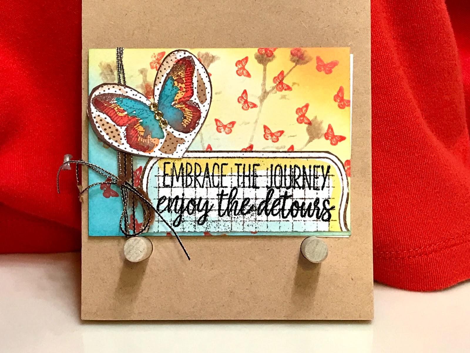
To finish the card I added several layers of paper, enamel dots, flowers and a butterfly. One of the papers I used a hand leaf border on. I think the card turned out a success...(in other words, okay)! If I were to do this over again, I would like to figure out how to make my own spray as the Glimmer mist was a little too opaque. But I’m interested in your thoughts. Take care, and until next time, happy crafting!

Update...took pic of some of the supplies!