Wednesday, January 29, 2020

January UnityATCs

Wanted to get a head start on Valentine’s Day with one of this month’s Artist Trading card sets. Oh, I had such fun creating the first set! I pulled out my Gelli block, a roller, and 3 acrylic paints I picked up discounted at a Tuesday Morning: a Satin Semi Matte Titanium White, a Daler Romney Brilliant Red and a Brea Reese Heavy Body Magenta. I cut up some inexpensive paper, pulled out 2 large Dress My Craft stencils and went to town! Basically, the process is laying down color(s), adding a stencil, either pulling it up or leaving it on the block and placing the paper on top and rubbing the paper all over to pick up the paint. I did this repeatedly ensuring I had a good interesting print on each paper with a mix of colors and patterns. Clearly each paper ended up unique, but that’s the fun of it.


Once dried I cut up the paper into ATC sized rectangles. I then black embossed the heart from Unity’s February 2019 Riduclously Amazing KOTM KIT. I white embossed the sentiment from Unity’s January 2020 Owl Adoration Uniquely Unity’s kit. I pulled out a heart die and cut out one of the hearts and backed it with paper from a Valentine paper pack. To complete the ATCs, I added tiny confetti hearts all over, Black ribbon, white string, a puffy heart and drew a black border with hearts at the corner, filled in with a glitter red pen. And these were done!


I fell back on a design I’d been thinking about for a while on the second set. I picked up a pretty cool Jane Davenport Washi set a while ago (again discounted) that contained eyes, lips and nose collages. The eyes really called to me and I knew I had to combine it with the sentiment from Unity’s 11/18  Open Your Eyes SMAK kit (love the sentiment). I picked the image from Unity’s 6/19 Enjoy Where You Are SMAK Kit for obvious reasons... could portray a visually impaired person, someone hiding behind dark glasses, vision that’s reduced by dark glasses, ... make of it what you want!

Now the challenge was what colors to use to combine with the Washi. I pulled out an Altenew paper and cut it down to ATC sized cards. I then white gessoed the the area that the face would appear in. I blended lavender and purple hued oxides onto the ATCS. I stamped and clear embossed half the woman image with a purplish blue Versaclair ink. I then added a die cut of craft paper below to bring in Kraft colors. I white embossed the sentiment on vellum, fussy cut it and attached it to ATCS Using coordinating Washi tape. I added the eyes Washi, a large gold sequin and little pearls and called this one done. Not as pretty or artsy as I would like, but I like the message.


Well, that’s it for another month. Till next time, happy crafting!

Monday, January 27, 2020

Hello Little Birdie Card

Gah! What a day... after repeated failed attempts to create a card, and in the process, contaminating first my brand new Gina K white embossing powder with clear powder, and, then, doing the exact same thing with my very large clear embossing powder container (with white), and doing all this with a hurting back, I gave up, sat down and sobbed (using GIFs) to my crafty friends. (They are wonderful support!) After consoling and distracting me (making me laugh), I was given a color palette to make my next card with as a challenge.

Sat and read for awhile and decided to start another card using this palette as a suggestion.


I pulled out a watercolor paper and stamped the bird from Unity’s Hello Little Birdie Kit using Inkon3 Fadeout No Line ink. I painted the bird using my Schmincke watercolors and then added pen marks. I added color to the background, stamped a sentiment from Unity’s Strength in Wisdom Kit, and die cut the paper. I used burgundy paper in the background and added string, a metal bird, and enamel dots and called the card done.


This simple card made a very nice change from recent efforts and was the break I needed to continue on. Thank you, my ATC friends, and especially Annie Sterner, for the support!

Till next time, hope you have a great week! And, if you get in a funk like me, try using this color palette as inspiration! Happy crafting!

Friday, January 24, 2020

Colorado Craft Company Chanel Card

Oh, I had to do it... just had to buy this new stamp, Big and Bold Perfume Bouquet, from Colorado Craft Company! Reasons: this perfume was my mother-in-law’s favorite (loved her and still miss her so), my sister-in-law and I are perfume junkies, I know my SIL will love the homage to her, and I’m loving the Big and Bold line from 3C! So, it was destined to become a non-traditional Valentine to my SIL.

I started by stamping the image onto Arches Hot Pressed Watercolor paper using Antique Linen distress ink. I began painting the perfume bottle with my Schmincke watercolors. I decided to keep the flower colors in the same family as I didn’t want to detract from the bottle, but rather coordinate with it, so I moved to orange colors. After I took it as far as I could with paints, I moved to pens, black, gray, green, brown and taupe. I followed that up with Prismacolor pencils to deepen colors. I left the coloring pretty loose all around. I spattered red paint, Perfect Pearls and white Gouache all over and cut the panel down.


This stamp is large, so I went for a 5x7 card base. I found patterned paper with bits of gold in it I could use to frame the image. I also used brown and a black papers for edging. I stamped and embossed the 3 sentiments from the kit, added orange ribbon, yellow, black and orange crystals and called it done. Probably could have/should have gone with an all gold paper background, but decisions were made permanent before I could change my mind.


So, the Valentine’s greeting will go into this card, along with special messages and be sent, along with dark chocolate Sees candy (another common passion), to my lovely, bedridden, sister-in-law, across the country! Hope she loves it! Hope you like it as well!

Till next time, happy crafting!

Thursday, January 23, 2020

SSS January Card Kit Card

Made this card using SSS January 2020 Card Kit called Window Frames.

I started the card white embossing the window image onto watercolor paper. I then ink smooshed Worn Lipstick oxide ink spritzed with water onto the same Arches Hot Pressed watercolor panel. After drying I poured ArtC Pink and Brea Reese Crimson glitter inks on my glass matte, picked most of it up with paper towels and then spritzed the mat again with water to pick up a light glittery glaze. Finally, I sprinkled a little Merlot Colorburst powder on the matte and picked up that. I made sure the panel matched the Polkadoodles patterned paper in the kit.

After painting the image using the same mediums, I die cut the windows out. I then did the same with Kraft cardstock and cut it down to make a frame. I also cut a rectangle, out of Acetate, the size of the Kraft window and glued those 2 pieces together. I then glued that onto the watercolor paper. I used the cover sheet of the paper pack to create a variety of window backings. I used another sheet as the back panel and Kraft cardstock for the middle panel, upon which I glued the 3 window backings. I added the mini heart buttons and used narrow foam tape to create shaker windows.

Finally, I used a heart die and a sentiment from the kit on one of the small papers from the cover, a paper painted with the glitter inks and the remaining Kraft paper to create Love You heart embellishments. I used white and clear embossing powders, Gina K Kraft ink, and a red and pink archival ink. To finish the card I added a ribbon.


I love the color combos, and the techniques used, but it is a busy card! Well, tomorrow is another crafting day! So, till next time, happy crafting!

Sunday, January 19, 2020

Penny Black Valentine’s Card

Took a bit of a break over the last week starting to minimize my home surroundings (I, a natural hoarder, have a ways to go still). It takes effort for me to get in the right mental state to let go of things, but it helped that I was getting a little claustrophobic with all the clutter (even posted stamps for resale in various swap groups! Yay!).

As I began digging out my craft room, I found this 2015 Penny Black set called All Abloom. It seemed the perfect set to create a Valentine’s card. I ended up coupling it with sentiments from another older set, the Hero Arts Celebrate Everyday set, and the Ton’s Sending Peonies set.

I started by stamping the heart image on Arches hot pressed watercolor paper using Antique Linen distress ink. I then used my Schmincke’s watercolors to loosely paint the image. I spattered the image with the red paint, a white Perfect Pearls and white Gouache. I used a Heart die set to cut down the image and backed it with papers from an old Valentine’s Day Recollections paper pad and the newest Simple Stories Valentine pad. I heat embossed the sentiments using Ranger White and green Wow powders and cut them down using coordinating scrap papers.


I used foam tape and little foam circles to aisle the heart and sentiments.After putting the card together, I left it as is, figuring the sentiments, images and papers were busy enough and didn’t need any other embellishment. I enjoyed putting this one together, and I loved painting the image! Hope you like this card and that you have a great week! Happy crafting!

Sunday, January 12, 2020

Picket Fence Rose Bouquet Card

Watercolored another card today using the Picket Fence Rose Bouquet Kit, with the intention of making my husband a nice Valentine card. I stamped the bouquet image using InkOn3’s Noline Fadeout ink onto Arches Hot Pressed watercolor paper. I then pulled out my Schmincke watercolors and started painting the leaves. I used a variety of greens on the leaves for the first coat, but then added more detailed painting, generally using a common paint blend.


I then began on the roses and after an hour started going cross eyed! I ended up dropping some paint on the paper, so I decided to just randomly add pink color to the background. I stopped there and reached out to my crafty friends for a “how am I doing” check in. I mentioned that I have a long standing love/hate relationship with painting roses... love the challenge, hate feeling like I’m losing the battle in getting them to look somewhat realistic! After getting a pat on the back, I went back to complete the painting and then took a break on a stationary bike. I then turned to my Prismacolor pencils and a green pen to soften the look and put an edge on the leaves. I ended up spattering the painting with Perfect Pearls, red paint, white Gouache and a Black Posca pen.


I found a patterned paper to offset the image from Simple Stories, called My Valentine. I used Gina K black paper for backing. I heat embossed the long sentiment onto vellum and wrapped it around the bottom of the image. I added black enamel dots and called this one done.


This card was definitely a challenge, but I’m glad I tackled it. Well, that’s it for today... have a good week! Happy crafting till next time!

Saturday, January 11, 2020

Unity Succulent Card

Okay, so, I’m not sure if this stamp was meant to be a succulent or not, but I made it one! The stamp I used on this card came from Unity’s Inner Voice 9/16 SMAK KIT. I started by stamping the image onto Arches Hot Pressed watercolor paper using Tattered Rose Distress ink. I wanted to try a paper pack I picked up at an Expo, over a year ago called, Moda Scrap Sweet Vintage Rose. Pretty soft colors that I decided could be used to turn this stamp into a succulent... what do you think... was it one before I made it one?

I painted the image using my Schmincke watercolors, until I was satisfied I had a good enough color that I could turn to my Prismacolors, a white Posca pen and a gray pen to complete it. I spattered paint, Biscotti Perfect Pearls and white gouache all over it. I then stamped a sentiment, from Unity’s Open Your Eyes 11/18 SMAK kit, I thought went well with a succulent because I think their beauty is often overlooked. I die cut the image and the background paper and cut a dark blue paper to frame the image. To complete the card, I added string and enamel dots.


Well, now that it’s done, I’m not sure how I feel about this one! Colors are pretty vibrant... perhaps too vibrant and image and sentiment are rawer than the delicate background paper. But, I’ll let you all decide! As usual, my soul is calmed when painting, so I enjoyed the effort spent. And that is what crafting is all about, I think! I’ve tried to paint succulents in the past with amateur results in an art class. I think its fun to try to capture their colors.


Anyways, that’s it for today! Enjoy your weekend and happy crafting!

Thursday, January 9, 2020

Blooming Peonies Card

Had an urge to use Primary Elements pigment inks today with Unity’s large Blooming Peonies stamp.  I used Bristol paper and brown archival ink to ensure I stamped the whole image. I then embossed it with Ranger’s Liquid Platinum powder. I then wet the paper and added Guatemalan Green pigment in background spots, spraying with water to move the pigment around. I also added Ginger and Olive pigment was well and then dried the paper. Finally, I stamped Fossilized Amber oxide ink on my mat and painted this onto the paper as well.

I pulled out orange and yellow Brea Reese Glitter inks and added color to the peonies. I used the Primary Elements pigments to add color to the leaves. Finally, I added white acrylic paint to the flowers and leaves to lighten a little and added white paint spatter as well.


After die cutting the paper, I used coordinating green and black paper to add layers. I embossed the sentiment on black paper using a Buttercup Ranger powder. I added the fussy cut sentiment, a yellow ribbon and matching crystals.

I must say, this card turned out pretty sparkly and was a nice break from decluttering my house. Been getting mentally overwhelmed with clutter, so decided it’s time to use a little Marie Kondo advice. Now,  back to sorting and cleaning up! Even my craft areas will end up getting thinned out when I get to them.


Well, till next time, happy crafting!

Sunday, January 5, 2020

Magnolia Way Cards

This paper pack, DCWV Magnolia Way, is just a stunner of colors! The card stock is unusual in that it is shiny, but so beautiful that I couldn’t resist it, at Tuesday Morning! Yesterday, I decided I wanted to make something with it. There’s actually a couple of sheets that have 4 6x6 squares on it that I cut up (one of the cards is laying on those sheets). I used 2 of those, plus a third in making these 2 cards along with Unity stamps.

So, first off, I grabbed a piece of watercolor paper and the You Are My Person Kit. I experimented with this kit once on cheap watercolor paper before starting to make this card. All of the stamping was accomplished using multiple oxide inks. I then began adding color using those same inks and some additional Gansai Tambi watercolors and freehand leaves. I then distressed the edges and used a brown pen to further delineate the shadows and add a little more texture. I spattered paint all over and added the sentiment. Finally, I found some Tim Holtz bird ephemera I thought would go. I distressed  a variety of background papers, and included the blue green paper from the kit. Finally, I added a Tim Holtz saying, a button and some string to complete the card. I had to work a little to get this one to come together enough to say it’s good enough! I admit it’s different! (PS note the Unity hood!)


The second card coloring was inspired by the flowers that I cut up and included on the card. All of the paper came from the kit. I stamped the image from Wild Florals using Antique Linen distress ink on Arches watercolor paper. I then used my Schmincke watercolors to coordinate with the colors in the paper. I also used some pencils. I used a Kat Scrappiness square die and a square card base in a coordinating color (that I really want use up) to create the card design. I cut up a striped paper for the larger background. I pieced together 2 of the papers and die cut that for the top background and fussy cut the butterfly and flowers on the side. Finally, I embossed the sentiment using 2 powders to get the right color and added ribbon and shiny yellow enamel dots and called this one done. Another one off unusual card, I know!


Yesterday was a bit of an off day for me, but we all have those, so I freely admit it! As I was saying to my crafty friends... I let the inner child free! And this is what happens... there I go off the beaten path...

Thank you for stopping by, I hope you have a great week! Subscribe if you’re interested in walking my path with me! Till, next time, happy crafting!


Saturday, January 4, 2020

Friends of Unity January Blog Hop

Welcome to a brand new year of Friends of Unity Blog Hops. We have a different kind of theme this month called Favorite Unity Stamp of 2019. We each got to pick our fav... but, oh my, I have too many favs! Well, being the "off the beaten path" kind of person I am, I just couldn't limit myself to just one stamp or stamp set. I, instead, went with the style of stamps, yes, 2, that I love (couldn't even limit that)!

As usual, several members are doing giveaways this month. Be sure to comment on each blog for a chance to win a freebie! Now it’s time for me to announce my winner from last month...

Melinda Stearns!

Congratulations Melinda, PM me your address to claim your freebie! Be sure to contact me in the next 2 weeks! Congrats again!

I made 3 cards using the rose from the December 2019 Kit of the Month (love flower stamps), called I Feel Love, and the background stamp (love background stamps), a collaboration with Brutus Monroe called Love Quilt.

I started the first card by making the background for the rose using a TCW stencil called Love Frame. I took Bristol paper, taped the stencil over it and using my Picket Fence Blending Brush, applied Worn Lipstick oxide ink. I then stamped Love Quilt over that with Aged Mahogany oxide ink. Finally, I stamped little roses, from the kit, over the background in black ink. I stamped the rose onto another piece of Bristol paper using black ink and lightly applied both oxide inks and then fussy cut it out. I  backed the rose with scraps of torn black paper and very old matching mulberry paper. I used an Altenew Fine Frames die to create a black frame and created a black card base. I stamped and fussy cut a sentiment from the Kit. I then found a K&C patterned paper I could use to frame the background, added black ribbon and enamel dots and called this one done.  I think this one has a nice masculine feel to it.


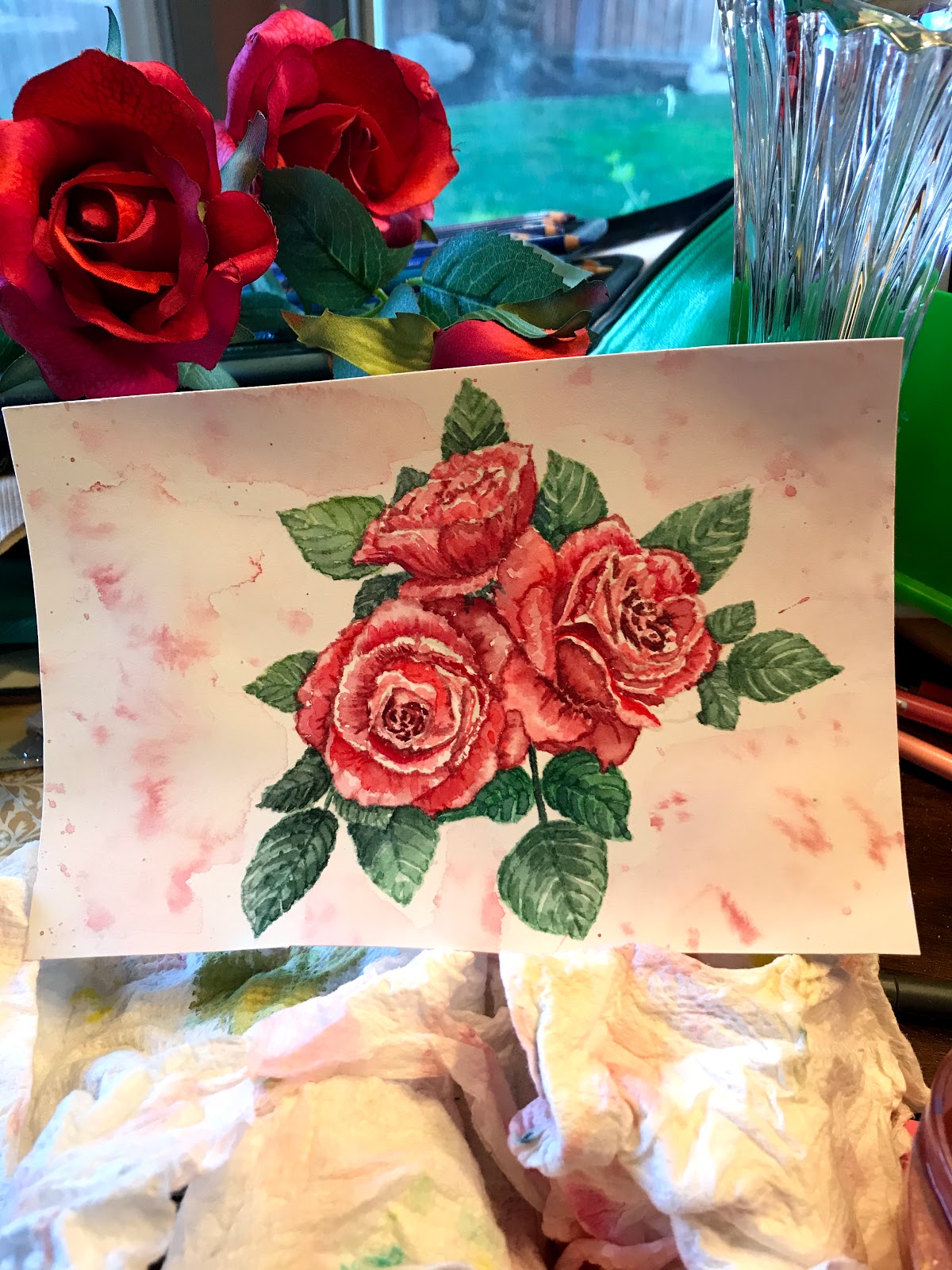
For the next card, I stamped the rose a couple times on watercolor paper using Antique Linen Distress ink and very loosely painted it. I spattered the paper with the paints and then again with Dylusions white spray paint, using a brush. I wasn't enamored with my painted roses, so, I then decided to switch things up a lot by pulling out a WOW red/gold glitter and a Glue Embossing Pad. I stamped the background stamp over the roses, applied the glitter and used a curved Crafter's Companion die to create an edge. I applied the same die on matching colored paper. I then found matching patterned paper that I could use in the background. I glued the pieces together and die cut the set. I white embossed a sentiment from another Unity kit, added Prima enamel crystals and called this one done.


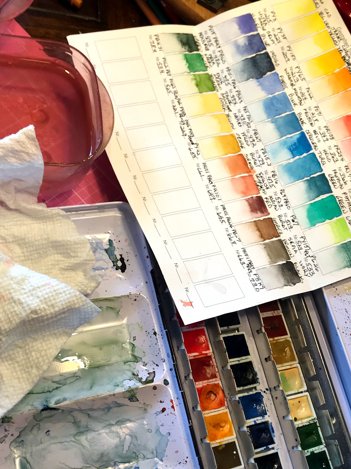
Went with a more tradition style for the last card! Watercolored the rose, using my Schmincke watercolors, stamped on Arches Cold Press watercolor paper. I spritzed the paper with paint and Perfect Pearls. I stamped the background stamp onto Kraft cardstock using a coordinating oxide ink. I die cut both pieces and stamped and gold embossed a sentiment from another kit onto Vellum. Found patterned paper to match and backed everything with more Kraft paper. I assembled the card, added enamel dots and this one was done!


Must admit I had fun coming up with 3 very different cards using the same set of stamps! Hope this inspires you to give it a try yourself!

Reminder, be sure to leave a comment before moving on for a chance at a giveaway! Again, we are not formally sponsored by Unity, but, we love the company and variety and quality of stamps they offer so much, we love showcasing them monthly. Member giveaways come from our own stash. now, onto the hop:

(You are here > Joyce)

Wednesday, January 1, 2020

Altenew Build a Flower: Aster Card

Well, I picked up quite a few Altenew products during the holiday sales, so thought I’d better check them out! Besides that, I’m in need of a few birthday cards and Altenew’s Build a Flower: Aster Kit seemed perfect. I also added a 2nd sentiment from my new freebie gift set, called Best Sentiments, and backed the image up using the Altenew’s Beveled Squares Stencil. Must admit, the quality of all of them was great!

So, contrary to instructions, I really, really wanted to watercolor the aster straight up without using the supplied layers. I stamped the image onto Arches cold pressed watercolor paper using Antique Linen Distress ink. I then pulled out my new 36 pan Watercolor set. Since, I recently received an email about a new January challenge, posted in the Altenew Inspiration Challenge Blog, I decided to try using that color palette. Hopefully, I came close to these colors!


So, I used 5 pink to purple colors on this image and a few greens for the leaves. When dried, I used a couple gray pens for further definition and then die cut the image using the supplied dies. I did use the layers and several green distress oxide inks to stamp out the leaves and I die cut those as well. Then the puzzle was what background to use. Since, I covered the green and purple/magenta colors, I decided I needed a background with orange. I finally decided to create my own and pulled out my new stencil. I thought the image might work well with thin stripes matching the thin petal strips. After taping down Canson Bristol paper and the stencil, I used the Picket Fence Blending brushes to blend Spiced Marmalade, Aged Mahogany and Seedless Preserves oxide inks on half of the paper.

I stamped and clear embossed the large sentiment using Thistle archival ink. I then stamped and clear embossed the little sentiment using Spiced Marmalade. I cut up strips of green paper from a striped patterned paper and wrapped them around the die cut stenciled paper. I attached the flower components and sentiments. I cut up a patterned K&C paper to use as a background and created a card base using an orange paper. I used foam tape behind the stenciled paper, added small coordinating crystals and called the card done.


Not my usual style, but I am having fun experimenting with new designs, colors, products and vendors. Seems I’m destined to welcome 2020 in with a fresh perspective! Thanks for stopping by -  hope the New Year brings you everything you wish for! Till next time, happy crafting!