Tuesday, July 31, 2018

Maple Girl Card

For some reason, I think seeing some other cards, I turned to making an autumn card (my favorite season). I used Unity’s Maple girl kit, plus the 9/14 KOTM (embellishment on sentiment card) and the 8/17 KOTM (maple leaf). I started by creating leaves. I wanted to see what I could do with the leaves from the KOTM. I used yellow, light and dark green, orange, and red oxides. I rubbed the lightest first and then added colors as I went along. I took Tim Holtz stencil to add circles and uncover colors underneath. I then used a script stamp to add marks using Vintage Photo. I then stamped a set of each of the leaves. I used another stencil to add a little texture paste (gold on the oak leaves and copper on the Maple leaves). I then fussy cut them. I only used 1 maple leaf on this card.

I then stamped the girl in Coffee archival ink. I used pencils to color in the girl. I also stamped the sentiment from the kit and added leaves around the sentiment. I colored those and added colors around both the girl and the sentiment. I used the Farmhouse paper pad to add coordinating papers. I ended up coloring the edges of the girl and sentiment with persimmon colored distress ink.

To complete the card, I added twine, some beads and sequins. It was a little cooler today, but as it heats up again, I’ll definitely be turning back to summer! How about you? Thinking of autumn yet?


Monday, July 30, 2018

Life Should Be Cards

Received this Unity stamp set, Life Should Be kit, in my last purchase (sigh). I also used a sentiment stamp from 1/13 SMAK kit. Also picked up some discounted TCW stencils that I tried out. Used a combo of media, Brea Reese Glitter Inks, Distress inks, Tattered Angels Glimmer Mists and Perfect Pearls. Experimented in layering stencils and trying out different coloring schemes.

In the first card, I used a yellow and purple ink to color, but because it’s so dark, I tried adding water and ended up losing the brilliance of the color. I used the left over bits to add another butterfly stencil which I added color to and ended up using as a background paper. I had used a gold Heidi Swapp mist that to add the butterfly impressions which was a little too watery. I also stamped a flower and used pencils to add coordinating colors on a lavender paper.


In the second card, I first layed down the yellow design and then added the purple mist which ended up covering up the yellow design. I stamped the image on the paper and stamped it again on another sheet, colored it, fussy cut and attached over the original stamped image.


The third card, which I think I like the best, I sprayed the purple rays first and then added the yellow rays. I used Perfect Pearls on this one.

I still don’t feel I’ve developed a card that really does justice to this pretty stamp, but it’s time to move on! Also, just a note, I used Paper Studio Kraft card base set for these, that is an unusual size. Noticed that the die sizes were too large for this size. May stay away from these in the future. Thanks for stopping by.


Second set of July ATC’s

Clearly, I was in a watery mood this month as 3 of the 4 sets I put together had water in them! The first set was created using 4 Unity sets: Beach Girl, Border of Bells, Inspired Minds and Let It Go and FOCUS. I was inspired by a video I watched which treated napkins with baby oil to make them translucent and like a decal. I found a small shell designed napkin set discounted at Tuesday Morning that had pretty colors. I began by pulling the top layer of the 3 sheets off and coating each side lightly with baby oil. I let that dry for 24 hours before I stamped the sentiment on it. I ended up using a white pen to highlight the sentiment. I fussy cut the napkin paper. I took watercolor paper, mixed a sand color and watercolored the background first. After cutting up the page into ATC size, I then took my blue and brown inks out and started stamping waves at the bottom using the border stamp. I also stamped using a watered down white acrylic paint. I used a bluer color and the white paint to add splashes using the splotch stamp. I embellished it all with a white Posca pen. I attached the shell at the top and then stamped out the girl. I watercolored her, fussy cut her out and ended up making a pseudo dock to put her behind (using markers). I attached those and called it done.

With the second ATC, I finally moved away from the water theme. I picked up some cheap, pretty colored, flower petals I wanted to try on an ATC. I also picked up Heidi Swapp stencils half priced that I thought I’d try. I LOVE hummingbirds and have 2 feeders servicing about 8-10 hummingbirds on my patio right now. I enjoy them year round, luckily! So, I pulled out the Faith and Hope Unity kit and stamped a hummingbird that I would use as a mask. I used my stencil to lay down a red strip and, with moving the stencil, a yellow strip. I then stamped the hummingbird and sentiment in blue ink. I colored the butterfly using Brea Reese Glitter Inks. I then used another stencil I picked up to create branches. I used a glossy paste mixed with Tattered Angels Green Glitter Mist to lay down the branches. I definitely need to get better at stenciling as it is difficult to do this in a production line (stencil gets mucked up, I get mucked up, the craft sheet gets mucked up,... you get the idea!). I then turned to the petals that were yellow with a pink edge and I noticed that I needed to add a little more color to the ends. After that, I stapled 4 petals to each ATC and folded the top one over and adhered it to the back. These were then done, even if a little imperfect!

Tried a lot of new products this time! I’m really enjoying doing the ATC’s as it gives me a chance to play and develop some skills. Till next month... happy crafting!


Saturday, July 28, 2018

First set of July ATC’s

Pretty hot outside, so I decided to cool off with water based ATC’s. The first set shown was based on a retired Unity stamp set called Seashell Song. I had picked up a set of pre-stamped white tags at a Tuesday Morning store that I thought I could use. I began by using a Tim Holtz stencil and a yellow distress ink. I then tried using the Ranger Micro Glaze to set the yellow, rubbing it on through the stencil. I then wiped it off and added a red ink. This went okay, but I think because I had to do so many ATC’s the glaze got on the sponge and the glaze ended up in places I didn’t intend. I then went over the edges with Vintage Photo. At this point I pulled out Stazon black ink and stamped and embossed the image. I cut the tag down to the appropriate size and then turned the leftover end upside down and stamped and embossed the sentiment. I fussy cut the sentinment and backed it with a distressed gold paper. I then took some watercolors and added a little color to the image and here’s where the glaze proved a little troublesome and interfered with that effort. I then took an Art Anthology bird stencil and added 3 images to each card using a Bo Bunny dark gold paste. I replaced the white thread with black twine and called it done.

The second ATC was created using 3 Unity sets: You Can Do It (bubbles), Beach Girl (sentiment) and the 1/15 SMAK kit (plant). I also used Recollection mini beads, a stencil, patterned paper, a Brea Reese light gold paste and a Heidi Swapp white paste. started by adding blue and green inks to the bottom of each card, with the darkest colors at the bottom. I then stamped the bubbles using different inks again including darker blues and greens. I also added a plant stamp image. Next, I added white dots using a stencil at the top. Next, I mixed mini beads in with the gold paste and slathered (yes, like buttah!) the mixed concoction across the middle top. I then colored the remaining section with Antique Linen and fussy cut some palm leaves from a patterned paper set I picked up in a magazine and attached one at the top of each card. I stamped, cut, and inked the edges of the sentiment. I added the sentiment and some crystal dots and called them done.


Hello Little Birdie Card

I decided to create another black and white card today into the Unity challenge. I was inspired by a grayscale card already entered and my coffee cup this morning. I used 5 kits this morning: Hello Little Birdie, She (by Donna Downey), Include Yourself in Beauty (flowers), Enjoy the Ride (postal stamps), Her Own Hero (sentiment), Eternal (gate background).

I pulled out watercolor paper and began by stamping and masking the flowers in the top corner using Hickory Smoke Distress inks. I painted a little black into the flowers to darken edges and shadows. I then took the bird and stamped the bird part in Black Soot Oxide and then added Hickory Smoke into the branch. I also painted the bird a little to add in gray. Then I stamped the gate lightly all over. Next I took the postage stamp and stamped one of the stamps in a few places. I then stamped the sentiment, dark black again. Following this, I added the Donna Downey sentiment trying to overlap wth the postage stamp, but again using the hickory smoke. I added a little gray paint here and there.

I decided I liked the whole paper I created, so I needed to go up a level in card size. I made a black card, added white strips at the top and bottom, using both the gate and postage stamps. And centered the paper.

I LOVE this design and am dying to try it out with other stamps, but in color! I think this one turned out interesting and pretty. But I think I will move to archival inks next time, so I can add color more easily to the background! I also will try to coordinate image styles a little better (thin lines vs thicker lines, level of detail, etc) and focus more on image placement. Well, hope you enjoyed blog entry, till next time, happy crafting!


Thursday, July 26, 2018

French Kiss Life Card

Decided to enter into Unity’s Black and White Floral Challenge. I barely qualify as there is only the floral stamp on the right side that I included at the last minute. I must admit, I didn’t even notice the “floral” part, but as luck, would have it there is a rose on the card! Phew!

Anyway, again, wanting to use some new TCW stencils and a new Tim Holtz embossing folder, I picked up discounted, I decided to create a Paris themed card. A little over a year ago, I visited Paris so it seemed appropriately timed! I first took white paper, sprayed it with water and folder embossed it with a French script folder. I then took the black ink and ran it over the raised areas.

I pulled the girl from Unity’s 12/16 SMAK kit and stamped her on an Authentique patterned paper in black ink. I then took some white gesso and lightened the right side of her to make her stand out more. I also used a Posca white pen to add highlights to her face, jewelry and clothes. I took a black acrylic paint and the stencil and added Paris and some script to the right side. I then pulled Unity’s Straight Laced kit and added a black lace impression on the left side. I finally stamped the floral label from Unity’s French Kiss Life kit.

I created some small ephemera pieces from other vendor kits that I thought would match. I then took black paper and embossed the sentiment from the label kit and diecut it. I had picked up the scrolling crystals at a half priced sale and really didn’t know when I’d ever use them. Seeing them, I thought this might be the closest I’d get to creating a card they’d work with. I also added black lace, black/white string and backed the patterned sheets I created with black paper.

Well, that’s all for today! Till next time - happy crafting!


Focus on the Good Card

Veered off my plan to continue with my pencils, as I was distracted by the new TCW stencils I just got and a new very pretty Prima Santorini paper pad. The colors in this pad are very summery and not my usual. I looked through my stash of unused Unity kits and happened on the Let it Go and Focus stamp set. I decided on a collage style card matching with the paper’s style.

To begin, I pulled a Canson Bristol paper and grabbed a pink, a blue and a yellow Tattered Angels Glimmer Mist. I wanted to match the paper in the pad so I spritzed the pink, added blue in 2 of the corners and dried the sheet I had cut down. I then spritzed all over the yellow to warm the colors a little. I dried the papers and the stamped the flower in both bright pink and a thistle shade (in the shadow parts), both archival inks. I then used black archival ink on the sentiment and embossed that.

To add color to the flower, I used both Worn Lipstick and Picked Raspberry Oxide inks. I also used a touch of pink Brea Reese ink to add glitter. I then used the script stamp using Broken China. I also grabbed a background stamp from the 11/17 SMAK kit using Coffee archival ink. I used the same ink to stamp Let it Go all over. I then pulled out a couple pastes, a white Heidi Swapp and a blue Nuvo paste. I used them with my new stencils to add some interest and dried the images (makes them puff up a little).

I then turned to the card and used the original inspiration paper as the base, distressing the paper first. I then used the paper scraps (the opposite side of the paper) to add interest, tearing and distressing bits. I also used the Hugs kit to stamp Hug and Smile in coordinating colors. I colored a doily fragment to match and added that. To complete the card, I added fancy trim to the watercolor paper and added vintage brown to the edges. The card is pretty glimmery and glittery so I didn’t bother with any other embellishments. 

I like how this card turned out and hope you do too! Happy crafting till next time! 


Tuesday, July 24, 2018

Life is Damn Good Card

Picked up this Unity Angie girl and sentiment in a swap. They’re both from Unity’s May 2016 KOTM. Was feeling very lucky today, having had a good life and reflecting back on some highlights! Don’t think I do this enough, how about you? Really felt the sentiment today!

Anyway, seems I’ve been very focused lately on watercolors and an eclectic style (a very kind lady called my crazy stuff this term, recently). So, I turned to my Prismacolor pencils and this, new to me, stamp set. I stamped the girl using a combo of red and brown inks on Bristol paper (which worked nicely for pencils). I pulled out an Authentique paper pad wanting to move into warmer bright colors (I tend to focus more on cooler and/or duller colors.) So I picked the brightest paper and used that as a guide to color the girl. Stamped the sentiment on paper from the pack, die cut it and added some shading.

To pull the card together, I ended up using a corner punch, a few dies to create hearts, and some crystal dots. Hope you enjoy the card, and, remember to take a moment to reflect on all the good things in your life!


Monday, July 23, 2018

Don’t Lose the Spark Card

I really felt the need to be artsy today! I had been playing with the background flower stamp from Unity’s January 2015 SMAK kit when I decided to try watercolor painting it to coordinate with a paper from a new Prima paper pad. I first stamped using a hunter green and then blue archival ink and proceeded to paint it using oranges, reds, and aquas. I cut the paper down and ended up toning it down using a light wash of Aged Mahogany distress oxide ink. I picked out a red background from the pad for the card base and die cut the flower patterned paper using a tag die. I decided to keep the top of the patterned paper and knew I could cover up the hole at the top of the pad with the background paper. I also used some of the paper scraps to make a strip at the top.

Once done, I then started thinking of what stamp I could use as a focal point with these these papers and my eye landed on the frame and sentiment from the November 2017 SMAK kit. I stamped that using the same blue and green archival inks and and added an orange on the flowers, and finally embossed it using clear embossing powder. I painted the frame and then stamped and embossed the sentiment from the same kit using plum archival ink, and fussy cut it out.

I then turned to my ephemera collection to see what I could use to balance the card out. I found a pale teal feather and teapot that I added color to to blend in with the other pieces. I also found the word treasure and a background for it that I added to the tag. Again, I added some darker color to this piece.

At this point, I still felt creative (or slightly whacked) and felt the need to turn the frame into a mirror and pulled out the girl from the March 2018 SMAK kit and the chandelier from the June 2017 SMAK kit. I practiced lightly stamping using Aged Mahogany, and finally, took courage into my hands and stamped the images onto the completed frame. I lightly took a brush full of water and smudged down the images. I dried the frame, decided I would keep it and took a brown Sharpie and added a little detail and a white Posca pen to add light touches.

I finally put the card together adding peach lace, a teal flower and cream fancy string. So, this happy mess is what happens, I guess, when I get in a mood to play. I had a lot of fun matching colors, designs and papers and playing at creating a mirror. Next time I will practice this in advance to improve my novice technique here. Interested as always in feedback! Take care and explore your inner creative urges... it’s always a surprise to see what happens!


Thursday, July 19, 2018

Single Layer Card

Been taking a break from crafting for a few hot days, enjoying the summer, reading and hitting a pool. Knowing I needed to get back into crafting, I decided start by entering 2 challenges with this card, Unity’s Single Layer Challenge and the Inspired By Beach Day Challenge (colors). I used Unity’s Holly Hoffman Blossoming Beauty kit and a Tim Holtz stencil.

Pulling out a Tim Holtz watercolor cardstock sheet, I grabbed the Distress inks in the picture below. I based my selection on the Inspired by Challenge picture, so I needed to mix 2 blues to cool the color down a little. I first stamped and mixed the blues and added a lot of water to dilute the color and picked up ink around the paper. I then did the same with Antique Linen, drying in between. I did this several times. I then pulled out the Walnut Stain and added water drops of the brown ink.

I then used my Misti with Coffee Archival ink to stamp the flower images, I then embossed with Liquid Platinum. I did this twice to make sure the images stood out. I then painted the images using my regular watercolors, making sure I added some yellow.

Once done, I used watermark ink to emboss the sentiment using a Stampendous medium blue. I then used Hickory Smoke around the edges using both a sponge and paintbrush. I used the same ink to add stencilled flowers. I finished up by adding blue and sand colored sequins, mounted it on Kraft cardstock and called it done. Hope you like this one! Now, back to ATC’s!


Friday, July 13, 2018

Challenge CAS Card

Decided at very last minute to attempt a CAS card (Clean and Simple) for the Unity Show and Tell Challenge. Not sure if this one totally fits the bill, but it’s definitely the closest I’ve come in awhile!

To begin I cut Kraft paper down to size, and pulled out Unity’s March 2016 SMAK kit. It contains multi layer stamps. I pulled out a rose colored Gina K ink, a deep red Memento ink and a black archival ink. I started by carefully placing the largest surface stamp in my Mist, carefully noticing the grid lines, and using 5he Gina k ink. I then lined up the solid lines stamp and used the red followed by the black with the split line detailed outline. I then pulled copper, gold and white Perfect Pearls powder wet it and painted some shadows in the flower. I then stamped the sentiment from the same kit in black. I added copper and green spatters.

I found paper to match and distressed the edges in coordinating colors in Oxide inks to blend in. To complete the card, I added a rose gold ribbon and green twine, and sequin. I wasn’t happy with the blandness, of course, so I ended up adding washi. I included both pics, so if you care to, leave a comment telling me which one you like better!

 It turned out I really love this flower from the kit, which is not why I picked it up. Now I can’t wait to try the other one! Till next time, happy crafting!


Wednesday, July 11, 2018

Butterfly Birthday Card

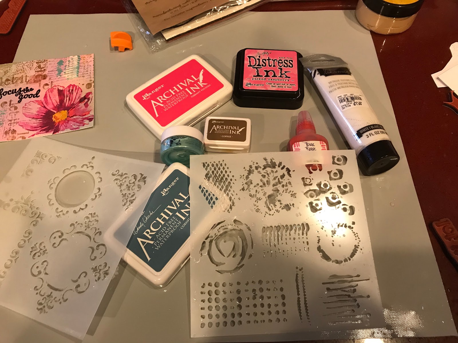
Last night, I watched a really enjoyable You Tube video by a talented mixed media artist, Cat Hand, called Mixed Media Collage - Leaves and Bird...so relaxed, creative and inspiring to watch. Well, this card was the output from my mind noodling on some of her techniques, and the fact that I just stopped in again at Tuesday Morning and picked up some goodies. So, here I go again, wanting to play with my new discounted toys, white and turquoise Heidi Swapp metallic pastes, a Tattered Angels Glimmer Mists 5 pack and a bunch of Heidi Swapp stencils.

I began by cutting a piece of Canson Watercolor paper. I pulled out a freebie butterfly I picked up in a grab bag (I was very intimidated by it when I first got it in December...I guess I’ve come a ways since then). It’s from a Unity SMAK kit from 9/17. I pulled out a Turquoise mist spray and a peach colored spray and the stencils. I began by holding the butterfly stencil offset on the paper and spraying around the stencil. I dried that and then took the negative stencil and and sprayed the butterfly image. After that dried I used a gray archival ink and stamped the butterfly in the center of the image. I then used a background receipt stamp from the March 2018 SMAK kit and stamped all around the butterfly using the gray ink. I took the patterned dots stamp from the same kit and inked it with red and blue oxides and filled in areas. I noticed in the video you can mute harsh transitions with white gesso, so I mixed a little turquoise paste with the gesso so it wasn’t stark white and painted the areas between the stencilled butterfly edges and the Unity stamp. Once that dried, I took the white metallic paste and the remaining stencil and, using a palette knife, added scallop like raised areas. Finally, I used a Stazon blue to add small butterflies from the August 2017 KOTM. I also added some black dots here and there.

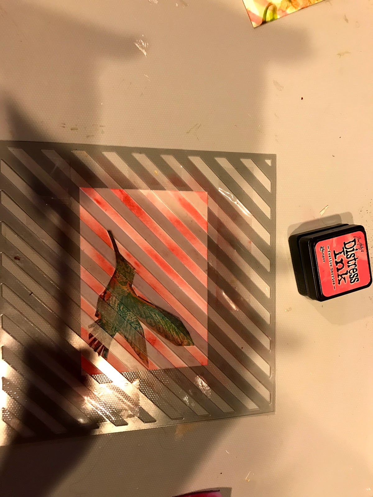
Turning to the butterfly, I grabbed the leftover watercolor paper and pulled out some oxide inks. In one of the pictures below, there’s scrap patterned paper I used somewhat for the color scheme. I took yellow, red and blue, one at a time and stamped the pad in a straight line, sprayed it with water and then dipped the paper first one side then the other to create similar lines on the paper. I dried in between colors, but they did mix a little. I then stamped the butterfly using a black Versafine ink and fussy cut it out. I used the leftover paper for the sentiment which came from the Happy kit. I used a silver paint pen on the edges of the sentiment and oxide on the hard edge.

To make the butterfly stand out, I pulled out pastel chalks and smugded black, then white, and finally turquoise around the edges. I also smudged a dark teal around the whole piece. I pulled a cream card base out, added silver paper strips to each side and used foam tape to add the base butterfly. Once mounted, I added a few smudges of the teal in the center of the fussy cut butterfly and affixed that and the sentiment to the card.

This was a lot of fun to create. I’m still learning what to add where, when to apply the paste, and how to enhance the primary image, but you never learn unless you keep trying. So, major issue...must have washed my hands 20 times, the craft mat 10, and I and my craft mat are still stained! Trying to keep clean is tough, another thing to learn, I guess! Well, till next time, happy crafting!


The Garden Tag Card

Needed a break from ATC’s, so I pulled out Unity’s The Garden {what not} Collection. Grabbed one of the tag stamps and stamped it out using my Misti and Distress Oxide Vintage Photo ink. I colored various parts using a small bit of Brea Reese Glitter ink and Perfect Pearls. I then pulled out a patterned paper and stamped that using the same ink with a stamp from the Vintage Era Background kit that I thought would coordinate well. I then used a new Tim Holtz stencil and a Heidi Swapp gold metallic paste that I picked up cheap at Tuesday am on the patterned paper. I also used white gesso with another TCW stencil. I finally grabbed a red ink and stamped a few butterflies from January 2015 SMAK kit on the paper. I took a brown pen and made dashes around the paper and affixed the tag to the paper.

I had some time ago used stencils on some vintage paper and mounted it on a card base. After looking through papers, I realized that would work with my images. I stamped the sentiment (not sure which kit it’s from) on scrap paper and die cut it. I added some Worn Lipstick color to the sentiment to blen in. I then looked through some of the ephemera packs and found the gold embossed paper, the plaid paper and some other bits. I pulled the card together using buttons, ribbon, and twine.

I’m pleased with how the card turned out...back to vintage, yes! Learned you could use stencils on patterned paper. Hope you like it!


Saturday, July 7, 2018

Friends of Unity July Blog Hop

Hello Unity Stamp Co. friends! So happy to be asked to participate in the Friends of Unity blog hop with such talented fellow crafters, my first ever! Seeing this is my first hop, I decided to pay it back by offering a giveaway. (One other Friend is offering a giveaway too!) All you need to do to win is leave comments on each blog in the hop. I’ll be randomly choosing and announcing a winner in next month’s Friends of Unity blog hop post.

This month’s theme, Christmas in July, has jumpstarted my holiday card making efforts. I focused on 2 Unity stamp kits, Magical (Bliss and Wonder) and Search for those Moments. I also used a frame stamp from the August 2010 KOTM All You Need kit.


The first card was created by stamping the sentiment using a Navy ink and embossing it using a Simon Says Navy embossing powder. The image was stamped using the same navy ink and a Colorbox gold ink. The image was then embossed with clear embossing powder. The background was created using the same ink and Perfect Pearls gold powder. I added Perfect Pearls to the branches and applied color spatters. I die cut the paper, added matching patterned and gold paper, gold twine, Washi tape and ribbon. I used a gold paint pen on the wooden star.


The second card was started by spraying Tattered Angels Gold Glimmer Mist on watercolor paper. I stamped the image with navy ink, again. I mixed the Glimmer mist with a Textured paste to apply dots and the word, joy, using stencils. I stamped and embossed the frame using Gold Colorbox ink and embossed with clear powder. I colored the alternate stripes using a gold paint pen. I then stamped and embossed the sentiment using my Misti. I added fir motifs using a Bo Bunny gold paste. I then stamped a snowflake using blue ink and adding Perfect Pearls gold paint. I pulled the card together with sequins, crystals, patterned paper and a burlap doily.


The last quick card was created stamping with oxide inks and spritzing water. I also used Silver Colorbox ink and a silver paint pen. The card base is navy with both a green and silver frame. I used a silver ribbon, silver charm, navy ribbon and crystal dots as embellishments.


Hope these cards and the others shared on the following blogs help to stimulate your creative ideas for holiday cards. Remember, if you wish to participate in the giveaway here, and, being offered on one other blog, be sure to comment on every blog. Always interested in your ideas!

Friend of Unity blog hop:
you are here —> Joyce Verdon
Next up —> Jeanie Marie Hays

Thanks for stopping by! Till next time, happy crafting!

Thursday, July 5, 2018

Smooshed Roses Card

Late last night, while listening to fireworks, I decided I wanted to try a technique called “smooshing” using Unity’s roses stamp from the April KOTM. As usual, since I don’t always follow rules, I would retitle mine, “targeted smooshing”! The sentiment I used is from Unity’s Nov. 2017 SMAK kit - it appealed to me as I used my fond rose memories to target the smooshing!

To begin, I pulled 5 oxide inks (see pic below) and cut a piece of watercolor paper to fit the large stamp. I grabbed an empty acetate zip bag which used to hold sticky crystals dots and placed all on my craft mat. I first stamped out the rose stamp on a paper invoice (never waste paper scraps) from a stamp purchase as a guide. I then stamped the inks for the flower colors on the mat, spritzed them with water and dipped the acetate into each color and tried to visualize where the colors belonged using memory and the scrap. I dried in between the colors. To darken some, I smooshed the color on twice. Once done, I used my Misti to figure out where to stamp the roses image. Came pretty close I think. I then added color splotches using a toothbrush and the inks and a white Posca pen.

I stamped the sentiment on a leftover paper scrap, added scripting images from the corners of the  roses stamp, and spattered that, also with watercolor and pen. I cut and backed both with brown paper. I then played around with card layout options and finally decided to go more traditional with a curve thrown in. I used 2 different yellow Washi tapes as a foundation and added Washi to the Roses image. I then added a ton of coordinating sequins and called it done. I really enjoyed playing with the looseness of this style. I love the bright colors of this card and am pleased with the end result! Hope to see you back here!


Wednesday, July 4, 2018

Amazing Things Card

Had a little time today to get back to pencil coloring using my Prismacolors and Unity’s Amazing Things kit. This was a really easy card to create, luckily. I also used the very pretty First Edition, Trimcraft Mulberry Kisses paper pad. I stamped the images using Olive Archival ink and Versacolor Lilac ink for the flower. I colored the image added a patterned paper border (using dies) and mounted that on another plaid paper (the original color inspiration). I added coordinated sequins and then called this little card done. Hope you like it! Till next time, happy crafting!