Saturday, February 29, 2020

Periwinkle Flower Card

Watercoloring a flower again without drawing out ahead of time... well, practice makes... me, hmmm, better, I think! So, while out walking the dogs, I took this pic and decided to try painting it. I guess comparing the two in this blog post will tell me how close I came to matching this gorgeous color (or what I need to change next time ;) ). It is a Vinca Minor or Periwinkle flower, a perennial ground cover. I guess I never noticed the middle of the flower before, so pretty and delicate.


Anyway, this time I pulled out a Bee paper cotton watercolor sheet. I used my Schmincke watercolors and an Escoda Reserva Kolinsky 6 and the Silver Black Velvet 4 brushes. I took a video under just an hour long, which I ended up speeding up 4.5 times, resulting in about 12 minutes of footage, included below.

After I was done painting, I spattered dark green and magenta tone paints all over the background, covering the flower. I then spattered white gouache all over. I die cut the sheet and backed it with solid paper. I decided to add a Unity sentiment from the Just... sorry kit. I took pretty light colored Kraft card stock I picked from Unity and added coordinating Washi tape to the corners. Finally, I added dots to the card and called it done.


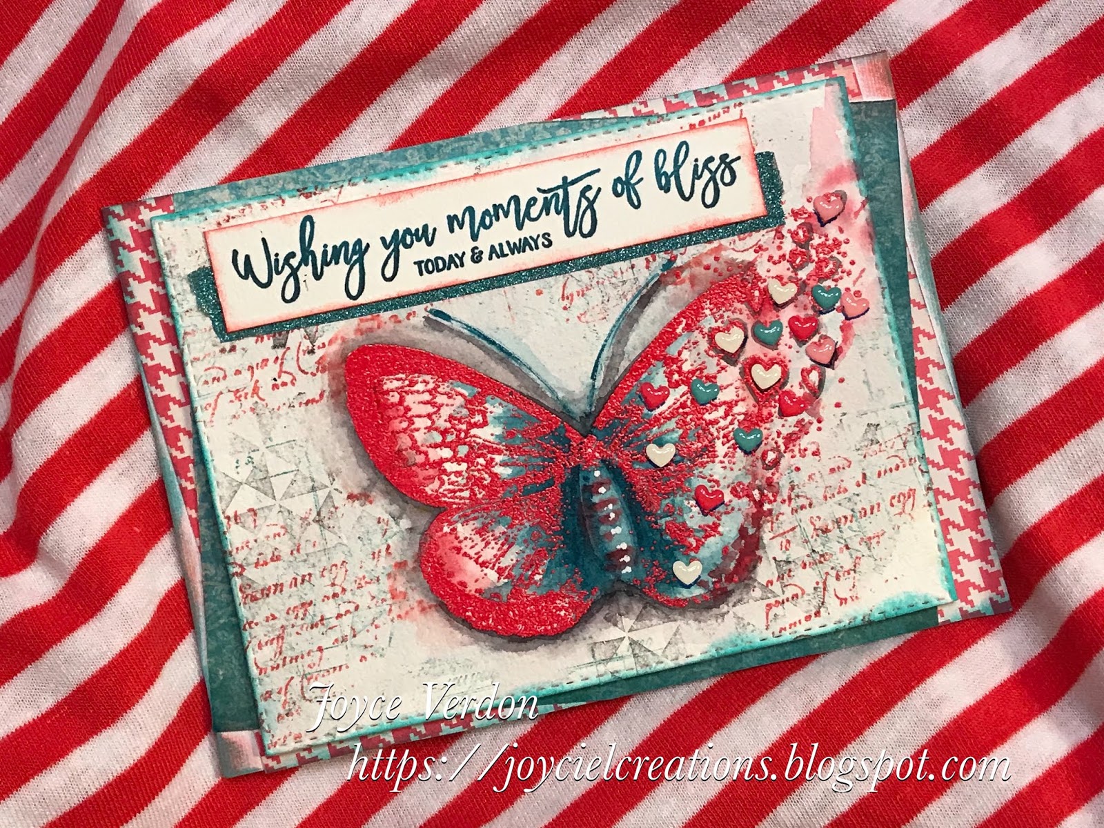
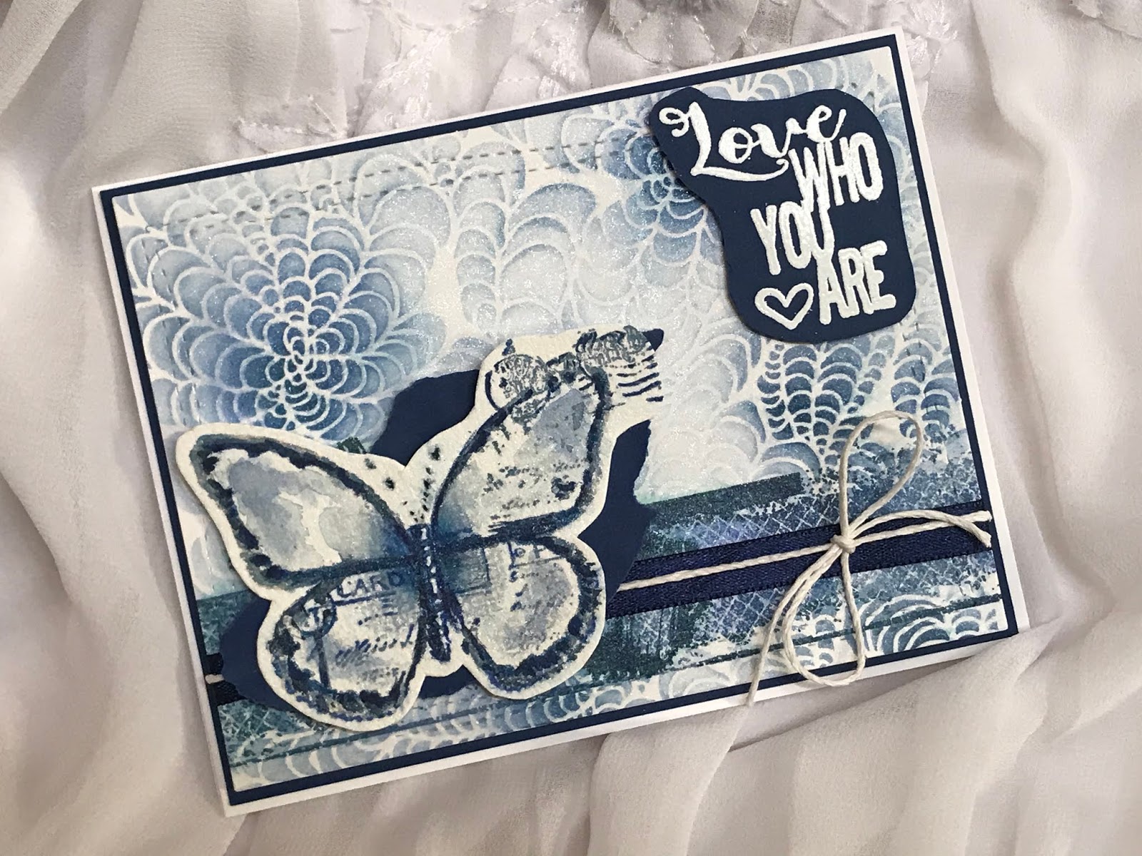
I know these are not great paintings, but I think they make special cards, being painted by hand. At least, I know they are not stuck away in a pile of mine but are being put to use! Hope you enjoy what appears to be an ongoing painting series. Hopefully, my skills improve! Again, thanks for stopping by and subscribe to this blog or my YouTube channel if you are enjoying my efforts. Happy crafting, till next time!

(Looks like the color tones were right just not dark enough... interesting!)

The video:


Wednesday, February 26, 2020

Freeform Poppy Card

Couldn’t wait to try another, what I’m calling, free hand painted flower. This is where I’m painting directly on paper without drawing or sketching an image out first. I usually get into serious trouble doing this as you can’t undo watercolors. But, it’s fun to do, so I thought I’d give it a try again, especially after my first attempt gained support.

For this image, I cased the internet for poppy photos and found one to use. Clearly, if I had drawn a poppy, I think the dimensions and orientation would have been much better. But, seeing as it didn’t turn out terrible I ended up turning it into a card. I think this is a good exercise to build skills. Anyway, I picked a poppy, because these also are a fav of my husband’s (he may be my muse). Here’s the image I loosely used as a reference flower (number of petals, look of stem, posture of flower...).


I started with a piece of Arches Cold Pressed Watercolor paper and used my Schmincke watercolors. The video which begins right at a clean slate, is again attached at the end of this post, and, is in Youtube. To see a bigger version, just click on the word Youtube and expand that. I pretty much completed the painting on the video, which is sped up 4xs. However, I did add a final second coat of red orange to bolden the colors off cameras and deepened the black area. I also added white Posca pen marks.


I used the SimonSaysStamp! Love Always Kit for the sentiment and a Kaisercraft In the Attic paper pad for the background, as well as black card stock. I added black string and black enamel dots to complete the card. Will need to try this again!

The video is 9 minutes long FYI. Let me know what you think... should I ditch the free hand painting? Would you prefer to see more stamped images? Are the videos useful? Thanks for stopping by! Be sure to subscribe if you like my creative endeavors!


Sunday, February 23, 2020

Blanket Flowers/Simon Says Stamp Feb 2020 Card Kit

DISCLAIMER: Oh, my... took me long enough to get blogging to come naturally... well, now, I’ve just uploaded my first sped up, shaky, no sound video! Yes! (It’ll only take me another year to get this down pat.) In the process, I managed to drop my phone into my water, saturate my half painted card, flood the floor, and upend my Altenew watercolors, not once, not twice, but 3 times.... YIKES (although that is NOT what I shouted about 20 times)! And when I mean upended... I mean wet gooey pans came flying out all over the floor, paints separated from their labeled pans, and paint went flying.... needless to say... if you seeing me looking all over for a color while painting in the video, it’s because it no longer is where it should be! Anyways, I persevered and mostly finished painting in the video.

To begin all over... I decided to try to paint one of the provided pre-stamped Suzy Plantamura cards in the March 2020 Simon Says Stamp Stronger Together Card Kit. I’ve been wanting to paint Blanket flowers (Gaillardia), for awhile, for my husband. After getting into gardening many moons ago, my husband started enjoying flowers, but he always wanted the bright orange and reds, where I went for the more dusty, paler colored flowers. So, I finally gave up and planted these very vibrant, but straggly, sometimes, perennials. He LOVES them and we always need a patch of them somewhere. Have tried painting them by scratch without success or patience, and decided, although the petals are not right, I’d make these flowers do and try painting them. Since they are mostly primary colors, I decided the Altenew palette would work.

So, I began painting the first layer trying to get in all the shading needed. I used primarily a Silver Black Velvet 4 brush and sometimes a Mimic Kolinsky 6 brush. I had the lightbulb idea, as it was turning out not too bad, to try videoing my effort... hence the disclaimer above! [I’ve attached the video at the end, in case those of you who get emails of this post end up with a truncated post.] Note, nice neat Altenew set!


After paint set:


After the video, you’ll notice I got some splotches of paint here and there, plus when the card got wet, paint moved. So, I tried to create a background, but the paper is not the best quality and the paints didn’t move great, so I ended up deepening the background color and cutting out the background on the right side. I also decided to use scrap patterned papers from K&C Company and try to emulate the patterns in the paper using various stamps and a stencil.

So, I adhered the watercolor card to the paper using strong 2 sided tape... best for straightening out curled paper and then die cutting that. I backed that with a lighter paper and then added another layer for the card front. I stamped the sentiment on the light green patterned paper, adhered those, and added red enamel dots. This kit is perfect for me as my “besties” and family are across the country and my husband is currently working out of state! 


Well, let me know, do I have a directing career in my future? Should I continue trying this? Hope you got a chuckle from this! Let me know your thoughts! Thanks for stopping by... and if you aren’t subscribed... feel free to do so!

Video... action, take 500:


Saturday, February 22, 2020

Freeform Watercolor Tag

Was so inspired by quite a few really captivating Instagram posts by very talented crafters that I had to try it myself... watercolor freeform flowers. As this was the first practice try at freeform painting, I didn’t spend tons on time on this as I wasn’t sure how it’d turn out.

To start, I cut down a Hot Pressed Arches watercolor paper to the desired size, pulled out my Altenew watercolors and started painting the large flowers, stems and leaves. I added the smaller pink flowers last, using the odd number protocol usually used in embellishments. I added paint spatters, dried the paper, and pulled out a black pen for detailing. I also used a white Posca pen for highlights. I added some shadows and called it done. I spritzed it with a Perfect Pearls solution and spattered white gouache. I then used a Carabelle Studios stencil, called Napperon, with a violet colored Memento chalk ink. I stamped a script stamp from Unity’s Be Fearless 6/17 SMAK kit using London Fog Memento ink.


Since I wasn’t sure of how it looked I decided to create a tag with it, as I’ve recently been wanting to create tags to have on hand to include with my destash packages. I used a Tag die set to cut both the watercolor paper and purple cardstock. I then took the leftover bottom of the watercolor paper, turned  it over and created a wash using the same paints. I dried it and then stamped a sentiment from another great Unity kit called Sending Kindness and backed that with black paper. This sentiment seemed apropos as I hope those who inspired me (and others) feel good about it and, in turn, I hope this tag encourages others, including the person who receives it!

Well, this certainly was fun and, while the result, while not perfect, by any means, was still okay enough that I think I’ll do this again, only taking it more seriously. I hope this encourages you to also try some freeform type of artistic effort on your cards... as major subject or just background doodles or painting.


Well, enough for today, back to stamps tomorrow! Till next time, happy crafting!

Friday, February 14, 2020

Massive Peony Card

Stamped out the image from this beautiful Gina K Designs kit called Massive Peony using InkOn 3 Fadeout Noline ink. Have to admit, the flower reminds me a little of a rose and I started thinking of the beautiful Peace rose. I love this rose and had one back at our old house in Rochester, NY, and, of course, I have one here, in Cali! So, when I painted this flower I was thinking of that pink and yellow combo...  surely there exists a peony like it in color! Unfortunately, I can’t grow peonies here, so since I’m not looking, I’ll never know.

Anyways, I used my Schmincke watercolors on this. To tighten lines and deepen color a bit, instead of turning to Prismacolor pencils, I instead pulled out my Inktense Derwent watercolor pencils. I also used some colored pens. If you look at the picture I took in the middle of painting and compare the pinks, you’ll see the deeper effect I got after applying the pencil color. In case you are wondering, I applied the color by wetting my brush and picking up ink off the pencil, then painting that on. I spattered red paint, gouache white, and a gold and a white Perfect Pearls solution.


I found some matching patterned paper for backing and used crystals and twine for embellishments. I clear embossed with a brown ink, one of the pretty sentiments in this kit. Love how this one turned out.

I didn’t bother with a background color as painting a complex image like this takes time and I wanted to be done. Let me know if I should have to bring more balance to the design.  We, enough for tonight, till next time, happy crafting.


PS if you have not already subscribed and enjoy my artistic endeavors, I invite you to do so!

Thursday, February 13, 2020

Take Time for Yourself Card

Have had this kit for quite a while and been longing to paint this stamp from Unity’s Love the Little Things 6/13 KOTM. I ended up pairing it with a sentiment from the Summer Celebration 6/19 KOTM.

Little vase collections, like this, make for a nice change in painting. Luckily, Unity has quite a few options with this style stamp. I had no color scheme in mind other than trying to change it up from recent colors. And having no event I needed a card for, I had no idea what I’d create... very freeing. I stamped the image with distress Antique Linen ink and began painting the leaves first. Since I seemed to move into a teal range, I then looked at my Schmincke gold, yellows and rust colors and ... the rest is history! I ended up using coordinating pens and stamped the sentiment in Sepia archival ink.

I happened upon coordinating patterned paper and after seeking advice from my crafty friends, selected a bold striped ribbon. I added coordinating enamel dots and a dark red solid paper for backing and called it done! The result, a simple card that I received pleasure from painting. The sentiment actually said it all!


Hope you like this one and I encourage you to try a little still life for a change. Till next time, happy crafting!

Wednesday, February 12, 2020

Frosty Mornings Card

Inspired by the Unity Show and Tell FB Page’s Tiny Challenge and this magazine paper I hoarded, I pulled out Unity’s Itty Bitty stamp set, Frosty Mornings and Lots of Snow Bird.

I clear embossed the black stamped image onto Kraft card stock. I then took a palette knife and scraped white gesso and then gold TCW paste around the image. I colored the bird with Prismacolor pencils and added black watercolor around the image. I stamped and clear embossed the sentiment and added pencil markings to match the paper. I carefully die cut the sides of the image and sentiment in a random pattern to match the paper.

To complete the card, I backed the sentiment and image, added crystals, a brad, matching mesh, enamel dots and black adhesive strips to frame the card.


Had fun creating this card and even though we don’t get snow here, I do remember snowy February’s back in upstate NY, where I’m originally from. Well, enough about this easy card, till next time, happy crafting!

Sunday, February 9, 2020

Power Poppy Happy Crabapple Card

Wanted to do a little watercolor today, and, oh my, I did... I painted the very little flowers and buds in Power Poppy’s Happy Crabapple stamp set. Painting that small is definitely a challenge with these old eyes and hands.

I first stamped the branch using InkOn 3’s Fadeout Noline ink, but I also used Antique Linen when I saw how tiny the flowers were... to aid in seeing them. I used Arches Cold Pressed watercolor paper. I used a gold pen for the flower stamens and green and gray pens to darken some areas. I spattered tiny paint drops all over and a mixture of water and Perfect Pearls. After painting, I stamped a sentiment from another kit called Planning for Magnolias and then die cut the paper. I decided, because the painting wasn’t tight due to old eyes and difficulty painting tiny things (at least for me), that I would have a soft background that it could blend into.

I found coordinating paper in a retired Modascrap Sweet Vintage Rose set and used Kraft card stock acquired from Unity Stamp Co. I added light colored sequins and a fancy “ribbon” and called the card done.


I think this card, while not great, will make a nice birthday card for an acquaintance and it served its purpose in satisfying my craving. I picked the crabapple because actually the pear tree across the street from my house is in full bloom so I know the crabs are not far behind.

Well, that’s it for today, have a great week and happy crafting!

Saturday, February 8, 2020

Tenderness Card

Created an unusual fun Valentine card, one of those cards that I didn’t know where it was going until it happened. These are fun, like the last card, where your imagination just takes off during the process and you go with it! So, how it all began...

I pulled out Unity’s Tenderness kit and stamped it out on white card stock with black ink. I first painted the hearts using Altenew paints. I then repainted the red hearts with Brea Reese Glitter ink. Finally, I spattered paint all over. I wasn’t real happy with my paint job, but then I remembered whole card shakers that I saw on a recent video created by a popular card maker, whose name is a blank to me. Please, if you know this person, comment with this ingenious person’s name! Anyway, the gist of the video was to recycle plastics that craft stuff is enveloped in. So, I decided to try to make a card patterned after this idea.


I found a plastic envelope slightly larger than an A2 card and then die cut the hearts paper. I remembered part of the process was to cut the plastic envelope corners at an angle to allow folding and taping of the envelope in the back. I did this with 3 sides, cutting off excess plastic as needed. I filled the front with both red and pink sequins and then sealed the final side. I actually used regular tape for this. I found coordinating paper I could use as a base. I then remembered I picked up a cute new die from Simon Says Stamps, called You Are Loved. I used another patterned paper for the words and black paper for the background.


Yes, the plastic is shiny and a little flimsy, but I still think it made for a cute card and is saving the environment a little. Let me know what you think!

Happy crafting, till next time!

Thursday, February 6, 2020

Love Abundantly Card

So, yesterday, I really wanted to make a card using a crafty friend’s color palette. I loved the soft colors and that picture; I so wanted to recreate it! However, I couldn’t find any stamps that would work. So, instead, I started pulling out other options and I was drawn to this stamp, Unity’s Love Abundantly kit, because of the hearts (this time of year, I’m all about hearts). I then remembered that color palette had red in it. And so, this card began!


I decided I wanted to see if I could make a red butterfly and emboss it. I found a Ranger Red Geranium embossing powder in my stash and did just that on a sheet of watercolor paper. Wow, I don’t think I’ve ever embossed that size image with that embossing powder... it is very bright! I then proceeded to add colors from the palette to the butterfly using my Schmincke paints. I ended up having to contrast the bright red with a dark teal (not in the palette colors btw), and, while I was at it, fill in the body of the butterfly and added antennas. As I said in other places, I feel like the color palette ended up on steroids with this card. I did end up using a blue/gray color for the background... so, I, at least, tried to conform. And I added a shadow behind the butterfly. I used a white pen for on the body.


I decided that, now, the loudly painted butterfly needed a much busier background, so I pulled out stamps from these kits, Make TodayHello Beautiful and Just Magic SMAK, and stamped the background with oxide and distress inks in Barn Door, Black Soot and Evergreen Bough. I die cut and inked the edges and added some mini Doodlebug hearts.

The sentiment from this kit, which I love, was way too big, so I chose a sentiment from Moments of Bliss and inked that up with a teal Momenta ink, darkened with Black Soot. I stamped on the original paper, but the background was too busy, so I used a separate paper and inked up the edges. I added a teal Washi tape first before adding the sentiment. I found coordinating papers and added them to an A6 size card base, at angles, and, inked the card edges.


Well, my gosh, this turned out completely different than the soft image I had in mind! I do love the colors and how the butterfly emerged.

Maybe, I’ll try this palette again another day! Well, till next time, Happy crafting!

PS if you are not already a subscriber or following me by email, and you enjoy my artsy endeavors, I encourage you to do so.

Wednesday, February 5, 2020

Lily Blossom Card

Spent a little time crafting the other day on an old style card using Lily BlossomHello It’s Me and Never kits from a Unity. I stamped the image on watercolor paper and painted it. I also used pens and a little colored pencil on it. I then proceeded to add color to the background using stamps from the other kits and Distress Oxide inks. I stamped the sentiment using a combo of Plum and Black archival inks.

A very talented crafty friend, Bobbie Sue McConathy, sent me a bunch of interesting papers from a variety of pads. I selected a few that I think came from a K&C Company pad similar to this one. I cut out a butterfly that I thought matched to use as an embellishment.


I inked the edges and pulled the card together fairly quickly, adding funky enamel dots. A retro card, if I do say so myself! It’s fun to have a style change... seems to refresh me!


As a matter of fact... wait till you see the next card... really switched it up! Till next post, happy crafting!

Saturday, February 1, 2020

Altenew Coral Charm Card

Had a hankering for watercoloring again! Pulled out Altenew’s Build a Flower:Coral Charm and stamped, onto an Arches Cold Pressed Watercolor panel, the leaves and auxiliary flowers around and the larger flower off a little. I stamped another large flower on a separate panel. I used Pumice Stone oxide ink to stamp the flowers. I decided to match the muted gold and delft blue colors in the retired Bo Bunny Genevieve paper pad and use a paper from the pad as backing.


I spent most of my time painting the separate flower and painted the rest lightly with my Schmincke watercolors. I used masking fluid on the central flower stamens before adding color. I then used my Prismacolors pencils and pens to fill in color all over. I added paint and spatters, stamped the sentiment and die cut the panel and the separate flower. To pull the card together, I added gold crystals and ribbon.


This was a very pretty kit! Hope the card did it justice! Well, till next time, happy crafting!

Friends of Unity February Blog Hop

Welcome back to another Friends of Unity Blog hop. What a challenge this month’s theme was... for many of us! After researching options a bit, I went with three different styles to showcase this month’s theme, monochromatic cards.


Reminder, this blog hop will include some stamp set giveaways —> me, for one! Just be sure to comment on each blog for your chance to win one! Make sure you leave your name if your ID is nondescript!

The first card presented here, representing a CAS style, or in other words, a clean and simple style was created using the feather from Unity’s Feather Soft Love Kit with part of a sentiment from their Know You’re Strong Kit. I die cut the Bristol paper and then stamped the feather using 3 different blue inks. I stamped and fussy cut the sentiment onto blue paper. I then folder embossed a frame onto the panel. Finally, I used a clear Spectrum Noir Glitter Pen on the white parts of the feather, added a ribbon flag and some of the freebie shiny sequins Unity recently sent out with kits. Must admit, I had fancier plans for this card, but in my many attempts to create that version ended up cross contaminating my white and clear embossing powders and decided I had done enough damage and started fresh with this card!


I took the meaning of “monochromatic” to a new literal level with the next card. I pulled out the jar from the Sweetness, Miracles and Wishes 5/19 KOTM and stamped it onto Arches Hot Pressed Watercolor paper using InkOn 3 Noline Fadeout ink. I then pulled out a Grumbacher Scarlet Lake tube of watercolor and, from my Gansai Tambi watercolor set, a white pan and a black pan. I then proceeded to mix several shades of color and painted the image. I added white and black pen details and ended up re-stamping the image using black ink and fussy cutting out a tiny tag to attach to the image. (This was quite an exercise and challenge for me to get the variations in color needed to differentiate each tiny component.) I stamped the sentiment onto white card stock and die cut that. I found coordinating ribbon, crystal dots and paper and backed everything with black card stock.


I used the lovely Love Who You Are Kit for this last card and coupled it with a pretty cool Stencil Girl stencil called Doodle It Tornado Flower. I used distress and oxide inks on this one as well as spraying the background and butterfly with a Perfect Pearls water mix. I stamped the images using multiple inks and painted more onto the butterfly. I used multiple inks and a blender brush through the stencil. I added a little pen to the butterfly. Finally, I used navy paper as backing, white embossed the sentiment and added twine and ribbon to complete the card. It has a pretty sheen to it because of the Perfect Pearls.


Hope you enjoyed and are inspired by these cards and the talented renditions of my fellow crafty hoppers. Be sure to leave a comment before you go, and, now, on to the hop:
<you are here - Joyce>