Thursday, August 30, 2018

ATC for Unity ATC Challenge

Okay, I succumbed to creating an ATC for the Unity challenge even though I already create 40 ATC’s a month (2 groups)! Wasn’t going to, but... I looked at the small squirrel in the Sept 2017 KOTM and the embossing folder with trees I found while cleaning up all my folders, stencils and dies and figured I needed to do it! (To reward myself for cleaning up and organizing craft stuff all day!)

To begin, I put down 2 different distress greens on my craft mat, spritzed with water and dipped my card into them. I pulled yellow, orange and rusty hinge Distress inks and did the same after drying the card. I then took a Hero Arts stencil and added leaves in same colors. I ran the ATC through with the embossing folder and took a brown Memento ink and swiped it across the raised tree trunks.

I stamped the squirrel first with Tea Rose Oxide, and then coated the areas of the stamp like the edges to create depth in the image using Rusty Hinge. I kept doing this until I was pleased with the squirrel. I then took the tread background stamp from Aug 2018 SMAK kit and stamped it both vertically and horizontally to give texture. I had cut a little heart out to mask the one in the image. I used Vintage Photo, Fossilized Amber and Rusty Hinge to apply the texture. I then added more shading using Prismacolor pencils and a brown Crystal for the eye.

I cut out some leaves and again swiped Distress inks over the texture created by the punch. I stamped the sentiment from the kit, cut it up and applied color to the edges and used a red pencil to add more. To complete the ATC, I darkened the edges, added flat enamel dots and more brown crystals to simulate nuts! Again, I’m on this fall kick, I guess, and, now, I’ll put away that kit for awhile! Thanks for stopping by and happy crafting!


Wednesday, August 29, 2018

Another September 2017 Unity KOTM Card!

Decided to try using the large flower stamps in this kit this morning. As I was posting a previous card, Gaylynn Martling, a very talented design team member for Unity, also happened to post a card this morning. I loved it and told her I that was going to try casing it. She used a foiling technique and, since I don’t own a foiling machine, I thought I’d try using my Nuvo Gilding Flakes instead. I forgot I had picked them up in a Tonic techniques class last year.

So, to start, I cut a piece of Canson Bristol paper down to a size slightly larger 5x7” (these flower stamps are large). I used my Misti to stamp the large stamp in the corners and then masked off the flower and used one of the smaller stamps to the side. I used a red archival ink on the flowers and then stamped the flower bud stem using a green archival ink. I then pulled out the Distress inks in the pic below and started painting the flowers, one color at a time going between dark and light colors. Once I finished painting the images, I then splattered some of the paint around. 

I did a little research on glues to use with gilding flakes and decided to try a glitter glue. I used a stiff acrylic brush to dab glue around the card and placed the copper flakes onto those areas. I used a round blending brush to dab the flakes into the glue and then, using swirling motions, brush the excess off. Worked pretty good!

To finish the card, I stamped a sentiment from the kit in black. I colored the edges with the same Distress inks and the oxide, Fired Brick, to deepen the edge. I added sequins. I also used a brown pen and brown pencil to deepen the shadows on the images and white and gold paint pens for the flower centers.

I think it looks varied enough from Gaylynn’s card to not be a direct duplicate. Hope you like it! Happy crafting till next time!


September 2017 KOTM Cards Continued!

Stamped another one from Unity’s KOTM last year, and continued with the “Hello...” theme using a sentiment from another kit. Also, used a background stamp from this month’s, August 2018, SMAK KIT to add a little more color. I stamped the image using a turquoise ink on the bottom and a green ink on the top. Used an orange ink on the butterfly. I used Distress inks to add color to the images and gels pens for sparkle. Used a square die on the watercolor paper, and given the imbalance of colors, felt the triangular patterned paper card design on a square card base would be perfect. Embellished with coordinating Washi tapes and sequins.


Thanks for visiting! Have a great day!

Tuesday, August 28, 2018

Fall Cards to Jumpstart the New Season

I know many in the country are experiencing hot weather, but we’ve had abnormally cooler weather for a change. I love the fall season (and the departure of the high 90’s temperature). I had to crack open last year’s September KOTM (9/17). I created and posted my first Unity card in September last year using one of these stamps. Actually, this was my first foray into stamping cards vs using ephemera! So, switching up all my paper pads for the new season, I decided to make these 2 cards rather quickly to get into the mood. Not my best work, but fun to make. Basically, the backgrounds were created using distress inks and the images were colored using Prismacolor pencils.


Thanks for stopping by!

Friday, August 24, 2018

Blow Your Own Mind Card

Needed to create a birthday card for a very special friend. Unity’s Blow Your Mind kit caught my eye, this afternoon, so I decided to pull out some watercolor paper and go to town with a ton of products again!

I first started by stamping the flower on some leftover paper with varied colored archival inks. I then sprayed the paper with some Prima Color Bloom spray and started adding distress color inks and even a dark red Gansai Tambi color. Once all dried, I then lined up the stamp again on my Misti and restamped the flower with clear ink and used copper embossing powder. I fussy cut the flower out.

I then turned to a larger paper and began by spraying, lightly, a stone colored Prima spray and then a green Tattered Angels Glimmer Mist. I, then, did pull out Unity’s Ikat background stamp and tried stamping using a somewhat dried out copper colored archival ink. Turned out this was unnecessary as those images are lost in all the other layers. I then dipped the paper in a rose/orange Distress ink. I then used the mesh like background stamp with Forest Moss Oxide ink. By positioning the flower around I decided I wanted to add yellow sprays coming from inside the flower. I used yellow archival ink and a bright yellow embossing powder to add those. I also added some white dots with a Posca paint pen. For the final layer, I added diamond stencil marks using copper Art C Metallic paste. Finally, after trimming the paper, I added darker color to the edges, added sequins, ribbon and mounted the flower. I stamped the sentiment using a sage green Gina K ink, fussy cut it, added corresponding colors and mounted that.

Pretty happy with how this one turned out. Hope you like it! Have a great weekend!


Loved Beyond Measure Card

This card was easily created using Unity’s January 2015 KOTM, August 2018 SMAK and the Ruler Background kit. I was having a little difficulty coloring this stamp for some reason (yesterday did feel like an off day) and finally used Brea Reese inks and Perfect Pearls. I started by stamping the images in gray inks. I did mask off the feet so they could be surrounded by the puddles (which I must admit looks more like a creek ;(  ). I then painted the images.

Once dry, I added the sentiment using both Harbour and black inks. I then die cut the paper. I found matching papers and ended up using a corner punch on the red patterned paper and backed it with shiny silver. I found a nice dark blue patterned paper for the foundation. I finished the card off with twine, die cut silver hearts and silver dots.

This looks, to me, like a masculine card because of the colors. I think it turned out okay given my struggles. Well, on to the next challenge. Happy crafting!


Wednesday, August 22, 2018

The Vine Wine Bottle Neck Tag

Was inspired to create this wine bottle tag by a Not a Card Card Challenge. I had an idea that Unity’s The Vine kit would be perfect for this use. I started by cutting watercolor paper down to 3” by 8”, scoring at 3”. I then stamped the 2 images using my Misti and Memento’s Rich Cocoa ink. I then used the wood grain stamp from the 2/13 KOTM to create a background adding brown and blue watercolor.

I colored the images with Prismacolor pencils, added a little more pencil color to the edges and wood, and finally stamped the sentiment from the Don’t Be Like The Rest of Them kit. I then backed the paper with patterned paper, die cut a hole and stamped the sentiment on the hole. I added string to the leftover hole and called the tag done.

Hope you enjoy this gift tag!


Fairy Card

I picked up the 11/14 KOTM and decided I needed to make a card for my wonderful sister-in-heart, sister-in-law, who’s a huge fan of fairies! I pulled out my watercolor paper, Distress inks, Glimmer mist, Perfect Pearls (white), Gansai Tambo watercolors, Posca pens (silver, white and black) and some stencils.

I started by spraying the paper with white Glimmer mist. I then layed down Distress colors, one at a time on my craft mat, spritzing with water, and dipping the paper in, drying between times. I then took one of the stencils and spread the dark cool greens on the stencil, spritzed with a tiny bit of water and reverse stamped the stencil on the paper. I then took another stencil and added a lavender doorway. I then stamped some leaves from the 4/17 SMAK kit. Finally, I sprayed a green Glimmer mist around the edges.

I then stamped the fairie onto another watercolor paper using my Misti, leaving the stamp in place so I could re-stamp when done painting. Used a variety of watercolor products painting the stamp. The wings and hair are simmery and vary in the light which you can see from the 2 different pics below. Once done I restamped her with black archival ink and fussy cut her out. I also stamped the image on the watercolor paper above. I painted the lines from her wand.

A wonderful fellow crafter, Bobbie Sue McConathy, gave me some patterned paper, knowing my obsession with them. Looking through the stack, I found some great matches for a background and started piecing the card together. I found a good patterned paper for the sentiment, used a purple ink to emboss it and tinted the edges. I used crystal dots and sticky binder ribbon to embellish the card. Hope my SIL likes it!

Thanks for visiting and have a great day!


Tuesday, August 21, 2018

2nd Set of August 2018 Unity ATC’s

Like the first set, I finished these early as well. I didn’t plan it this way but they went in completely opposite style directions. I first decided I wanted to use the woman from the love. just love. regardless kit from Unity and I wanted a black background. I pulled a black and white scrapbook paper out and cut it into ATC size cards. I then took the image and one of the sentiments and stamped and embossed them on plain white cardstock using my Misti and using black Versafine black ink and clear embossing powder. I fussy cut everything. I then took some red patterned paper and made a background for the sentiment. I used a Zig watercolor pen on the image. I pulled everything together, added sequins and, using black and red pens, a border.


My favorite ATC this month is the last one. I LOVE this Unity stamp, Anastasia (believes), by Donna Downey. I was intrigued by this stamp and wondered how it’d turn out on a very small ATC, and was delightfully surprised! Clearly, I am only capturing a small portion of the image, but still... stunning! She is 4.25” x 7”. I used the “unique” stamp from the, a love Beyond Measure, kit. Good thing, as every ATC did, indeed, turn out unique. I started by coating the stamp with Stormy Sky Oxide ink. I then placed the precut watercolor paper ATC base onto the stamp to capture the face and part of the head. I decided to add the background stamp, Circa Journal, using Tattered Rose. I then used my Misti to add the sentiment using Rich Cocoa Memento ink. I pulled out Prismacolor pencils in dark blue, browns, gold and pale rose. I used the navy as the shadow color in the hair and on the glasses. I quickly added color using broad sketchy strokes. I used a white Posca pen to highlight the eyes and a touch on the glasses. I then added 2 different Washi tapes to two corners. I then took a wood grain embossing folder and added texture to the ATC. I then rubbed Tattered Rose Oxide over the texture to add more color. I added Stormy Sky color along the edges and then rubbed the edge on the brown ink pad and called it done. Each ATC turned out differently as some were stamped on the right side of the face, other’s I colored over the ear, facial contours and eyes differed and some had blonder hair color. Had fun creating these ATC’s.

Well, enough for now! Till next time, happy crafting!


Wednesday, August 15, 2018

1st Set of Unity ATC’s for August

Was inspired this month to start my ATC’s early, and it seemed each one spoke to me, calling to be made! I had been saving Unity’s Sunflower - Miss You, Friend kit for the August timeframe. I paired it with a sentiment from the love. just love. regardless kit from Unity. I started by stamping the flower in brown archival ink on each card. I then took my Gansai Tambi watercolor set and painted each card in a very quick almost impressionistic style. I added a little white Posca pen marks to each card. Once dried, I took a new Tim Holtz mini stencil and added small squares around the flower using a bright red oxide ink. Finally, I used a brown marker to add a frame. I then stamped the sentiment, cut it down, and added some distress inks using another stencil to match the flowers. I then used a hole puncher on the sentiment tag and the ATC and used a coordinating brad (an assortment) to combine the two. I really liked how it turned out...reminds me of a French country kitchen for some reason!


The second ATC went in an entirely different direction as I had just received new Unity goodies I had  ordered. I decided I wanted to try my new 11/16 SMAK kit and a new mint/blue embossing powder I picked up on sale (my favorite color). I first made a prototype using the embossing powder and inks I thought I could use and used that as the basis for the colors and designs. I started by finding and cutting up some cheap patterned paper I thought could make a good ATC foundation. I inked up the large feather and stamped it in the middle of each ATC card using Memento Rich Cocoa ink. I also found another distressed white patterned sheet that I picked up in a discount store that I stamped lightly all over with the music sheet background stamp using Vintage Photo ink. I added some Evergreen Bough and Antique Linen Oxide ink to the page to mute the white. I tore two ends of the ATC off and attached pieces of the now off-white paper. I inked up all the edges using Vintage Photo. I then took out a stencil and added Heidi swap metallic paste in white and Brea Reese gold paste. Finally, I stamped the the two smaller bird stamps in the Evergreen Bough and Rich Cocoa inks on the inked up off white paper. I fussy cut them all out and added crystal dots for eyes. I then cut up cardstock for the sentiment. I added Antique Linen, Evergreen Bough and Vintage Photo to each piece. I used an Avery Elle ink in mint color and then the embossing powder to add the sentiment. To finish the ATC, I added another dot to the sentiment, darkened the edges of the ATC and sentiment and glued everything together. The ATC turned out okay, but I really love how the birds, sentiment, feather and music background stamps complement each other so well. This really is a lovely kit! That’s all for now! Hope you enjoy these!


Tuesday, August 14, 2018

Sunflower Card

This month’s Unity SMAK kit (August 2018) has beautiful sunflowers in it that I had to play with! Been busy doing ATC’s so, after the long break, felt the need to dive into a lot of products. I started by stamping the 2 sunflowers onto Canson Bristol paper using a combo of yellow, orange and black archival inks. I then took one of the background stamps from the kit and started stamping around the flowers with clear embossing ink and then embossed Hot Cocoa Nuvo powder on the background. I then began adding paint to the sunflowers using a yellow and then a mixed orange Brea Reese Glitters inks. I then pulled in Pewter Perfect Pearls to darken some areas. Once dried I used both white and black Posca pens...I have a question about this later.

Turning to the background I first started adding distress and oxide blues and Fossilized Amber. I then sprayed some Distress stains in Fossilized Amber and Heather Smoke to darken some areas. Following this I decided to add more blue and pulled out a darker Tattered Angel Glimmer Mist and hit the lighter areas. I finished the background by adding Peacock Feathers Oxide in several areas. I then wanted to add a border, so I took a ruler stamp from Unity’s A Love Beyond Measure kit (also used a sentiment from this kit). I used Peacock Feathers again for the border and then added paint up to the border. I took a dark gold Bo Bunny paste and used a TCW stencil to add petals in 3 areas. Because I wanted a little white in the mix, I also used a TCW stencil to add 3 butterflies using Brea Reese White texture paste.

To assemble the card I found matching paper and distressed the edges for the background, a matching paper clip bow, a glitter star and some sequins. I inked up the sentiments from the 2 kits and distressed the edges and added those. Now, the questions I have is -> should I outline with black the background behind the sunflowers? Or, should I continue detailing the flowers with the black pen? Or, finally, leave as is? Very interested in your feedback! Well, thanks for stopping by and have a great day!


Monday, August 6, 2018

Dragonfly Card

A beautiful FB friend recently sent me some wonderful patterned paper having nailed my style perfectly! As I was looking through the papers, I started looking through my stamps, trying to decide what to couple with the paper. Suddenly, I became distracted with the intricate designs in the papers and wondered if I could case them. So, I followed my latest diversion and took out some watercolor paper. I then began adding distress color to the paper (drying the paper between color additions). I pulled out a large Unity Mandela stamp from the 7/17 KOTM and stamped that a few times using oxide ink. I then pulled out the Thoughts from the Past Stamp and stamped around 3 times again. Finally, I pulled Unity’s Happy kit and used the spatter to add a little blue.


At this point, I pulled out black Versafine ink and stamped the large dragonfly. I used oxide inks to color in the butterfly and finally added Brea Reese Glitter inks and Spectrum Noir Glitter pens to add sparkle to the butterfly. I went over the dark lines with a Micron pen. I then pulled out a white Brea Reese Texture paste and a TCW stencil to add a little texture and white paint. I stamped the sentiment, added paint spatters and fussy cut that and some of the blue paper, sent to me, to back it. I smudged all the edges, attached everything to the card base and added sequins. I did add a little pencil color around the butterfly.

Hope you enjoyed this card! Till next time, happy crafting!


Saturday, August 4, 2018

Friends of Unity August 2018 Blog Hop

Hello, again, Unity Stamp Co. friends! Back again, with another blog hop. But, first, I’d like to announce the winner of last month’s giveaway! Using a random number generator, Mary Reiner won my giveaway. Mary, to claim your prize, please message me with your mailing address and I’ll get it out right away! You have 2 weeks to claim this prize. This month there are 3 other friends offering a giveaway, Eileen Mathis, Jeanie Hays and Robyn Jordan! All you need to do to win is leave comments on each blog in the hop.

With this month’s theme, Coffee and Tea, I found stamp selection was so easy as Unity offers a large selection of coffee/tea based stamps. I decided to focus my efforts on a, new to me, stamp, Spring to Go, for the coffee theme, and, for the tea theme, one of my very favorite stamps, Sweet Tea Kitty. Had to do both themes because I’m a lover of both beverages!

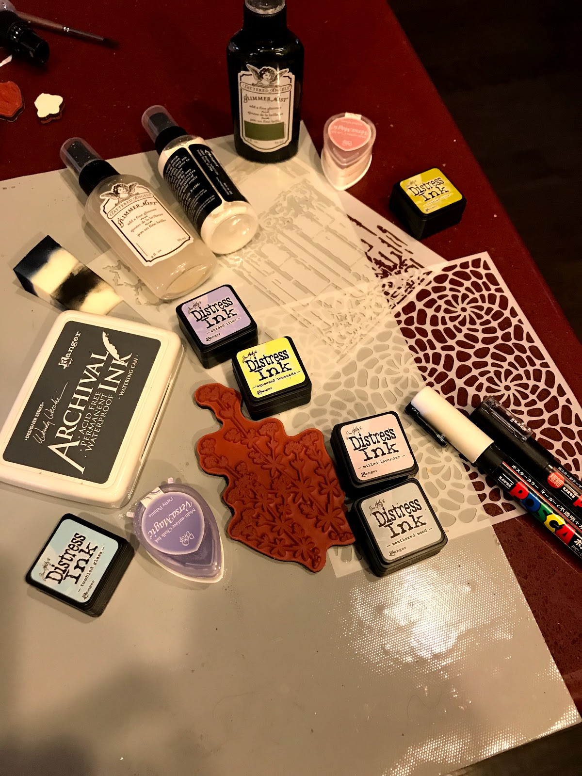
For the first card, I stamped the cup in both gray and brown archival inks and the sentiment in brown. For color inspiration, I decided I wanted to incorporate the washi I included on the card. So, the color scheme is cool blue, yellow, cream, brown and a soft orange. Using my Prismacolor pencils, I tried mirroring the white flowers and used the blue for the leaves and cup top. I added the washi tape and used a Gina K die to cut the paper, and coordinating colored patterned papers. I added coordinating twine, a coffee cup paper clip and enamel dots. I also cut out raised shiny beans from a patterned paper I picked up in a junkie kit.


For the second card, I started by using an embossing folder I picked up in a discount store. I spritzed water on the paper before running it though my Big Shot. I then ran both pink and red inks over the raised areas and diluted the white background by adding a little Antique Linen color in the depressions (I did this by adding color to the folder and repressing the paper.) I then stamped the image on watercolor paper in red and brown archival inks. I stamped the sentiment in red. I used tube paints and distress inks to add color to the image. I then added paint to the background. After this I pulled out a Gina K. stencil I had also picked up on sale and added red and brown marks to the background and red marks to the sentiment. Once dried, I added a Heidi Swap metallic white paste over the top of the same design, adds a cool luster in spots. I added some Spectrum Noir Glitter ink to the kitty. I then took coordinating patterned paper and used a Tim Holtz die cut on it. I used a combo of Gina K and Memory Box dies in this card. I backed that and the sentiment with burlap patterned paper to tie in with the kitty! I finished off the card with gold and red ribbon, glittery gold enamel dots and a gold butterfly. What can I say...I love texture!


Hope these cards and the others shared on the following blogs help to stimulate your creative ideas (like I find when I hop). Remember, if you wish to participate in the giveaways, be sure to comment on every blog entry in this Hop. We, all, on the Friends of Unity design team, are always interested in your feedback! That’s why we use our own stash to offer giveaways.

We are NOT sponsored by Unity Stamp Co., but they approve our hop. We are huge fans of the company, their products, the owners and staff, and the Unity Show and Tell community, which is why this Hop was started. Just wanted to share our theme based designs and some of our favorite stamps.

Friend of Unity blog hop:
you are here —> Joyce Verdon
Next up —> Dawn Fields

Thanks for stopping by! Till next time, happy crafting!