Wednesday, February 28, 2018

Hummingbird Stamp in a Stencil Card

UPDATED: see below!

This morning, a card challenge tweaked my interest, stamping within a stencil. Since I’ve been on this kick of trying out stencils, I decided to participate in this challenge with another experimental card. I used stamps from a variety of Unity KOTM’s, specifically, May 2017, February 2013 and June 2017. I tried a variety of stencils before I selected the one shown in the card. I discovered you really needed to have a lot of open space in the stencil to get a clear image. I felt that it would be better to color and stamp on a soft surface, so I put magazines under the paper. I also just used my fingers to stamp; later I’ll try using a regular block.

To start, I pulled Distress inks out and placed the stencil offset on the paper. I colored the image darker to lighter from top left side to bottom right side. I then pulled Memento inks out, knowing they stay wet longer. I colored the butterfly using multiple inks and just placed the stamp on the paper and used my fingers to impress the image. I did the same with the flowers, although I ended up stamping over the flowers at the end. They were just too delicate to grasp the essence of the images through the stencil.

Once done I spritzed the image with water and distress inks. I used my Misti to stamp the sentiment. I found paper to back the image and pulled the card together with twine, a metal bird and sticky sparkles. 

Hope you enjoy my experiment and if you have suggestions for improvement, please pass along!

UPDATE: only change, this time I used a block, still keeping the magazines underneath. I don’t think the coverage really changed much. Also, I bypassed spritzing with water or ink drops, which I like better. This stencil is a TCW stencil btw!


Monday, February 26, 2018

Tattered Angel Lace Flower Card

Experimenting again today on the flowers from Unity’s KOTM from September 2017. Areas explored 1) get more comfortable with the Tattered Angel Glimmer Mists, 2) create simpler cards 3) stamping a folder side, 4) reverse stamping a stencil and 5) adding a pattern to a large stamp.

First I began by taping off a piece of Canson Bristol paper on a craft mat. I spritzed the Tattered Angel Mist over it, wiped up the excess and sprayed it again. I dried that paper and then took an embossing folder and stamped that onto the paper using distress ink. Although it showed somewhat it was very light. I then took the stencil and used a brayer to apply Memento Rhubarb to it. I laid the stencil over the paper, covered it with wax paper and used the brayer again. You can see a little more pattern in the paper now, but no pattern is distinguishable. I think the glimmer mist is somewhat resistant to ink and is dark colored. Next time, I might only use distress or oxide inks or much darker colors. But I love the shimmer the mist gives!

I used a Misti to stamp the flower and sentiment on the card. The sentiment came from the Radiate the World kit. Now it was time to create the flowers. I took a Brutus Monroe Lace Background stamp and covered it with Distress Fired Brick ink using a watercolor brush. I did this twice sponging up excess ink with a paper towel. I then place a sheet of white paper over the stamp and used my hands to help transfer the ink. This worked well as I didn’t want a very dark image. I then used the Memento ink to stamp the flowers. I used distress inks to add shadows to the flowers, fussy cut them out and added them and the patterned paper to the card.

To finish the card I added patterned paper tags, sparkly rose gold ribbon and sticky sparkles. Major lesson learned here - stamp the design first on scrap paper (as I would have changed the length of the stem if I knew how it was going to turn out), CAS (Clean and Simple) cards need heavier cardstock, be more careful of paint splotches as it’s very hard to keep the card clean, and I have to figure out a way to clean my hands from ink, suggestions welcome on this one! I think the card turned out okay, but I’m going to continue experimenting until I get these techniques down.

Thanks for visiting and have a great day!


Sunday, February 25, 2018

Bird World Card

Made another Prismacolor pencil colored card today. This time I used Radiate the World Unity kit. I also used Kaisercraft’s Rose Avenue paper pad again which I think works great for more nature related colors. I pulled out some ephemera with matching color and that also give me ideas for the card. Finding bird ephemera, I decided instead of focusing attention on the flowers, to focus more on birds and the bird at the top of the globe. This card may end up going to my birder cousin!

So, to start, I took an ephemera card with a bird and used an embossing folder on it that I had just picked up with a post card image, cut it down in size and distressed it. I also picked out a piece of Tim Holtz vellum that had flowers and a bird on it and affixed it to a piece of paper from the pad and cut it down. I decided they’d hold down the corners of the card. I used these, the papers and other ephemera to help select pencil colors.

Once the image was colored, I then went back to designing the card. I found a washi tape that would also work with papers. I decided I wanted a non-traditional background for the image, including a circle imitating the world. I also found matching map paper from another pad that I liked. I decided to stamp the sentiment on the circle and place that on one side and the map paper on the other. I used a new earth toned fancy string I bought at Tuesday AM to wrap the image.  Because this card size was 5x7, and the pad is 6x6, I extended the size of the background by using the postage stamp piece and a blue ephemera. I distressed all the ephemera. I then adhered all the pieces onto the card. I added a chipboard bird I colored with chalk writers and a white pen and called the card done.

 I like how all the components relate and I think the colors ended up blending well. Hope you like this one and have another great day!


Saturday, February 24, 2018

Another Build the Life Card

I love Unity’s Build the Life stamp kit and decided to make a second card with the stamps today. This version was fairly simple to create. I decided to use the soft pink patterned scrap paper as the back focus. Using Memento’s Paris Dusk ink, I stamped the image and clear embossed it. I used a postage die on the image and backed it with navy paper. I jazzed it up with rick rack ribbon. I also ended up coloring the butterfly with a combo wash of Brea Reese Pink Glitter ink and Tattered Angel Pearl Glimmer Mist. I also used Unity’s Hello Beautiful corner stamp to decorate the corners with Colorbox’s Silver ink.

For the sentiment backing, I used a white tag. I stamped the script from the Hug kit in Navy and the net stamp in silver on the tag. I used the navy ink and stamped the sentiment onto the pink diamond paper. I backed that with a navy tag die cut using a postage die. I added colored paper and silver sticky strips to decorate the sentiment frame. I also threaded white thread and more navy ribbon through the tag and decorated with a metal clock and a strip of pink crystal leaves.

The card was pulled together first with a navy foundation, the diamond paper and a silver doily. Then the image and sentiment components were added. The card was finished off with pink Nuvo drops and clear crystal dots.

I really like the navy, pink and silver combo. Hope you like this card. Have a great day!


Build the Life Card

This card was inspired by the fact I purchased 2 of Unity’s Build the Life kit, somehow...just not sure how that could possibly happen (eye roll)! So I posted it in a swap group last night. Thinking about the kit, I kept thinking how much I love it, but haven’t used it yet. I was saving it, which seemed silly. So, today, I decided to try making a card showcasing the large background stamp. I’d watched a video lately demonstrating using multiple color inks on the same stamp, so I decided to try that. Also, I’d watched some videos recently using stencils and also applying ink with reverse stamping. I decided to make a make a background with this method using the same inks, plus an oxide. So, here’s the details...

I first gathered 4 Memento inks (2 pinks, a red and green), inked up the stamp with all 4, and stamped on scrap paper. I was pleased with the results. Taking that paper I matched the pink colors to an Echo Park Be Mine paper pack (pink and grey). I ended up stamping the stamp on a plain paper from the pack. I then used that same paper to create the background. I took a Hero Arts stencil and some cosmetic sponges and sponged the colors through the stencil. Deciding I needed to add some grey, I took my craft mat, stamped Black Soot Oxide on the mat, spritzed it with water, and laid the stencil down on the mat trying to pick up ink on the solid parts. I then overlaid the inked stencil on the already inked paper aligning the feather shapes and smoothing the stencil over the paper with my hands. Again, I liked how it turned out, but I think next time, I’ll try to leave less white space.

To add a bottom border, I used one of the pink inks and a lace stamp from the Unity kit, Straight Laced. I inked it, applying a little of the green to the edge of the stamp and stamped on the same paper.

To put the base card together, I used a cream card base, a grey paper and the lace border. I decided I wanted to use a green ribbon and washi tape on the side. Noticing a pale green color in the ribbon I used Twisted Citron on the edges of all the papers to coordinate colors.

I backed the image with a striped paper from the pack and the grey paper, using a die cut on the striped and fancy corner punch on the grey. I rounded the corner of the image. Wanting a little more definition of the butterfly in the stamp, I used a grey pen the the image. I fussy cut the word You and the hand from the paper pack and applied them to the image frame. I also added a sticky butterfly from the pack and some crystals. 

Next the sentiment, which, I stamped using the green ink on a lined paper from the pack, and outlined the letters with a grey pen. I fussy cut the sentiment and added a fussy cut grey paper as backing.

I pulled the card together with green sequins and a metal butterfly. It’s a pretty busy card, but I think I like how it turned out given the use of 2 new techniques. I may try using the stamp again soon with an all black image, which I think will be pretty sharp!

Hope you enjoyed reading about this card! Have a great day and enjoy crafting!


Thursday, February 22, 2018

Unity Mushroom Card

Last night I choose a couple stamps, paper and ink I thought would be a good fit. One of them, the mushrooms from Unity’s KOTM, I paired with Rose Avenue paper from Kaisercraft. I also took out a Tim Holtz Vellum paper pad I bought on sale over the holidays. I wanted to see if I could use a snippet from the pad. Since these were mushrooms I wanted to use a combo of greys, tan/browns, yellows and blues. I found some yellow flowers and thought I would use the same greens on the grass blades in the image. I stamped the image and called it a night! (Just an FYI, I am challenged by blogger on an IPad so sometimes the pictures appear out of order. See below pics for more details!)


So to begin, I pulled all the papers I had gathered and started selecting pencil colors. I kept the colors on the cool side with the yellow orange providing a nice contrast. I colored the image and then added blue to the background with the lightest at the top and darkest at the bottom.

Once the image was completed I started adhering paper to the card. There were some changes from my original design as I lost a paper in my mess, but I ended up selecting a sheet of pale blue doors that I ended up liking. I had a piece of blue and white cross hatch Bella Blvd scrap paper that I backed the vellum with that to me gives the impression of a gate behind the flowers. I die cut the mushroom image and backed it with a Kaisercraft green wood grain paper and a JoAnn cream colored paper. I then pulled the sentiment from the kit and stamped that on the same cream paper. I would back that with another paper from Kaisercraft once I used a tag die cut that I ended up modifying to fit the card.

To complete the card I pulled some Kaisercraft and Tim Holtz ephemera and added Nuvo drops. I’m pretty happy with the look of the vellum as I was concerned whether I could ever use it! Hope this card tickles your fancy, so to speak! Have a great day and come back and visit!


Wednesday, February 21, 2018

Easy No Regrets Card

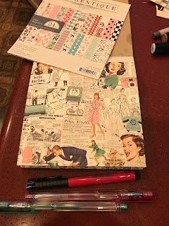
I have to say I love and identify with the sentiment on this card! That and the image are from from Unity’s No Regrets kit. This card was “easy peasy” to make too! Since I’ve spent the last 3 days making ATC cards, I wanted to move slowly back into cardmaking. Recently, I stopped in at Hobby Lobby to check out the sales, and while they didn’t have the huge discount selections others found in theirs, I did happen upon a 50% off paper pad sale. So, I picked up a small Paper Studios Kirby Teesdale Studio pad. Very colorful with vintage vibe images.

To put the card together, I just stamped the image onto the paper I selected, trimmed it down, fussy cut it out on one side. I added another sheet of paper behind it as these papers are pretty flimsy and I wanted this sheet to be raised up with foam backing. I pulled 2 other papers out, one for the sentiment, and the other, I cut out the dress form. I also fussy cut out 2 butterflies. I had another sheet of paper (I’m not sure where I got it) that I used as the base. I pieced the other 2 pages on, added the sentiment, butterflies and enamel dots. I also fussy cut out of another paper pack the Eiffel Tower. I added a few more random embellishments and this card was done! I love how colorful it turned out! And it was a nice break from harder cards! Hope you enjoy it and have a great day!


Sunday, February 18, 2018

Experimental Watercolor Green Card

In preparation for participating in an ATC (Artist Trading Card) Swap, I wanted to experiment today with watercolor backgrounds. So, I grabbed a Melissa Francis watercolor paper (very lightweight but absorbs color well). I pulled out my oxides and distress inks and craft mat. I wanted to match a Graphic 45 paper that I want to use as the background. So I stamped colors onto the mat, spritzed them and started painting. I found a Bo Bunny leaf stencil and pulled out my small Library Green archival ink and started stamping through the stencil to build a leaf type background. Then I grabbed a wet wipe and started lifting color through the stencil. I liked that combo look a lot - light and dark leaves. I dried that and then pulled out a Unity freebie honeycomb stamp and the houndstooth texture stamp from the new Unity kit I was using today, YOU Deserve. I added more texture and then called it good.

Then it was time to turn to flowers. Now this card will be entered into the Green Color challenge so I decided I would color the flowers green and add some green toned down shamrocks from the February 2018 KOTM. I grabbed another Melissa Francis paper and stamped several images on it and I also stamped the images on the painted paper. I colored the shamrocks with a bland green. The flowers, however, were colored with my brand new Brea Reese glitter inks (I mixed yellow and blue drops to get the light green color I wanted). After I completed painting, I fussy cut everything out and adhered to my paper sometimes raised with foam strips. Because the background is so dark, I decided to create an art journal look by outlining the flowers and leaves. I also stamped out the sentiment from this kit and a sentiment from the So Very Grateful kit, fussy cut those, distressed the edges and treated them the same as the flowers.

I pulled the card together, framed the watercolor paper with white cardstock , added a dusky gold paper behind the watercolor paper and added sequins. I really had fun playing with my new inks and creating an interesting background paper using a stencil and texture stamps. This card certainly won’t win any prizes but I like the essential look and look forward to repeating some of the techniques. Thanks for visiting and have a great day!


Thursday, February 15, 2018

Unity Green Color Challenge Card

Loved moving into yet another color realm with shades of green on this card! I was inspired by an ATC (Artist Trading Card) video which started the card with a pretty wet wash of watercolor. I decided I wanted to create a varied green watercolor paper with a white edge like the video!  In order to get varied colors I decided to use my Cotman watercolor half pan set which includes 4 greens. I also added a few yellow hues and a blue to enhance the variation in colors. I wet washed the watercolor paper and started adding colors. Once done I dried the paper using a hairdryer (yes, it works) ensuring to dry both from the back and front to maintain a flat shape. Like the video, I created my own edging with 2 lines using a Tombow dark green pen. Love how it turned out!

Time to turn to patterned paper to complement the watercolor paper. I also decided I wanted to add a flowered stamped image to the paper. Found a good background paper in an Authentique pad and a glossy accented green sheet I bought from Love from Lizi. I then looked to my archival inks to see what I could use on the watercolor paper, tested out a few on scrap paper and finally chose Library Green. I decided I probably needed to clear emboss the green ink to darken it.  I then looked at my Unity kits for flowers and decided to create my own bouquet using several kits.

I grabbed the Single Flower Miracle kit, the Wishing You Joy kit and the flower from the So Very Grateful kit. Wanting to make sure the bouquet would fit and not wanting to ruin my watercolor paper, I inked out a sample bouquet first on scrap paper and decided I liked the look. So, turning to my Misti, I carefully stamped and embossed each image at a time.  I had to mask off the bottom of the paper so I wouldn’t destroy the edge. I also turned around a few stamps to extend the stems to the edge. I was finally happy with that result.

Now the card challenge also promoted glamming up the cards with sparkles and glitter! How fun! So, I then pulled out 2 different shades of green glitter and a white sparkly glitter. Pulling out my coffee filters and glitter glue I decided to use all 3 colors in combinations on the flowers. I proceeded to do that 1 glitter at a time and added dots of glitter around the bouquet. I probably could have been more precise in the use of glitter, but I felt the paper and images wouldn’t be enhanced with precision.

Turning next to the sentiment, I stamped, embossed and die cut the sentiment on plain green paper. I then turned to assembling the card. I found a solid green paper to back the black patterned paper and mirrored white, green, and black backing on the sentiment. I pulled all the components together using Scotch running tape and foam tape. The card was completed by attaching a bow, sequins and green pearl dots.

It certainly is a vibrant sparkly card; was fun to create and allowed me to use both a new technique and one I use infrequently. Hope you enjoy this card, thanks for reading my blog and till next time... happy crafting!


Wednesday, February 14, 2018

Vintage Pink Kindness Card

Today, I used Unity’s There Are Always Flowers image and colored the image with Prismacolors pencils. I had stamped the image on a grey piece of scrapbook paper. Masking off the flowers, I also used Vibes background stamp on the same paper. I fussy cut the paper and found ephemera I wanted to use with this stamped paper. Then I found another beautiful piece of scrap paper I received in a Love From Lizi kit with sparkly roses in it. I also had a sheet of labels that I wanted to use and found a sentiment in Unity’s Sending Kindness kit that would fit. I stamped that on separate paper and added a few embellishments stamps on each side. I then used a Tim Holtz label die, colored the edges of the sentiment and placed it on the fussy cut label.

The card was assembled using ephemera, various flowers (including one put together with a brad), a homemade paper heart that I added glass dots to, Liquid Pearls, glass dots, ribbons, twine and a metal flower.

I think it finally came together okay, but there was a lot of rework done on it. An analogy I’ve heard before, if I made sausage and you enjoyed the taste, don’t ask how it was made. You really don’t want to know! Have a Happy Valentine’s Day!


Tuesday, February 13, 2018

Library Card

Today, I opted for a very simple quick card. I bought Unity’s Struggle is Part of It stamp kit a while ago and at Christmas time picked up Brutus Monroe’s Library Background on sale. I thought they would  pair great together. So, I stamped the image on a paper from Prima’s Life Time paper pad and stamped the sentiment on a tag in the paper pad and fussy cut that out. I distressed both papers. I colored the books with Prismacolor pencils and used pens on the word “Cherished” from the tag. I stamped the background stamp on Kraft paper. Because I wanted to add an accent color, I pulled some strips from a Heartfelt Creations paper pad that to me match the subject well. I pulled the card together and added a metal key, a button and sequins. 


Thanks for visiting and have a great day!

Monday, February 12, 2018

First Distress Card

Okay, wanted to veer into a different card type this afternoon after I received my new Unity kits in the mail, yeah! One of those kits, Who You Really Are, has a beautiful sentiment and butterfly I wanted to use. I guess I can relate to this kit since I’m retired now and going in an entirely new direction. I also want to move into mixed media and journaling next month and to start I need to get more comfortable playing with distress inks.

So, I got out a sheet of Canson Montval paper, some Distress and Oxide inks, and a water spritzer. I proceeded to apply color to the table, spritzed it and started smooshing the card into it. After I was happy with the colors, I then pulled out a couple background stamps from the Vibes kit (also new) and started stamping with an Oxide ink. I dried the paper and then stamped the butterfly and sentiment on the paper. I also pulled out a smaller butterfly from the August 2017 KOTM and stamped that, all with black archival ink.

I then started looking for background paper and I ended up loving the yellow/pink mandala style paper. I offset that and added plain yellow paper. I knew that I needed to restamp the sentiment as it was too hard to read on the painted paper. So I used yellow paper for the sentiment and added a paperclip on the end. I used a Spectrum Noir Glitter Pen on all the butterflies. I pulled the card together by adding twine, sequins and a metal butterfly sticker (Tuesday Morning find).

I was rather pleased with the colors in the card, but I’ll be looking at Facebook to gauge how well the card works. This was a great learning experience and I’ll be trying more of this type of card. Thanks for stopping by and have a great day!


Authentique Fabulous Girl

Played around today with an Authentique paper pad, Fabulous. I decided the girl from Unity’s 5/17 Kit of the Month (KOTM) was a perfect fit for the pad, especially with the hair band. I also stamped the phone and a sentiment from the 12/17 KOTM.

This card was relatively easy to make. I stamped the image on one of the pages next to the Stay Sassy saying. I also stamped it on a patterned paper and a blank cream sheet. I colored the girl using a combo of Copic and Spectrum Noir markers. I fussy cut glasses from pad and also drew a mouth on the girl. I fussy cut and paper pieced clothes and the hair band onto the girl and fussy cut that image out. I added the completed image to the paper. I also cut out the Hello Darling image from the pad and added that to the top left of the girl. I backed that with red paper.

To create the card, I used a 6x6 card base and added patterned paper, red dotted paper stripes, the image and phone. I colored a doily using Festive Berries Distress Ink and added that to the bottom. I dovetailed the sentiment tag and combined it with another tag using a red brad. The card was finished with some red and blue green dots.

Hope you enjoy this fun card! Thanks for stopping by and have a great day!


Saturday, February 10, 2018

Vintage Butterfly Card

I went back to my comfort zone today! In an effort to clean my craft room, I found a paper pad I had forgotten about, Prima’s Frank Garcia Wild and Free. Frank Garcia’s paper is really nice for shabby chic card making. It’s nice and thick, full of potential ephemera objects that can just be fussy cut and beautiful colors and images. And I just noticed he has a new one out, Love Story, that, oh no, also looks beautiful! Prima’s flowers are color coordinated with these pads. I digress, again, just like I did from cleaning my craft room ...

So, I immediately removed the first page as it was perfect for starting a card. Someone yesterday gave me such a nice complement (who, I think, is a very skilled crafter) that I was driven to use the sentiment from the Progress Not Perfection kit. I noticed it had a butterfly in it and so does the paper. So I stamped it on a piece of paper I had torn for the bottom left side of the card, that was plain in the middle and ornamented on the side. I used another piece of paper for the top and fussy cut some butterflies. I distressed all edges. When I turned the paper over I saw it had a card image stamped on it and I fussy cut that. It’s nice and bright and could be used as a background for whatever image I decided to add.

Now, given the butterfly idea, I started looking through my Unity collection for butterflies. I found a pretty butterfly that I’ve only used so far for plain envelope art and thought I’d use that. It’s from the May 2017 Kit of the Month. I stamped that on another piece of the same paper and fussy cut it. I colored the large flowers very softly using some old colored pens. I also used green and white pencils to add shadows and light, which all ended up adding color to the image. I then looked to crystals to embellish the butterfly.

Putting the card together took no time at all. I noticed the bottom left side needed more color, so I used my pens again to add color there. I also noticed the Ace card was too bright so I added a fussy cut feather and another butterfly. A partial doily, more crystals, pearls, a creamy silk ribbon, and a pink crystal flower finished the card and then I was done. Hope you enjoy this simple vintage card. I really like how it turned out!


Friday, February 9, 2018

Unie Card Challenge Pink/Orange

Oh boy, this card challenge really challenged me and it shows!  “Rules” were:
White card base
Any Unity Stamp Set
Black Ink 
1 Orange Piece of Paper
1 Pink Piece of Paper
1 Heart
1 Paperclip
1 Button
Colored Pencils
Now, the rules are somewhat flexible, and, after all, it will be a random drawing for the wonderful prize of an honored fuzzy Altoid piece of candy! Yes, one of the more serious Unity fan crafters offered up this wonderful challenge yesterday! The lengthy post had me laughing for a good hour! The Unity Show and Tell Facebook crowd are a really positive funny bunch to hang with! Anyway, on to this serious challenge!

Okay, I really wanted to stamp out the pears in the Sending Kindness kit. I then pondered how I could pull in the pink and orange themes and found there is a Red Anjou Pear, who knew? Well, then, I proceeded to stamp the pears in Memento Black Tuxedo ink and pulled out the Prismacolors to color it (of course, including pink and orange). After completing the pears and leaves, wanting a non-white background, I colored a pencil scratch like background.

After that, I had to contemplate what next and here’s where my inexperience in cardmaking showed up. I tried a few different options and colors and finally came up with another wonky design! By that I mean I doubt a sketch could be found anywhere for what I pulled together (probably for a very good reason). I wanted to try using an embossing folder as I am a huge fan of patterned paper and I was stumped how to offset the details in the image with plain paper. So, tried a coupled using orange paper and decided the weave pattern sort of matches the pencil scratch background (and after I was done and taking photos, I realized I could have created the same weave behind the pears). I die cut a round circle for the image to show through. I then edged the paper using a leaf border punch on one side and a zig zag border die on the other. I then pulled some pink paper and used the same zig zag die on one side.

Stamped a pretty sentiment from the same kit and spent way too much time fussing with using dies to create the right size tag for the sentiment and the card. There must be an easier way!!! Then, after searching and trying several options, to balance the card, I selected an orange paperclip, a colored pink/copper heart and pink button with orange twine.

Overall, I think it turned out... wait for it... just... okay. 😕 But, at least it’ll be entered now, and, after all, every card is a learning experience for me. If you have suggestions for me, please comment below! Always interested in advice! Thanks and have a great day!


Monday, February 5, 2018

Black and White Feather Card

Here’s another Unity Black and White Valentine card for my husband! I used the first card to play with all the background stamps. This time I wanted to make something special for my husband and I was urged by someone on the Unity blog to “get to it” and watercolor a card after admiring hers. So, looking through my stash I found that the Beautiful is Never Perfect kit has a fun image to color and has beautiful sentiments. I stamped the feather on to Canson Montval watercolor paper and stamped a sentiment below it. I then turned to my watercolors and set up 3 tones of black (grey). In my watercolor class, I was taught to make my own black by mixing pure Alizarin Crimson and Phthalo Green until you achieve black and to always have a ready made mixture on hand. I used that mix. I keep the colors in a plastic pill case and, yes, I do use a ceramic egg holder to hold my mixes while painting...hey, it works! More on that some other time... I used the 3 tones to create shadows and texture and then added a shadow underneath the feather - not perfect, but hey, it’s a card!

Once painted, I wanted to add another sentiment and found it in the Love is Grand kit. I stamped that onto the paper, and, here’s where I made a boo boo! The edge of the stamp left a mark... as sometimes happens (I hate when that happens, don’t you?). So, then I went searching for options to cover that up. In the meantime, I also started looking for a background paper that would frame the image. Found an Authentique paper and used that and black and white card stock to mount everything. Still was searching for solutions to my boo boo. Thought about some stickers and rejected those. Finally decided on black ribbon, but I didn’t want a bow! So, started looking for brads and finally found a Bo Bunny one that I thought was elegant. (Okay, the “started looking” took a 1/2 hour as I’m still trying to organize my stuff in some way that makes sense!) To complete the card, I added the ribbon and black dots.


I like how this one turned out and hope you do too! Till next time, have a great day!

Sunday, February 4, 2018

Damn Girl Selfie Card

To change things up this afternoon, I wanted to veer away from the shabby chic type vintage card to a more Art Deco-like style. I had recently picked up a film strip washi tape and wanted to use it. I wanted to a add another washi tape with color and found one that I thought had an abstract film strip feel. I envisioned Unity’s brand new Damn Girl stamp kit was perfect for this type of card. Hope you enjoy reading about it!

I started by stamping the image on white card stock and distressed it with antique linen and black soot. I had recently bought, on sale, Bo Bunny’s Selfie die set. I looked around my paper stock to find a greenish blue paper that would complement the washi tape. I die cut that and the image. I found a grainy paper I thought could be the foundation and after cutting it to fit the card, I decided to offset it. I then used the washi tape to fill the white spaces and provide edging for the card. I then turned to stamping out the sentiment. I wanted the paper to be lined. Used several different papers till I found the one I wanted to use. I also die cut a film strip that is used to back the sentiment, and added washi tape. I had colored the hat and face on the image, so I used the same pencil to fill in a little of the flowers on the paper. Tried several colors for the heart hole in the picture frame and finally settled on shiny gold complementing the washi tape. Finally added embellishments and called the card done! 

This card was a challenge for me. I hope I did the style justice and that you enjoyed it. Thanks and come back and visit in the future!


Prima Rossi Belle Card

I finally opened up a card embellishment kit I bought on Etsy last year (I’m sorry, but I couldn’t find the vendor name). However, the kit contained 4 6x6 papers, several flowers, butterflies, card tags, doilies, home made die cuts, sequins, journal cards and a few chipboard pieces, all coordinated to Prima’s Rossi Belle paper. This paper pad may be discontinued, but I really liked the look and colors of the paper. I decided my brand new Unity kit, Beauty every Little Thing, would be perfect to use with this kit.

I decided I would stamp the birdcage from the kit on the plainest piece of paper I had. Once I had that stamped I remembered I received a little butterfly stamp in a grab bag that would work well on the side of the cage. After stamping that, I then tore the paper, created a 5 x 7 white card base and started designing the vintage look I wanted using torn paper pieces. Once that was done, I distressed many of  the pieces and then looked at the journal cards, doilies and tags to see which would make a good frame for the birdcage and the love die cut. I then affixed all the pieces to the card base and started playing with the flowers and butterflies. I also wanted to use another Unity stamp for a sentiment. I decided the treasure and love me stamps from the We Treasure You kit would lend a perfect vintage feel to the card. Using only the words treasure and love I stamped those on leftover paper scraps and backed treasure with lace to emphasize it and provide a small lace accent. To finish the card I added ribbon, Nuvo drops and sticky dots.

I love how this card turned out as: 1) I love birdcages, 2) I love vintage cards and 3) I love brown stripes (check out my Henry Bendel bag behind the card!). Hope you like this one as much as I do. Also, I recommend trying a card

embellishment kit like this sometime. It was reasonably priced and cheaper than buying a full pad and all the embellishments separately! Take care and have a great day!

Friday, February 2, 2018

No Color Hug Valentine

In response to Unity’s No Color Valentine Challenge, my mind, as usual, turned immediately to creating a vintage card. I had been longing to try out my Unity background stamps, so I grabbed a piece of white paper, grabbed a bunch of sets and started stamping. I ended up loving the look and added some words, Smile, Hug and Kiss. The kits used to create this paper were Unity’s Hug, Happy and Cherish Your Dreams. I die cut the paper and backed it with black paper. Given the size of the background I created and that I really liked it, I decided to use it as part of a 5.5 x 8.5” sized Valentine card for my husband. 

I found Graphic 45 paper that would make a good foundation, attached black lace to the side, backed that with black paper and mounted it onto the white card base. I then found white lace and fixed that to my homemade paper and mounted that onto the card. Now I needed to find the right sentiment and focus image. I tried several options before I finally settled on using the heart/butterfly stamp from the July 2017 Kit of the Month. I knew I wanted it to be an almost solid simple black image, vintage inspired and Valentine related and it fit perfectly. I fussy cut the heart image. I wanted to use white ribbon and, with the heart focus, a Melissa Francis key, so I created an embellishment combining the two and added a small string of pearls I received as a freebie from Unity. I then looked for a sentiment I could turn into a heart and found that the sentiment from Dec 2017 Kit of the Month would be a good fit across the board. I had already pulled out the Bo Bunny Fanciful Dies set to potentially use as embellishments. I decided to see if I could create a heart frame with scrolls and fussy cut black scrolls to do just that. I mounted all components and completed the card by adding another embellishment above the butterfly heart.

Now that the card is completed, I’m not sure if it’s too busy (a hot mess) or if it works well. I’ll let you decide! Thanks for reading my blog, hope you’ve received some new ideas from it and that you have a great day!