Monday, November 26, 2018

Christmas Ornament Cards

As you may know from another post, I periodically pick up craft magazines of which I still have a full stack. I have found some of the papers to be wonderful. The beautiful patterned paper that inspired me to create these 4 cards came from a Cardmaking and Papercrafter magazine, probably from a year ago. Looks like it was Kaisercraft Christmas Wishes. 


Creating these cards was tricky as the ornament paper and blue fir were on opposite sides of the same sheet (and I only had 1 sheet). The sheet was the size generally used in England, slightly different measurements from ours. So before I made these cards I carefully measured and cut pieces that allowed me to use every bit of the paper and both sides (I really wanted the fir tree strip to be horizontal!). I cut circles out of the gilded gold paper. I also used a glitter paper that I thought matched well. I backed all with Kraft paper and used a shiny cream card and envelope kit.


I stamped the Unity image from the 9/15 KOTM onto watercolor paper. I used coffee archival ink for the whole stamp then went over the words with a dark brown to make sure they’d stand out. I then used Distress inks and white and gold Perfect Pearls to add matching colors and a sheen to each of the ornaments. The base card is the same, but I embellished differently and made a shaker out of one. I love how these turned because of the colors and paper. Hope you do too! Thanks for stopping by!


Sunday, November 25, 2018

November Unity ATC’s

So, keeping to the holiday spirit, and, since I love autumn, I made more ATCs with fall colors and Thanksgiving in mind. I’m very thankful for my ATC swap group and hope these ATCs send that message to them! I’m always inspired by their creativity!

The first ATC was relatively easy to create. I stamped the image from unity’s 9/10 KOTM onto watercolor papers cut into ATC size. The sentiment came from another Unity Kit. I watercolored the image using my Kuretake watercolors and added background grasses. I added fall washi tape and sequins and called this card set done.


I wanted to try (play with) my new Primary Elements pigment powder in the second set. I had also picked up some glitter I wanted to try and 2 spritzers from Tuesday morning recently. Not exactly sure what medium to try mixing the pigment with I decided to use 2 different types, a glazing medium from Liquitex and a Vicki Boutin gel medium. I was thinking the gel medium would help hold the glitter. I think to add more color I might have lightly added an orange Distress ink as well.


I used 3 methods on the Ranger Mixed Media paper. First I added water, pigment and medium to each spritzer and shook it to mix. I then sprayed each one and sprayed the result with plain water to get the colors to flow around. I then tried just adding pigment directly to wet paper and spraying. I liked all the colors, of course, and the effects made with blending and leaving clumps of pigment. Finally before the paper could completely dry, I added glitter and dried the paper from underneath,  I had originally planned to add background stamps but the paper turned out so pretty, I left it as is. Since I had leftover spray contents, I made another paper to use another time. I cut the paper down to ATC size.

I stamped the sentiment image from the 9/14 KOTM, onto Kraft paper. I then colored the image with Prismacolor pencils and added Spectrum Noir glitter pens to the leaves and acorns. I fussy cut the image. I found a patterned paper scrap I could use with a Sissix die I picked up at Tuesday morning to create leaves and a border. I put everything together including 3 strips of color coordinating raffia and called these done.


Hope you enjoyed these ATC’s and if you have any recommendations or ideas for using pigments, let me know! Thanks for stopping by and happy crafting.

Cozy Christmas Card

Decided to try my hand at the girl in Unity’s 10/17 KOTM. I remembered I picked up My Mind’s Eye Cozy Christmas pad last year on sale. I used 2 sheets of that paper along with another patterned paper as the base. I first started by stamping the girl on watercolor paper. I then colored her with my Kuretake Gansai Tambi watercolors. I also decided to add some glittery ink, so I added red Brea Reese to her coat and a gold glitter ink to her boots and gloves (a happy circumstance is it gave the black a shiny green tinge). I also used pens to delineate edges. I used pencils to color her face. I fussy cut her.

I die cut a circle with one of the papers and stamped her again and then adhered the painted image. I used a gel pen on the stars and dots surrounding her. I glued that to the paper I was matching everything to, used a postage die on that paper and then backed it with red paper. I added 2 ribbons and stamped the sentiment on another sheet. I added some embellishments to the sentiment, inked the edges and adhered that. 

To finish the card, I added the red backed base paper to the card, the image paper, shiny green pearls and red crystals. I think the card turned okay and pretty festive. Now on to posting about my November ATCs!

Monday, November 19, 2018

Shine Bright Girls Card

So I just had to use the paper that inspired my last card and decided these paper pieced girls, from Unity’s Shine Bright Girls Kit, would be a perfect complement! And, because, if I’m going to paper piece one wardrobe, might as well make 4 with all the odds and ends. So, I stamped the girls onto 3 pieces of patterned paper from the Amy Design Christmas Wishes paper pack (goes well with the other paper that came from a Tattered Lace magazine pack). I also added a bland red dotted paper from another pack that I thought would blend in. I also stamped the girls onto white cardstock.


I cut up all the pieces of clothing and, yes, my hand is a little achy today. I colored the heads of all the girls with Prismacolor pencils. I then played with my paper dolls till I got the combination of outfits I wanted. I then glued everything on and colored in the gloves with red pen did a little more with pencils. I fussy cut the girls out leaving off the embellishments around the girls. I liked the clean look so I didn’t bother stamping the girls on the winter scene. 


I die cut both the plain red and patterned paper and used more paper to back the winter scenes. I stamped a freebie sentiment in red archival on white and backed with leftover patterned paper. I added a wood like gray background. I then used red/white twine to make a sign and bow and added a variety of embellishments. I attached all to silver cards and called them done! I think these will make nice friend cards. 


Thanks for stopping by!

Saturday, November 17, 2018

Hello Little Birdie Card

When looking to see what Christmas card I would make today, I happened upon a paper design I received from a magazine a year ago and decided since I liked the colors and concept, to make my version. Since I wanted a more silver/white base I pulled out a Spectrum Noir Aqua watercolor paper (closest paper to white) and a bunch of distress inks. I also pulled out a blue and white Perfect Pearls. I stamped the colors I wanted for the background, added Perrfect Pearls powder, spritzed with water and dipped the paper in. Did this several times, drying in between. 


I then stamped the pine leaves, from Unity’s Winter Blessings Kit, using coordinating distress oxides,  layering several colors. I did this 3 times. I then stamped the red part of the bird, from Unity’s Hello Little Birdie Kit, and then the black parts with Archival inks. I took leftover paper and stamped the bird the same way and clear embossed it. I used primarily my Kuretake Gansai Tambi watercolors to color the bird. I then fussy cut it out.


I pulled out a silver card base and added coordinating patterned paper. I then die cut the watercolor paper using a Penny Black die and added the second bird using foam tape. I added silver ribbon and red and silver crystals and called the card done. 


I love how this one turned out and the unusual Holiday colors. Hope you do too! Thanks for visiting, and remember to follow me if you like my crafty learning journey! Till next time, have a great week and happy Thanksgiving!

Thursday, November 8, 2018

Card Inspired by Bo Bunny Paper

Had to do it! Inspired by Christmas in the Village paper, I created a Christmas border similar in colors and elements to the paper. I used the same Unity kit as last time, KOTM 9/15, and Tim Holtz holiday stencils. I also used primarily Distress inks, gold pen, red Art C wax paste, Yellow Prima Color Bloom spray, Brea Reese gold paste and a green Primary Element pigment powder.


To begin, I stamped 2 yellow Distress inks onto my Tim Holtz platform and sprayed both water and the Prima mist on top and placed watercolor paper onto the mat to pick up the yellow color. I did this till I had the color I wanted. I first stamped and embossed the sentiment using Gina K brown ink. Then I stamped the pine cone image in 3 spots using coffee archival ink and began painting it. Using stencils, in between painting color layers, I took the red paste and added some poinsettias. I took the gold paste, added green Primary Elements pigment to it and added leaves next to the pine cones. Once I finished painting, I took more Distress inks and a brush and added vines, leaves and berries to the paper. I ended up using all 3 stencils. I took Vintage Photo to add a little color to the edges. I backed this with brown paper.

I then found a patterned paper that complemented the colors and stamped the same pine cone image around the edges using the darker Gina K brown ink. I cut to size and added brown paper behind that sheet. To create the card, I used foam tape behind the new composition and added red and good enamel dots.


Here’s a pic showing original paper and last card.


 I had a lot of fun creating this, and as usual, didn’t practice creating this, so “it is as it is”, an original! Hope you like it! Till next time, happy crafting!

Wednesday, November 7, 2018

Bo Bunny Paper Card

After finding the Bo Bunny Christmas in the Village paper pad at Tuesday AM, I really wanted to make a card using it. This pad has a lot of non-traditional holiday colors in pretty papers. So, looking through the pad and my stamps I decided to try pairing the pine cones and sentiment from Unity’s 9/15 KOTM to a yellow pine cone paper. I also thought Kraft paper might look good.

So I stamped the image on Kraft with Coffee archival ink and stamped the sentiment using a darker brown Gina K ink. I colored the image using Prismacolor pencils trying to stay close in tones to the paper. I also added a red shadow to the sentiment. I played with dies to frame the image and used another green paper as the foundation. I added sticky green strips inside the frame and green ribbon to the corners. After adding sequins, I originally decided to stop there. But then I started thinking about creating a watercolor using these stamps and some others to mirror the paper, which would mean adding a snowflake, some berries, and maybe, flowers. At that point, I remembered I picked up a Penny Black die cut at a store closure that had berries in it and I could add those to my card. Tried it and liked it! I’ll share both for you to decide! (Though, I still may try doing the watercolor.)


Well, thanks for stopping by! Happy crafting!

Monday, November 5, 2018

Comfort and Joy Brutus Monroe Limited Edition 2017

Okay, I am late to the party! I admit it! I bought the box thinking it was a pretty set, but last year I used mostly ephemera on cards. Given I only started coloring stamps in September last year, I was still getting my feet wet at that time and I was intimidated when I received it. It’s definitely a change going to cling stamps from red rubber. But these are very detailed stamps and I’ve enjoyed inking up a few that I’m sharing today.

I decided to start with the pretty poinsettia stamp and going with a simple design. I pulled out watercolor paper, cut it down and stamped the image and sentiment using Gina K. Amalgam ink. I then pulled out tube watercolors and painted the image. When I was done, I added paint spatters. I found a soft plaid paper, Say Freeze, by Craft Smith, that I thought would complement the image. I backed both with the dark gray paper that came in the kit and added gold striped twine and red crystals and called this one done.


For the second card, that I created before my coffee this morning, say what?!?, I decided to use a holly stamp. I also wanted to pair it with a dark green DCWV paper, that, I thought of, but was too dark for the first card. I thought by adding a soft light complementary color background that pattern paper piece would work. I stamped the image in 2 spots using a green Colorbox ink and watercolored it and the background. It’s funny, I watched an Eric Lundgren painting video last night (which is probably why I needed to watercolor this am) where he used in a painting the watercolor paints that get the most negative press, like black and white inks. I didn’t do that here but he inspired me to go against my training and use pthalo green for leaves versus mixing more realistic greens with blue and yellow and red paints. Kinda fun to be different! Anyways, I added  green spatters and white Distress paint. I then lightly used a black pen on it. I stamped and clear embossed the sentiment 3x’s. I finished the card adding plain green background paper, funky striped sequins from the kit and red twine.


So pleased I’ve got a couple more Christmas cards completed and satisfied my watercoloring itch! I’m also happy I’ve started using this kit! Hope you enjoy these cards, and have a great day!

Saturday, November 3, 2018

Friends of Unity November Blog Hop

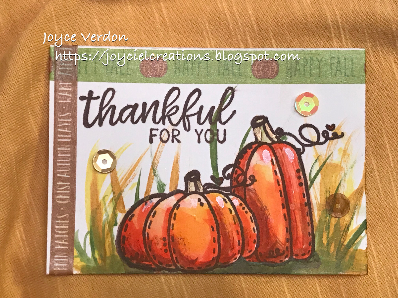
Welcome! Friends of Unity are back with another blog hop for November with a very different theme, Strength! This one is sure to bring a variety of stamp selections to the hop.

Every month several friends offer giveaways. To WIN leave comments on EACH blog in the hop AND check back on next month’s hop for the WINNERS from this month’s giveaways. Thanks for playing along with us!

I originally decided to use birdcage stamps this month. Had the best intentions, until I literally cooked a stamp, or rather roasted it along with my veggies (but that’s a whole other story). I’ll start with my birdcages and finish with the substitute.

It is in Herself She will Find the Strength She Needs -
On this first card, I used a tag stamp from The Garden Whatnot Collection Kit. I used a sentiment from the 12/17 SMAK kit. I also used several background stamps trying to replicate the tag, bird’s from the Vintage Era Background Kit and leaves from the 9/15 SMAK kit. I also used a Tim Holtz embossing folder which creates a vintage frame around the edges and a striped stencil. I created the background and tag paper, and applied stamps (some embossed). I then found matching papers in brown and peach and added sequins, metal bird, wooden birdcage, ribbons and a button.


You are Stronger Than You Think/You Are Not Alone -
I then used another stamp I picked up in a swap and later found out it was retired. (Oh well, so sorry, but it’s been a busy month with delivery of new grandchild.) I created another collage card using only patterned Prima and Paper Studio paper. I also used 3 different die sets (border, sentiment and flourishes), ephemera, enamel dots and sequins. I spent some time adding color to the stamped birdcage from the set called Enchanted using pens, paint and pencil. I also used the bird from that kit, a sentiment from Everything Stronger, a bird stamp from 11/14 KOTM and a flourish stamp from You Can Do It. I love patterned paper and collage cards give me the opportu to indulge myself.


Others are Fighting Battles We Know Nothing About - 
The final card was meant to be created with the birdcage stamp from the Strongest People. At least I used the sentiment and paired it instead with a stamp from Don’t Be Like the Rest of Them. I colored the watercolor paper using Glimmer mists, embossed the image and sentiment and added color using Glitter inks and Glimmer Mists. I added ribbon, washi tap, an embossed and colored background paper to coordinate with image, and sequins and crystals.


Hope these cards and the others shared on this blog hop serve to inspire. Remember, if you wish to participate in the giveaways, be sure to comment on every blog entry in this Hop and check back next month. We, on the Friends of Unity design team, are always interested in your feedback! That’s why we use our own stash to offer giveaways.

We are NOT sponsored by Unity Stamp Co., but they approve our hop. We are huge fans of the company, their products, the owners and staff, and the Unity Show and Tell community, which is why this hop was started.

You are here -> Joyce Verdon
Jeanie Marie Hays

Thanks for stopping by! Till next time, happy crafting!