Friday, October 22, 2021

Fussy Cutting With Mintay Papers

 While cleaning up craft supplies, ran across this beautiful 6x6 Mintay Papers paper pad, called Woodland, I picked up a year or 2 ago. Their papers are so delicious in detail! I also recently watched a YouTube technique video featuring similar Ciao Bella papers, another one of my favorites. Not in English, but I experimented with measurements after watching this fun lovely video! My version can’t compare, but I think my just turning 3 years old grandson won’t mind the imperfections! I decided to share it in case I could inspire others.

I found a coordinating paper I could use for the accordion folds that make up the frame of the shadowbox style card. I knew I didn’t need to fit a normal card envelope as it would be too thick, so I was free to pick and choose the size I wanted. I picked Kraft card stock for the base and used my Scor-pal to create about a 3/4” back. I started by folding the paper with 1/4” folds. I’d say for this first experiment I used about 6 folds. I cut 2 about 5 1/2” strips. I did this again for the top and bottom of the frame, this time, I believe the size was more like 4 1/2” size. I then carefully meshed the ends of a short strip and a long strip together. Continuing to gently nudge then tightly together, then gluing the top and bottom of both sides. (Again, the talented artist in the video was much better than I at this, but I tried hard… here’s the video… https://youtu.be/MXVFb3ZYa9w). I did this same process on all 4 corners.

Once completed, I adhered it to the paper I used as the bottom layer. I then added a top layer using paper from the same pack and made sure I created a mitered corner look. I adhered it to the card base and added papers to all sides except the back.I then started fussy cutting! My little guy is getting into “qurrel” (squirrels) and “bur” (birds), etc! So I wanted to capture as much wildlife as I could. Basically, you use the folds in the accordion frame to create different elevated heights of the cutouts.

The only stamp I used was from a Unity stamp set for the cover. I ended up spritzing everything with white paint and Perfect Pearls. I also sprayed a couple fake flowers to match the colors in the kit so I could tuck them in as well. To complete the storybook, I added ribbon, a metal leaf and Nuvo drops.


Must admit, this was a very fun experiment and for a first try, it didn’t turn out too bad. In reality, ephemera pack cutouts or cutouts from a 12x12 collection pack would have made larger more visible images. But I still had a heck of a lot of fun putting this together. I had been considering using stamps to create the images to insert, but that’s a much more complicated effort, and then you have other considerations…such as, finding coordinating stamp sets with similar sized images, styles and perspective. 

Hope you enjoy this idea and give it a try! 

Thanks for stopping by! Happy crafting, till next time!

Saturday, October 2, 2021

Friends of Unity October Blog Hop

 Hey there… time for another Friends of Unity Blog Hop! This month is all about technique!

Before I start, I wanted to congratulate Jan Vint on being my giveaway winner from last month’s hop. Congrats! Please PM me, Jan, with your address to claim your prize and I’ll send out your goodies as soon as I’m able to! Reminder, my friends and I regularly give out new Unity goodies from our own stash. To be eligible, all you need to do is enter a comment on each blog! 

For this exercise, I created 2 different Christmas cards… yeah, I know, I’m either too early or too late. These are my first for 2021! Anyway, for the first card, I unapologetically plagiarized a card from one of my favorite crafters, Tracy Evans (see Youtube video https://youtu.be/MsG_gkX-u2g). I can listen to her voice all day long. Anyway, she reminded me of one of the classic techniques, second generation stamping. In my case, I used branches from the Beauty of Life kit and oxide inks. She also used the cool technique of using circle dies to create Christmas ornaments and a frame. I decided to put a bird on my ornament as well and used the image from an old KOTM, Love the Little Things. I also used a music script from another kit to add further embellishment to the ornament and frame. I had received an ornament topper stamp from Unity to pair with their pattern stamps. I stamped that out to put at top of ornament. I also drew lines in. I first made a simpler version of the card, then changed it up by hand drawing berries in and adding color to the bird. You can let me know which you like better. I may make more of these. To complete the card, I backed with brown paper and added sprinkles and crystals.

Here’s the original:

Here’s the modified version:


For the second card, I used different favorite technique I picked up from Gina K, another talented lady. I used the September Kit of the Month, Looking Forward for this card! Ever since I saw this technique demoed bu Gina, I seem to make a holiday card every year using it. It’s quite simple - first start by white embossing the image and sentiment. Then using 3 coordinating inks, add color, using a blending tool, to the image, starting at the outside edge with the lightest color and moving toward the center with the darkest color. I them went back and added more to the leaves and the berries using a paintbrush. This time I used red to pink colors. This creates a very soft look and is easy to do. To complete the card, I backed the panel with a soft green glitter paper and a patterned paper, and added twine and crystals.

Hope you enjoy trying these “borrowed” techniques! I really cannot do either of them the justice they deserve! Remember to leave a comment! Now on to some fabulous cards from my crafty friends! You should have come to my blog from:

Dawn’s Blog

To continue, check out:

Alaine’s Blog

To start at the beginning, visit:

Crystal’s Blog

Wednesday, September 29, 2021

Artist Trading Cards - August

 So, good news - I’m back making trading cards after surgeries! The other good news is my husband has finally returned home after a 3 year stint working for the federal govt. in Wash., DC! Although still working, at least he’s based at home! It’s been a rough 3 years… nothing like what I had planned… which was frequent back and forth visits exploring all DC and whatever the surrounding areas had to offer. All of that was derailed (along with everyone else’s life) with a pandemic! However, I did manage to get into trouble starting a renovation of the entire house… hence the first set of ATCs. 

I used Tim Holtz’ Doodle and Bubble kit. I first cut up an AB Studio grungy paper into ATC sized cards. I then used a wood block Tim Holtz scroll stamp across the cards in brown ink. I used both green and gold distress oxide inks to add texture using both sides of the stencil in the kit. I also added pen circles freehand. Then, I stamped, watercolored and fussy cut the sentiment, cat and yarn. I also used another TH kit to create the ticket. I assembled the pieces adding gold mesh as a layer.


For the second ATC, I stamped some gold/brown distress oxide inks onto my craft mat and spritzed it with water. I then dipped and 8 1/2 x 11” mixed media paper onto wet inks. After drying, I used same technique with Lindy’s metallic copper pigments. I then cut up the sheet into ATCs and added torn pieces of paper. I used a Somerset magazine image and cut up circles and tore off strips. I paper punched holes in the strips and added to ATCs. I used white gesso to blend everything together, Finally, I added pen outlines.

I stamped the bird from Unity’s You Are My People kit using Stazon ink. I then added color using blue and purple Pigment inks to create shine. I cleaned up the images with white and black pens. I also free hand added a branch using a variety of metallic and paint pens. I stamped the sentiment from the kit onto a Unity patterned paper, from a “marble looking” paper pack, cut it up and attached it.


Hope you like my first foray back into the ATC world. If you would like to exchange ATCs with me, pm me. The group I exchange with has recently shrunk and I would be willing to exchange monthly one on one. PM me if interested. I am looking to expand into other stamp vendors as well. I am limited to how many I can do… so, if per chance, I decline, please don’t be offended. 

That’s all for now, happy crafting!

Saturday, September 4, 2021

Friends of Unity September Blog Hop

Hello, crafty friends! Welcome to my first hop back and my slow return to the crafting world. After 2 Carpel Tunnel surgeries, the last of which was 2 weeks ago, I am finding my high expectations on fast healing and being pain free need a little ratcheting down. However, knowing movement helps healing, I am determined to get back into a groove! I am also fettered by lack of a crafting space as my whole house is under renovation. So, please forgive my rusty skills and abilities right now!

I was determined to make it back for September’s Blog Hop, as the theme this month… 


was suggested by me, many, many moons ago! Love it! Note: They’ll be a color challenge album set up in USnT with additional giveaways! See Crystal’s blog for details!

A reminder, before I start, that Friends of Unity do giveaways every month from our own stash. This month, being no exception, I will be doing a giveaway. Check in to next month’s hop to see if you are a winner! Also, I promised in the last hop I participated in, that I would do a giveaway, so my winner from May is:

Sue D

Congratulations, Sue D! Please PM me your address and I’ll forward your package to you!

For the first card, I used 2 newer Unity kits, Olive Branch and Grace Will Lead You. I also used a couple old background stamps, Make Today and And Then One Day to embellish the image and Kraft card stock and to make the 500 embellishment. I started by stamping the stems onto watercolor paper using Versafine Brown ink. I then watercolored both pieces. I cut down an artist page from a Somerset Studio magazine for the background. I used dies to cut out tag and frame. I added  ephemera, a wooden heart, twine, the sentiment and white acrylic dots.

I used the Time to Grow kit on the second card, which turned out a little greener than I wanted, but hey… For the background paper, I used a sheet from 49 & Market Vintage Artistry Hike. This time, I used my Prismacolor pencils to color the image. For embellishments, I used Nuvo drops, white pearls, green ribbons and a white Gel pen.

Be sure to leave a comment if you’d like a chance at a giveaway from me. Thanks for stopping by! Now, on to some spectacular fellow crafter creations:

To go back one step in the hop, visit:

Bobbie Sue’s blog

 Next stop:

Dawn’s blog

To start at the beginning, visit:

Crystal’s blog

Monday, May 10, 2021

Climbing Rose Card

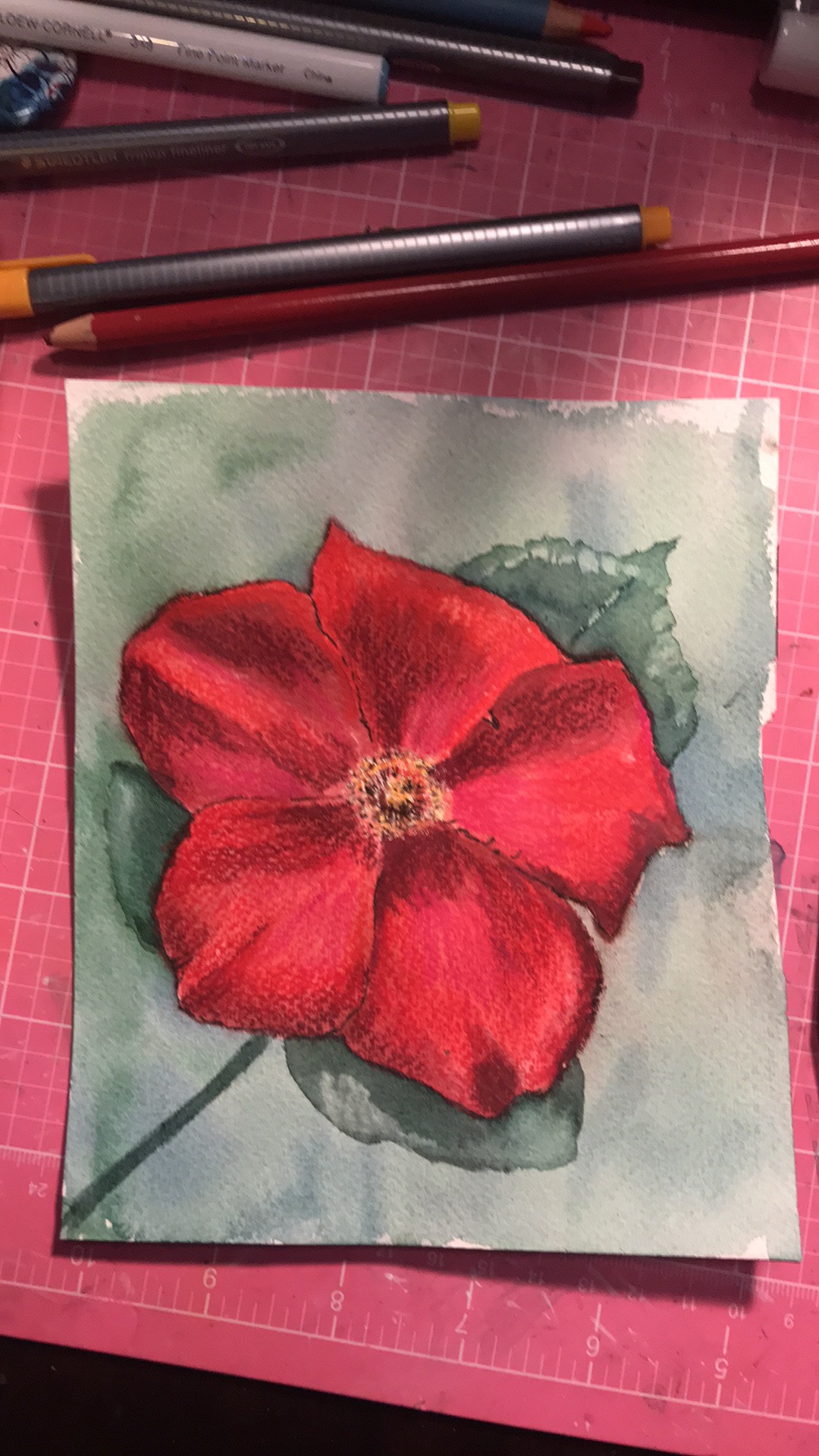
Snipped off a climbing rose today, and tried my hand at watercoloring it. I first used a watercolor pencil to create an outline of the image on Arches Cold Press watercolor paper. I then began painting the image with my Schmincke watercolors. I didn’t capture the painting process as I’m a little rusty, but I did have fun adding yellows and purple tones to the red tones. Once I had the base done, I felt the need to turn to my Prismacolor pencils to brighten the reds and cool down other parts of the image. Before doing that I used a little black pen on the edges. Here’s the original flower and before pencil stage:


So, next step was to add a little orange and white, poppy red and purples to the image with pencils, and paint in some leaves. The pencils ended up adding a nice texture to the petals. After I added the leaves I decided to add a muted background, and this is where I ended up:


I think I played around with the flower a little more with pencils to make the reds pop even more and with the leaves, and then, I added more background interest with watercolors. I also added black and white dylusions ink by tapping the ends of the spray bottle tops over the image. Finally, I spattered a bit of gold Perfect Pearls that I had wet down with a brush. This this was the result:


Finally, I decided to make a card with this image. I had to use a 6x6 card base to capture the whole image. I found some paper I thought matched and used black card stock to back everything. I added black Nuvo drops and a sentiment from Unity’s Forest Butterfly kit. My friend had encouraged me to get back to watercoloring. So, this card was created for my friend and their family members who are dealing with a tough cancer battle with a sibling.


Hope the explanation of my process helped in lieu of a video. I will try soon to get back to recording my efforts. Let me know what you think of the end result. Thanks for stopping by, till next time, happy crafting.


Sunday, May 9, 2021

Love Me, Love Me Not

Tried using one of the beautiful digital sets from Polka Dot Orchard the other day, Love Me, Love Me Not. I’m still new using digital stamps with my laser printer and my IPad. So, this was definitely an experiment. After learning how to play around with the images using Docs, I printed off the sheet and proceeded to add color using Pastel chalks. A messy business, I must say… but I had fun adding and mixing colors from my limited palette.

I ended up really liking the combo of colors and started pulling out a variety of ephemera packs. I definitely had fun playing around and gluing the pieces together. I also used burlap and a fancy ribbon that I also glued down. 

Feels good to get back into vintage cards every once in a while and this kit, besides having great sentiments, has a perfect image for it. This card was also inspired by a special person, that has been battling fiercely the cancer fight. The sentiment says it all for me.

Next, I’ll have to try various papers in my laser printer to give me more media options. Well, that’s it for now, till next time… happy crafting.


Saturday, May 1, 2021

Friends of Unity May Blog Hop

Hey, everyone, welcome back to another blog hop with Friends of Unity. This month our theme is Flora and Fauna! Please join in the hop for a chance at winning Unity stamps. Remember to comment on each blog in the hop! As a matter of fact, I’ll be giving away some stamps this month!


I ended up choosing stamps that were more conducive to creating scenes. Since I prefer flora over fauna, I first started with the April Whit Kit, Kindness is Magic. I ended up using the stamp set, paper and Nuvo drops from the kit. I started by stamping the image in grey archival ink. I used several Distress Oxides and a Memento ink to color in the image. I also used a variety of pens on this one focusing on creating a color palette that matched the paper. When I was done, I added Nuvo drops all over and ended up sprinkling aqua sprinkles all over the dots. I backed the image with papers from the pack and called it done.


The second card I created after swimming in my son’s pool... a little cold but refreshing. Looking up from
the pool there’s palm trees in view. So, ready for warmer weather and swimming again, I couldn’t resist pulling this card together. I pulled out the Time to Refresh kit and thought it would go beautifully with Mintay’s beautiful Suntastic paper. I stamped the flower and leaf twice on watercolor paper and painted them with my watercolors. For final touches I used a pen and some colored pencils. I fussy cut them out. I then took the beautiful ocean paper and die cut it down. I embossed the sentiment using archival ink and Speckled Egg Embossing Glaze. I them stamped the frond several times directly onto the paper. I adhered all the pieces, using another 2 papers from the kit for backing and added some Nuvo drops. 


Hope you enjoyed my flora cards. Remember to comment before you leave! Now on to the rest of this fun hop with my crafty friends! You should have arrived here from:

Rachel’s blog

To continue, head to:

Amber’s blog

Or, if you’d like, head to the beginning:

Crystal’s blog

Sunday, April 11, 2021

Let Beauty Find Its Way Card

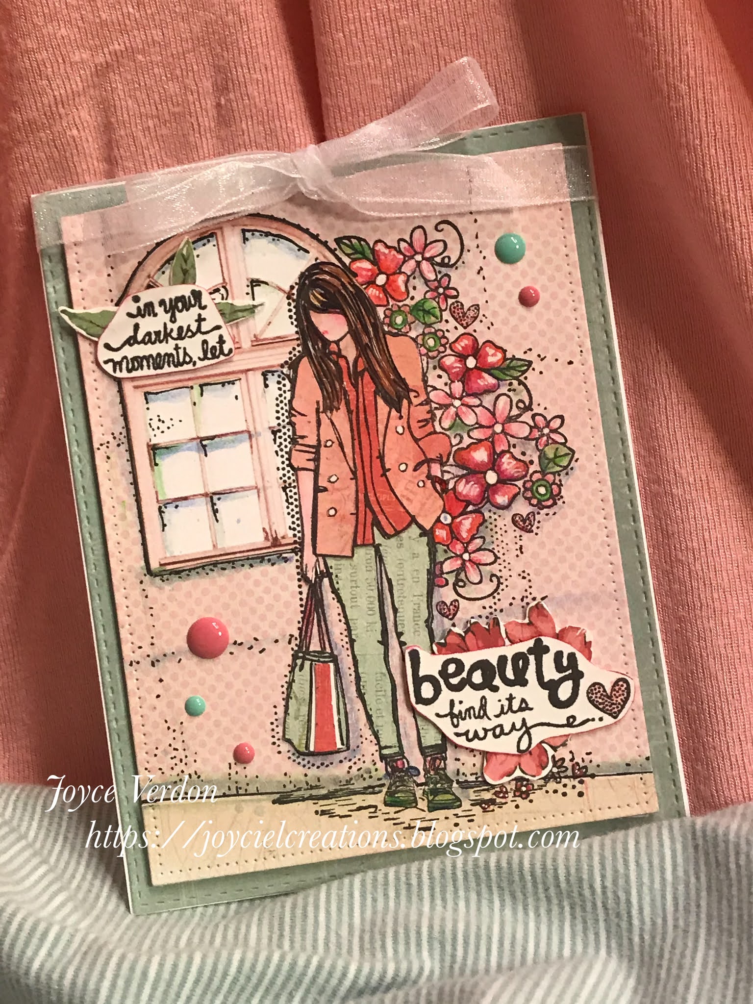
So, I was supposed to be cleaning up and I spotted this window ephemera piece in a Kaisercraft ephemera kit, that I obviously hadn’t put away (and still haven’t because instead I created this card). And I was driven to pair it with a standing Unity girl stamp, which I found in the Erica Girl kit. And then, I was driven to find paper I could pair it all with, which I found lying around and not put away either... My Mind’s Eye Lost & Found Market Street. Some may call this serendipitous and others just a fun excuse not to clean up. I’ll say nothing!

After looking at the pad and window and stamp, I realized I’d be paper piecing her outfit again. So I found multiple papers I could use, and began it all by stamping the girl on the first pink sheet that I thought could make a wall. Keeping everything in place in my Misti, I then decided where to adhere the window, affixed it, and then stamped the girl again, now focusing ink on the window. I decided I wanted to add another piece of paper where the wall and ground meet, found a neutral piece in the pad, adhered it and stamped again focusing on the feet. Once done, I pulled the paper base out of my Misti.

Next I stamped the bag, the pants, the coat and shirt on different papers and fussy cut them out. I stamped  the bag again on Bristol and red paper pieces to embellish the bag a little and fussy cut those out. Next I stamped the human parts of the girl on Bristol paper and used colored watercolor pencils on all parts and black pen on the hair.

I used watercolor pencils to color the flowers and leaves on the background. To blend everything together I added dots on the background for shading similar to the stamp shading using a black pen. I also adding shading using a green and a blue watercolor pencil around the girl and window. To make the flower centers and buttons pop, I used a white gel pen.

To complete the card, I stamped the sentiment from the kit and fussy cut out 2 portions. I backed each part with ephemera from the same kit as the window. I used another paper from the pad as a first layer, added a white ribbon and matching enamel dots to complete the card.


Overall, I had great fun putting this together... so much more fun than cleaning, and I think it turned out pretty cute. I also have the perfect person in mind for this card. Let me know what you think... till next time, happy crafting!

Artist Trading Card Catch Up

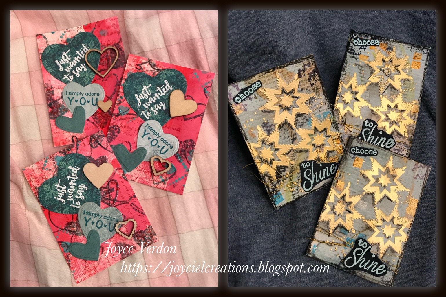
Haven’t posted trading cards in awhile, so I thought I’d share some of my favorites over the last few months. Used several different techniques on these, but all were created using a combination of Unity stamps.

The heart set background was created using acrylic paints, embossing powder with a Unity heart stamp, a stencil and paste and my own scribbles. The background on the Shine ATC, was created using a magazine artist paper and adding acrylic paint colors with a stencil to evenly distribute colors. 


The Soul Joy background was created using a 12x12 paper from a pad, stenciling on green leaves and adhering a flowery napkin to get the background colors I wanted. The Good Day background was just created with watercolors and adhering but up boots from a paper pad. I tried to recreate the colors in the watercolored boot image.


For the Love set, I watched a bunch of Tracy Evans YouTube videos, because a) l absolutely love her style and b) I love her voice and accent ;-). It was created using a couple circle dies. For the top circle, I die cut another paper and partially stamped the Unity image through the circle and the traced the outline. The 2 bottom circles are actually die cuts, again with partial images. I also stamped on a stencil, spritzed it with water and laid it on top of each ATC, holding it in place to get the ink transferred. For the Amazing set, I was inspired by another art journaling artist...and I can’t find her name. I took a sheet of Bristol paper and used a combination of Perfect Pearls, cream acrylic and red pigment powder to create a variegated background. I added some background stamping all over. Finally, I drew lines with pencil and added heartfelt words and artistic thoughts randomly all over the sheet. I then cut it down to ATC’s. I created star cutouts using 3 sizes of dies and patterned paper. The girl was embossed, and watercolor added to her.


Hope you enjoyed seeing the different looks you can create with backgrounds. Thanks for stopping by! Til next time, happy crafting.

Saturday, April 3, 2021

Friends of Unity April Blog Hop

Welcome back to another blog hop! April’s hop is all about the Birds and the Bees... bet you thought you knew all about those already, huh? 🤣 Well, who knows, maybe we have a few more things to teach. 


As usual with this hop, we’ll be giving away some Unity stamps, so be sure to leave a comment on each blog for a chance at winning some! I’d also like to announce that

Karen Connor

won some Unity goodness from me from last month’s hop. Please PM me your address, Karen!

So, for this month’s cards, I got my inspiration from the super talented artist Tracy Evans. Check out her pretty cool YouTube videos yourself! 

For the first card, I cut down Bristol paper and taped up the sides with Purple tape. I then pulled out Daler Rowney’s Rich Gold and Cream acrylics, a Brea Reese Ocean Green paint, and a brayer. I first added a little cream paint, then some light touches of the gold. I next added more gold, using a makeup sponge and TCW’s Love Frame stencil. I then added some flower centers using the green paint with the same stencil. I added more cream, gold and green paint to the heart center. 

Next, I pulled out Unity’s Thoughts from the Past and Vintage Passport and stamped portions of them using Versafine Brown ink. I then outlined the stamp and stencil images with a brown watercolor pencil and a stabilo pencil and added both color and shadows. I also added color to the edges and pencil marks before taking off the tape.

Next I stamped and embossed the owl image, from Sending an Owl, using Brutus Monroe Coffee Espresso powder, onto a buttery colored card scrap. I added a little of the gold color to the bottom portions of the owl and then fussy cut it out. I restamped and embossed the envelope portion of the image on white paper and colored it in using the paints.

Next, I stamped and embossed the sentiment from the kit onto Bristol paper, using Speckled Egg oxide ink and glaze embossing powder. I added a few envelope details and cut that down. I backed the sentiment and the painted paper with brown cardstock. I adhered everything together, added crystals and called the card done.


For the next card, I pulled out the You’re You kit, and an old SMAK kit, Stories to Tell. I started by stamping the bird stamp using some green oxides and a green Gina K ink and then covering the branch and bird areas with Versafine black ink. I then added dots of metallic gold and black Gansai Tambi watercolor to the bird and branches. I followed that up with a black micron pen to add feathers to the front of the bird and used a Posca white pen for highlights.

I then traced an oval around the image using an oval die and a green graphite watercolor pencil. I pulled that color in a little using a paintbrush and water. I then masked off the area outside the oval and used background SMAK stamps to add texture. I then masked off the oval and added more background stamps  using both the green and black stamps. I used another discontinued kit I picked up called Circa Journal. I added both the green pencil and green oxide to the ovals in the corner. Finally, I stamped the sentiment, die cut it and added the green and stabilo pencils again.

Wanted to share with you, I also tried some of Tracy’s techniques on ATCs I recently sent out. See below. More on that in another post. Her techniques are so unique and fun to try.

So, hope you enjoyed these... now onto the remainder of the hop. Remember to post a comment before you leave! So, you should have got here from:

Rachel’s Blog

To continue on go to:

Robyn’s Blog

And if you want to start at the beginning go to:

Crystal’s Blog

Sunday, March 21, 2021

Growing in Unity Blog Hop

 Hello there, welcome to the Growing in Unity Blog Hop. So fun to enjoy this little extra hop after our week events!


So, for my card, I used this month’s, March’s, Whit Kit, Wayward Florals. I took one of the papers from the Golden Marble paper pack and 2 Prima Color in Bloom sprays, Spring Dandelion and Magic Stone. Inside a box, I placed the Stencil Girl Rooted in Nature stencil over the paper, and first sprayed a little of the yellow and then sprayed the Magic Stone color. Love how this turned out. I had used the reverse side as I wanted to use the leaves stamp that leaned to the left.

After it was dry, I added a little script and dots using various Unity stamps with Rusty Hinge and Tattered Rose oxides. I then clear embossed the leaves stamp using Versafine black ink. I used Prima’s and Gambi Tansai metallic inks and a white Posca pen on the leaves. I used a white pencil around the image.

After embossing the sentiment with Rose Gold powder, I used dies to cut both the image andsentiment down. I backed the sentiment with black paper and used a black patterned paper with gold foil dots on it for the image. I finished off the card with fussy twine, sequins and Prima dots. 

Pretty pleased with how different this one turned out and loving the combination of stencil and the leaves stamp.


Thanks for hopping! Remember to leave a comment before you go for a chance at Unity stamps. You should have arrived at my blog from:

Amy’s Blog

Next up in the hop is:

Lynda’s Blog

And if you want to start at the top, go here:

Teresa’s Blog

Monday, March 8, 2021

Hello Gorgeous Card

Decided I needed to get my watercoloring on today! And I chose a flower stamp I’d used before, in a much different way, from the 4/18 KOM, Eyes of the Beholder. I used papers and the color palette from Mintay’s Lady paper pad for this card.

First attempt, in my early carding days:

I had pulled out this kit again recently and saw again the beautiful flowers buried in the background. After playing a bit with various options, I finally settled on the technique I’d use. I pulled out a sheet of hot press Arches paper and cut out 2 pieces. I also grabbed Ken Oliver’s Color Bursts in Alizarin Crimson and Lemon Yellow and my Schmincke watercolors. I mixed the 2 powders in a tray with a bit of water. Then I loosely painted stripes in first one color on my glass mat and laid the card down. I dried the card and did the same with the second color. I then painted a watered down blue green from my pan set to add a little duller color to the base. Once dried, I pulled out a Tim Holtz stencil, and Archival Library ink and added little squares in 3 areas. I then stamped the image using the same archival ink.

On the second paper I stamped the image again with Distress Antique Linen ink. I then used my watercolor set to paint the leaves and flowers. I didn’t fuss over the painting as I knew they would blend in with the whole larger image. I then fussy cut out the flowers and leaves. After laying the pieces over the background, I decided I needed to push back the background by painting over it with a watered down white gesso, effectively muting it a bit. 

I die cut the papers, used foam tape to adhere all the flower pieces and added a stamped sentiment from the Aging Gorgeously kit.


Hope you like this card. I have one rose blooming right now and all the others have gorgeous growth on them. Can’t wait! Till next time, happy crafting!

Saturday, March 6, 2021

Friends of Unity March Blog Hop

Hello and welcome back to our Friends of Unity Blog Hop. This month we’ve focused on a sketch that Crystal came up with. I struggled a bit with this new theme, but think I accomplished the goal. 


As usual, there will be Unity stamps given away with our blog hop to commenters by various members. I intend to do a giveaway myself this month. To be eligible, just comment on every blog in the hop! I’ll announce my winner in the April hop, so stay tuned!

So I made 2 cards for this hop. On the first card, I used pretty Market 49 papers and an image from Feel the Fear. I started by embossing the image with Distress Glaze powder over Oxide inks, and added colored pencil coloring. To add more color to the papers I stamped a butterfly with the second generation technique and also the sentiment from the image kit. I cut out some of the papers for mini tags at the top. I combined edge papers to make the strip down the side. I used a Market 49 ephemera tag for the sentiment.  After receiving great advice from a friend because of the soft feel of the card, I used a sentiment from last April’s sentiment kit, Trust it Will Be Okay I embossed it with purple powder from Crafters Companion. I inked all paper edges using violet ink. To complete the card, I added violet and light aqua enamel dots to the card.


For the second card, I combined elements from Unity’s KOM, from 4/18, Eyes of the Beholder, and Prima’s Pretty Pale paper pad, along with the sentiment kit from above. I embossed the bee on paper from the kit, using Brutus Monroe Espresso brown powder. I then added embossed dots using an embossing pen and Crafter’s Companion Copper powder. Once die cut, I also embossed the edges. I then embossed the bee hive pattern with the copper powder on another sheet from the pad. Again, I cut it down and embossed the edges. I added black flecks of paint onto the hive paper. Finally, I added an embossed spotted pattern using another stamp from the kit to the black paper behind the bee. After embossing the edges of the top level paper, I embossed the sentiment and backed that with paper. I added tags using the matching Prima Washi tape.


Hope you enjoyed these ideas! Remember to leave a comment before you go! Now, if you want to continue on in the blog hop with my very creative friends, go here: 

Alaine’s Blog

If you want to start from the beginning, visit:

Crystal’s Blog