Used the December 2018 KOTM from Unity for the image, the June 2017 KOTM for the sentiment and My Mind’s Eye Pretty Things paper pad for all pieces. After stamping the girl onto watercolor paper, I watercolored pieces of her. I then stamped her again on other pieces of paper and pieced her together. I also used pencils and pens on the completed image.
Pretty easy to put this card together with a brad, enamel dots, MFT dies and some lace.
Hope you like my vintage tulip girl! Have a great week! Happy crafting!
Monday, March 25, 2019
Saturday, March 16, 2019
Back Again Making Cards
Took a break from cardmaking after hitting the winter blues. After a month of rain, I’ve been enjoying walking in the sunshine again, getting pumped up with Vitamin D and reorganizing my craft supplies. Thought I better get back to cardmaking, so I pulled out some supplies and some Unity stamps to makes these 2 cards. They show how rusty I am!
The first card was made following a technique posted on the Unity Show and Tell FG group. I modified it slightly by using Primary Elements pigments and water to paint the stamps, let them dry, then spritz them with water before stamping the image. The nice thing about Primary Elements is that they have a shimmer to them. I used the bike and sentiment from the 8/17 SMAK KIT, the flower and map stamp from the March 2019 LOL ki , and the background stamp from the 1/19 SMAK kit. I also used a small bicycle I picked up in a trade from an older KOTM, that I stamped around. It’s kind of a mish mash design, but I was feeling the sentiment. I used 5 brads 3 ribbons and a distressed patterned paper. Even one of the brads, has a bike on it!
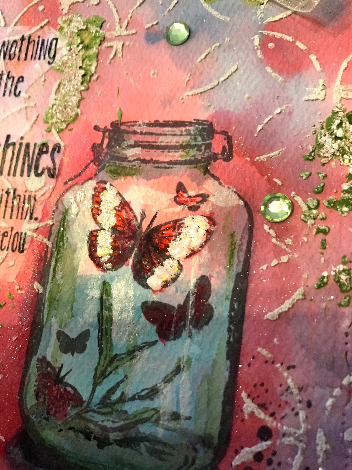
The second card was made using Brea Reese Glitter inks for the background and Neenah watercolor paper. I used Lake Blue and Crimson Red, and a Pink. I started by adding droplets to my mat, spritzing with water and then drying the paper before adding the other colors. I had recently picked up a 6x6 BoBunny Butterfly Kisses pad that had paper matching the stamp from Unity’s 3/18 KOTM. I stamped the jar onto the colored paper, using grey archival ink, wondering to myself whether I could paint the jar and make it stand from the background. I pulled out my Gansai Tambi watercolor, which is more like a gouache, in that it’s more opaque than watercolor. I added more of the blue glitter ink to the sides of the jar to darken the edges, painted the inside images, used the white paint to add highlights, and added a greenish cast to the base parts of the jar and the shadow below. I also ended up using both the glitter inks and paints to deepen color around the jar to make it standout.
I wasn’t entirely pleased with the kind of hard line borders between colors in the background, so I decided to break it up using an Art Anthology stencil and white Brea Reese Texture paste. Not leaving well enough alone, I then combined white modeling paste with Primary Element Olive Vine pigment powder to add green netting using the same stencil, which ended up too dark and splotchy! So, to break it up I poured a Stampendous embossing powder (which has gold, white and pink flakes in it) over the green paste and heat set that. Now I was happy! I decided to make the butterfly in the jar stand out by adding embossing powder there as well. I used an embossing pen to do that. To add the sentiment, deciding I didn’t want to cover up the background, I had been thinking, vellum or acetate, but, instead, I happened upon some white scrap tissue paper. I stamped on it with black ink and collaged it onto the uneven background using gel medium.
To make this card, I mounted patterned paper, the die cut watercolor paper (with color coordinated Washi tape at top and bottom), fussy cut images from the patterned paper, ribbon and green crystals to a square cut card base.
Well, if nothing else, had fun trying some new techniques. Till next time, happy crafting!
The first card was made following a technique posted on the Unity Show and Tell FG group. I modified it slightly by using Primary Elements pigments and water to paint the stamps, let them dry, then spritz them with water before stamping the image. The nice thing about Primary Elements is that they have a shimmer to them. I used the bike and sentiment from the 8/17 SMAK KIT, the flower and map stamp from the March 2019 LOL ki , and the background stamp from the 1/19 SMAK kit. I also used a small bicycle I picked up in a trade from an older KOTM, that I stamped around. It’s kind of a mish mash design, but I was feeling the sentiment. I used 5 brads 3 ribbons and a distressed patterned paper. Even one of the brads, has a bike on it!
The second card was made using Brea Reese Glitter inks for the background and Neenah watercolor paper. I used Lake Blue and Crimson Red, and a Pink. I started by adding droplets to my mat, spritzing with water and then drying the paper before adding the other colors. I had recently picked up a 6x6 BoBunny Butterfly Kisses pad that had paper matching the stamp from Unity’s 3/18 KOTM. I stamped the jar onto the colored paper, using grey archival ink, wondering to myself whether I could paint the jar and make it stand from the background. I pulled out my Gansai Tambi watercolor, which is more like a gouache, in that it’s more opaque than watercolor. I added more of the blue glitter ink to the sides of the jar to darken the edges, painted the inside images, used the white paint to add highlights, and added a greenish cast to the base parts of the jar and the shadow below. I also ended up using both the glitter inks and paints to deepen color around the jar to make it standout.
I wasn’t entirely pleased with the kind of hard line borders between colors in the background, so I decided to break it up using an Art Anthology stencil and white Brea Reese Texture paste. Not leaving well enough alone, I then combined white modeling paste with Primary Element Olive Vine pigment powder to add green netting using the same stencil, which ended up too dark and splotchy! So, to break it up I poured a Stampendous embossing powder (which has gold, white and pink flakes in it) over the green paste and heat set that. Now I was happy! I decided to make the butterfly in the jar stand out by adding embossing powder there as well. I used an embossing pen to do that. To add the sentiment, deciding I didn’t want to cover up the background, I had been thinking, vellum or acetate, but, instead, I happened upon some white scrap tissue paper. I stamped on it with black ink and collaged it onto the uneven background using gel medium.
To make this card, I mounted patterned paper, the die cut watercolor paper (with color coordinated Washi tape at top and bottom), fussy cut images from the patterned paper, ribbon and green crystals to a square cut card base.
Well, if nothing else, had fun trying some new techniques. Till next time, happy crafting!
Wednesday, March 6, 2019
Pretty Pale Prima Girl Card
Yesterday, I started another vintage card using Prima’s Pretty Pale paper pad and ephemera, and Unity’s 5/18 SMAK kit.
I started by stamping out several browns and pinks and selecting complementary oxide and distress inks that would coordinate with the paper. I then stamped the pretty girl using several brown shades of Oxide inks onto a sheet of the Pretty Pale paper. I then stamped her again on masking paper and fussy cut her out. Masking her off, I stamped the large background stamp across the bottom. I then took the circles and stamped those around. Finally, I took the butterfly and stamped just the script words to the side.
I started watercoloring the girl using the same inks, very lightly as I used paper from the pad. I then die cut her and another sheet from the pad. I then took some 7 Gypsies coordinating paper and die cut a circle, a doily and the cage out. I added distress colors to the doily and circle. I backed the Fearless ephemera with the same paper. I stamped another sentiment onto scraps of the Pretty Pale paper and fussy cut that. I inked the edges of almost everything.
Finally, I put the card together using 2 ribbons and crystal dots. I took matching flowers, added glitter, attached them and called the card done.
Somehow, this time of year speaks vintage to me. I seem to be attracted to those soft colors and all the luscious details found in these cards and beautiful papers. Hope you like this one... now back to some mixed media! Happy crafting!
Monday, March 4, 2019
Lean on Me Flower Stem & Butterfly
I’ve been wanting to ink up a card with this beautiful butterfly from an American Craft Co. kit. I’ve been stumped with inks to use as the Distress line doesn’t have a total color match per se (and I just fell in love with the colors). So, the question was, how to set it off with a colored background with complementary stamps. I now have a pretty complete set of Tattered Angels Glimmer sprays, so I tried those and found the 3 purples were great for this.
I began by spraying a watercolor paper with the sprays, lightest all over and darkest in the corners, heat setting in between. I also spritzed a little Brutus Monroe Silver spray in strips. For a complementary soft green, I decided to emboss the flower bud stem from Unity’s Lean on Me using Sage embossing powder. Because I wanted to add color to the buds, I did this again an plain watercolor paper, fussy cut out the buds and adhered them over the original image. I then took a white and black pen and added shadows and highlights to the stems and buds. I added color to the buds using silver glitter ink, Pewter Perfect Pearls, Green Prima Metallic watercolor and a little purple Color Burst ink.
I then pulled out 2 coordinating Distress Oxide inks and stamped the flowers from the Lean on Me kit and a couple sprigs from Unity’s Insightful Meadows Kit. I added some white Distress Stain dots around and called it done. I then adhered the butterfly. I used a sentiment (the font matches perfectly with the stem, I thought) from Unity’s Magnolia Kit. I used a roller to add Color Burst paint to the stamp and stamped it out. I backed that with grey paper. I used a silver card base and added violet thread and crystal dots.
When I began taking pictures to post and trying different backgrounds, I remembered I had this special scarf I loved of Claude Monet Lilies, that I had picked as a souvenir at the Musee de l’Orangerie in Paris. This museum has an oval room filled with huge paintings of the water lilies, almost touching, giving a gorgeous surround experience. And the scarf almost matched colors...wow. Guess I really loved that color combination!
Hope you like this card! Till next time, happy crafting!
I began by spraying a watercolor paper with the sprays, lightest all over and darkest in the corners, heat setting in between. I also spritzed a little Brutus Monroe Silver spray in strips. For a complementary soft green, I decided to emboss the flower bud stem from Unity’s Lean on Me using Sage embossing powder. Because I wanted to add color to the buds, I did this again an plain watercolor paper, fussy cut out the buds and adhered them over the original image. I then took a white and black pen and added shadows and highlights to the stems and buds. I added color to the buds using silver glitter ink, Pewter Perfect Pearls, Green Prima Metallic watercolor and a little purple Color Burst ink.
I then pulled out 2 coordinating Distress Oxide inks and stamped the flowers from the Lean on Me kit and a couple sprigs from Unity’s Insightful Meadows Kit. I added some white Distress Stain dots around and called it done. I then adhered the butterfly. I used a sentiment (the font matches perfectly with the stem, I thought) from Unity’s Magnolia Kit. I used a roller to add Color Burst paint to the stamp and stamped it out. I backed that with grey paper. I used a silver card base and added violet thread and crystal dots.
When I began taking pictures to post and trying different backgrounds, I remembered I had this special scarf I loved of Claude Monet Lilies, that I had picked as a souvenir at the Musee de l’Orangerie in Paris. This museum has an oval room filled with huge paintings of the water lilies, almost touching, giving a gorgeous surround experience. And the scarf almost matched colors...wow. Guess I really loved that color combination!
Hope you like this card! Till next time, happy crafting!
Saturday, March 2, 2019
Friends of Unity March Blog Hop
Welcome to March’s Friends of Unity Blog Hop with the very intriguing and challenging theme of Creativity! (I can’t wait to see how the other hop participants addressed it!) I took the opportunity this month to dive head on into the mixed media world. I hope my fledgling foray into this wonderful craft venue inspires you to try, if not mixed media, something new to you. I’ll let you judge my novice attempts, but I have to say, I had fun doing it!
This blog hop, as usual, offers giveaway goodies. I will be doing a giveaway this month as well. To be eligible, please leave a comment on each blog in the hop. Winners are randomly selected and posted on or by the next month’s blog hop.
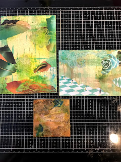
I started off by using 3 small Ranger canvas mixed media boards I picked up discounted at Tuesday Morning. They are sized 3”x3”, 4”x6” and 5”x7”. I also picked up a Gesso Canvas 6”x6” at Hobby Lobby. In all cases, I started by laying down a cream acrylic paint, adding paper (magazine paper or patterned paper) and “gessoing” that, and then adding more paint and/or sprays. What I found out with mixed media was that, if you didn’t like something...just go over it again with other colors as many times as you want. That being said, I also found that it can be time consuming as you continue to “create” your art work day after day, especially when still learning. With all, I added different combinations of Unity stamps (I think from 11 kits). I used stencils, embellishments, pastes, inks, sprays, glitter, ... I also used pens, a lot! and took liberties in using the images. (See product images below).
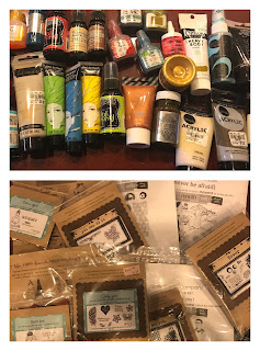
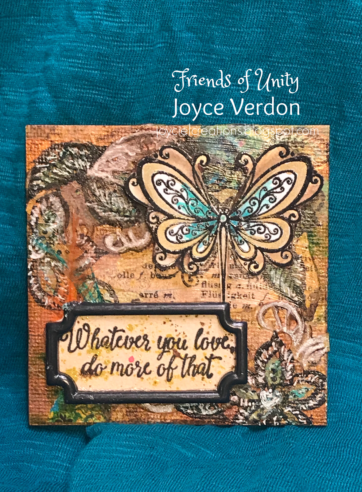
So, on to the first set of 3. I started by preparing all the canvases the same way, with the only difference being the color scheme. I then started layering on colors and designs, completing each one before moving on to the next (smallest to largest). You may not even see the layered paper pieces except for the colors. I used primarily a small flower/butterfly kit for the littlest canvas.
I used a vintage era background stamp kit for the focus of the second, but added a different butterfly over it.
For the largest of the 3, I actually started by using an Art Anthology stencil to start the flower branch, but penned my own flower heads, which I added chunky Vicki Boutin glitter to. Again, Unity stamps clutter the background of this one.
For the last canvas, I started the same way, except I also included the sides (painting, stamping and stenciling).
Hope you enjoyed seeing these unusual, strange and unique art works of a novice. At a minimum, I hope they demo the versatility of the wonderful collection of stamps offered by Unity Stamp Co. Be sure to leave comments on each hop for your chance to win a giveaway.
Just to remind everyone, we are not sponsored by Unity Stamp Co., but they do approve of this hop. I and my fellow crafters on this hop are keen users of their products and enjoy focusing our attention on monthly themes where we can showcase their products. We use our own stash as giveaways to share our inspiration and ideas with others. Hope you enjoy these efforts as much as we enjoy doing them! If you are interested in my art journey, I invite you to follow me by clicking the follow button, or adding your email!
Now on to the hop:
This blog hop, as usual, offers giveaway goodies. I will be doing a giveaway this month as well. To be eligible, please leave a comment on each blog in the hop. Winners are randomly selected and posted on or by the next month’s blog hop.
I started off by using 3 small Ranger canvas mixed media boards I picked up discounted at Tuesday Morning. They are sized 3”x3”, 4”x6” and 5”x7”. I also picked up a Gesso Canvas 6”x6” at Hobby Lobby. In all cases, I started by laying down a cream acrylic paint, adding paper (magazine paper or patterned paper) and “gessoing” that, and then adding more paint and/or sprays. What I found out with mixed media was that, if you didn’t like something...just go over it again with other colors as many times as you want. That being said, I also found that it can be time consuming as you continue to “create” your art work day after day, especially when still learning. With all, I added different combinations of Unity stamps (I think from 11 kits). I used stencils, embellishments, pastes, inks, sprays, glitter, ... I also used pens, a lot! and took liberties in using the images. (See product images below).
So, on to the first set of 3. I started by preparing all the canvases the same way, with the only difference being the color scheme. I then started layering on colors and designs, completing each one before moving on to the next (smallest to largest). You may not even see the layered paper pieces except for the colors. I used primarily a small flower/butterfly kit for the littlest canvas.
I used a vintage era background stamp kit for the focus of the second, but added a different butterfly over it.
For the largest of the 3, I actually started by using an Art Anthology stencil to start the flower branch, but penned my own flower heads, which I added chunky Vicki Boutin glitter to. Again, Unity stamps clutter the background of this one.
For the last canvas, I started the same way, except I also included the sides (painting, stamping and stenciling).
Hope you enjoyed seeing these unusual, strange and unique art works of a novice. At a minimum, I hope they demo the versatility of the wonderful collection of stamps offered by Unity Stamp Co. Be sure to leave comments on each hop for your chance to win a giveaway.
Just to remind everyone, we are not sponsored by Unity Stamp Co., but they do approve of this hop. I and my fellow crafters on this hop are keen users of their products and enjoy focusing our attention on monthly themes where we can showcase their products. We use our own stash as giveaways to share our inspiration and ideas with others. Hope you enjoy these efforts as much as we enjoy doing them! If you are interested in my art journey, I invite you to follow me by clicking the follow button, or adding your email!
Now on to the hop:
Wednesday, February 27, 2019
Unity February 2019 KOTM Flower Card
Wanting to try out my new Color Burst paints, I stamped the flower in this kit on watercolor paper. After experimenting with 2 of the colors, I decided to pour them out on my glass media mat and paint the flowers with them using a regular watercolor brush. Since I only had a red/purple selection, I painted the leaves using my Gansai Tambi Set. I painted the flower centers with Brea Reese Yellow Glitter ink and a little distress ink.
I decided to also stamp out Unity’s background kit, Ikat. I used a combo of ink colors...a Magenta MomentoLuxe and a magenta Distress Oxide, which I then clear embossed. For a card panel background, I pulled out a Sizzix 3D folder and embossed a colored paper. I then swiped Distress Picket Fence across the top to make the embossing stand our a little.
I stamped and embossed the sentiment from the kit using a black archival ink and the Magenta Distress Oxide, which, I again, clear embossed. To complete the card, I cut down the panels, added a brad, coordinating enamel dots, and ribbon.
Was a little rusty creating a card after handling mixed media inks, paints and pens! Hoe you like this one, and, till next time, happy crafting!
I decided to also stamp out Unity’s background kit, Ikat. I used a combo of ink colors...a Magenta MomentoLuxe and a magenta Distress Oxide, which I then clear embossed. For a card panel background, I pulled out a Sizzix 3D folder and embossed a colored paper. I then swiped Distress Picket Fence across the top to make the embossing stand our a little.
I stamped and embossed the sentiment from the kit using a black archival ink and the Magenta Distress Oxide, which, I again, clear embossed. To complete the card, I cut down the panels, added a brad, coordinating enamel dots, and ribbon.
Was a little rusty creating a card after handling mixed media inks, paints and pens! Hoe you like this one, and, till next time, happy crafting!
Monday, February 25, 2019
February ATC’s
I’ve been offline lately working on some mixed media projects for the upcoming Friends of Unity blog hop! One thing I’ve found with mixed media, if you don’t like something you can keep working it. Problem with that is, hours can easily get consumed by 1 project! Oh well...on to this month’s ATCS.
The first ATC was inspired by a trip to Tuesday Morning, where I found a Heidi Swapp set of acrylic butterflies and some pink tags. The butterflies had patterns of pink flowers, scripts and blue stripes. I ended up, once I stamped and added color, cutting the tags down to ATC size using a die I also found there. I added stripes using an Altenew blue spray and stencil to tags. I turned the stencil over with spray still on the stencil and stamped it onto white watercolor paper. I used that to stamp the butterfly from Unity’s 8/17 KOTM. I then stamped the script from the 11/16 SMAK kit onto the tag. To make the acrylic butterflies stand out, I painted the back with white acrylic paint. I added Washi tape down the side. I stamped and embossed the sentiment onto vellum. I outlined all pieces using a pink glittery Spectrum Noir watercolor pen. To complete the ATC’s, I added string and ribbons, large crystal dots I picked up in a Brutus Monroe Mystery Box (they are lovely), and regular pinkish crystals.
Because the first ATC was over the top I wanted to have a one layer look on the second. I recently received an order from Joggles, which came wrapped in beautiful silvery tissue wrapping. I desparately wanted to use it. I also had just received my Layers of Life February Unity Kit. I ended up using the mini flower stamp and one of the sentiments. To create this one, I stamped both onto cut down watercolor paper. I then painted it using my Gansai Tambi watercolors to match the colors in the paper. I then tore up pieces of the paper and used an Extreme Glitter ModPodge glue. I then used a Bo Bunny silvery blue paste and a stencil to add some texture. I loved how simple and colorful it turned out.
Well, that’s it for today! Till next time, happy crafting!
Sunday, February 17, 2019
2 Recent Unity Cards
Took another hiatus from cardmaking to enjoy some downtime reading during our rainy season! But I did have a chance to play a little.
The first card was inspired by a new purchase of a beautiful Alexandra Renke Washi tape. Just love the colors. I started by layering a strip of Washi down one side of a card panel. I then started looking through Ephemera scraps and found, what I thought, was a torn piece of fibrous watercolor paper. I decided to use that and then turned to my Unity 5/16 SMAK kit and found a vintage flower stamp and some others that I could use. I stamped the flower using a brown archival ink and started painting using oxide inks - 2 reds, a pink and orange, plus a brown Distress ink. I ended up covering the flowers with a very light sheen of Prima Metallic watercolors. I stamped the “be unique” image on another page and painted that. I used 2 papers from a Prima Julie Nutting pad to complete the cardface and provide a background for the watercolor paper. To add a little detail I stamped the “Authentic” word on vellum and embossed it with a mixture of a pink Ranger powder and a Gold Wow powder to get the peach color I wanted. I added fancy Prima crystals and peach ribbon and called the card done.
After watching some watercolor artists on YouTube (wishing I had their skills), I decided to watercolor another card today. This time I pulled out Unity KOTM’s for a heart from the 2/18 kit and sentiment from the 1/14 kit. This time I stamped the image using pink ink and the sentiment using black archival ink on a Melissa Francis watercolor paper. It’s very thin and quickly absorbs color, making it more difficult to blend colors. I decided after I was finished that I needed to outline the image. I used a gray pen for the leaves and a green pen to add shadows and definition on the flowers. To finish the image I decided to use crystals for the flower centers. I found green paper to use as trim and a subtle patterned paper for background.
Had some fun using up paper scraps, using different papers for watercoloring and trying new stamps out. Till next time, happy crafting!
Wednesday, February 13, 2019
Poppies Card
For this card, I waned to ink up the poppies stamp from Unity’s Poppies and Love kit and see if I could channel the pretty paper from Prima’s, Pretty Pale, collection. I started by inking up the stamp and printing it on waterpaper (I actually trashed my first attempt at this). For the background, I then pulled stamps from the Bitty Backgrounds Kit, the 12/15 and the 2/13 KOTM’s. I stamped those and then colored all in using pencils. This is the paper and pad, I was channeling:
I decided to veer a little away from the original colors and used gray, tan, brown and black raspberry pencils. Once I was done, I ended up tearing the paper to give it a Vintage feel and inked up the sides. I then found odds and ends paper, (including a piece from the pad), to use as collage bits. I also unearthed a 30 year old paper, I don’t know what kind of paper, with fiber threads in it and tore some of that up to back the watercolor paper. I found a butterfly and cut out more butterflies with a punch to surround the flowers. I used the sentiment from the Hello It’s Me kit, which I must admit, I identify with. I first used the mini background stamp and then stamped the sentiment and inked the sides.
Hope you enjoy the vintage feel of this one. Till next time, happy crafting!
I decided to veer a little away from the original colors and used gray, tan, brown and black raspberry pencils. Once I was done, I ended up tearing the paper to give it a Vintage feel and inked up the sides. I then found odds and ends paper, (including a piece from the pad), to use as collage bits. I also unearthed a 30 year old paper, I don’t know what kind of paper, with fiber threads in it and tore some of that up to back the watercolor paper. I found a butterfly and cut out more butterflies with a punch to surround the flowers. I used the sentiment from the Hello It’s Me kit, which I must admit, I identify with. I first used the mini background stamp and then stamped the sentiment and inked the sides.
Hope you enjoy the vintage feel of this one. Till next time, happy crafting!
Sunday, February 10, 2019
One Layer Valentine Card
Been wanting to make this card for awhile and I’ve been experimenting with it on and off. Finally did it! I used stamps from Unity’s 11/15 KOTM and the 1/15 KOTM, and my Misti, along with Gina K.’s Amalgam Black ink and Vermillion archival ink. I used a red pen, a little red glitter ink, red crystal dots, freebie Heart sequins from Unity and a red striped twine! I also pulled out a new Altenew border die, that I must admit gave me a little trouble, to create the thin red paper border. Other than that, this was so easy to put together!
Hope you (and, my son and DIL) like it! Happy crafting till next time!
Saturday, February 2, 2019
One-Off Set of ATC and a Coin
Decided to participate with a talented crafter I met in Unity’s Show and Tell FB group in a mixed media Artis Trading Card and Coin exchange! This was so fun as there - no hard deadlines, try something new... anything goes kind of exchange, no limit on brands, no need to make replicas (just one of each)! So, here’s what I did!
For the coin, a 2 1/2” circle, pulled out a circle die and my Ranger mixed media paper. I then pulled out a new blue Dylusions ink spray, and a Brutus Monroe Silver spray. After spraying and drying the paper I did use a Tim Holtz letter stamp that ended up getting covered up. After that, I took a silver and black patterned glitter paper from a pad and tore up 3 small strips that I ended up gluing on. I then used a dark silver paste along the edges to smooth out the paper edges. I then used a white Brea Reese paste to add circles using a TCW stencil. I also wanted to try this very chunky blue Bo Bunny paste that seems to have large silver pieces in it. I used another part of the stencil to apply that 3 times and wow...is it shiny! Leaving all that to dry, I pulled out Watercolor paper and stamped the small moon/star image from 7/18 SMAK kit using a dark blue Stazon ink. I watercolored the image with blue and gray Distress inks and added a clear glitter ink. I fussy cut it out and inked up the edges with pen and ink. I used the same stamp and ink to add stars to the the base coin. I then inked up the sentiment twice only using a Brutus Monroe Silver embossing powder on the word SHINE and blue paint to the Chose to part. I then fussy cut both out. I used a blue pen and then a black pen to color in the word shine (to make it a dark navy). To complete the coin, I inked up the edges, glued the image and sentiment on, and then used a black pen around all the pieces.
For the ATC, I used the same ranger paper and, this time, I sprayed a Prima red spray and tried to use up a Primary Elements green/gold concoction I made up for a previous card. After that dried, I started inking up pieces from a Finnabair stamp set I picked up on sale at Micheals using Red Stazon ink. I then pulled out a green BoBunny paste and a gold paste and combined to the 2 together and added large dots using a stencil. This ended up blending well with the colors. I then took a burlap doily and added red color to that and glued it on and cut off the excess. Letting all that dry (and really not thinking ahead that well...if I did I may have used different images), I inked up a couple coffee cups using watercolor paper, dark red inks, glitter ink and gold glitter pens. I fussy cut them out. Wanting to pull more green into the ATC, I found a Washi tape that would help and added 3 pieces. I then inked up the Tim Holtz sentiment that I love (and, actually, is applicable, as my husband is away from home...so the mess I made went undetected). I then fussy cut that out, inked up the edges and dirtied the paper a little with distress inks. I glued everything on, added cute embellishments and string, and again, used pen to outline everything.
I must admit I am having fun playing with pastes, sprays and colors. The ATCS are offering up a great opportunity to play, but I’d like to move on to larger canvases as I’d have more real estate to break up the busyness of the layout. I still need much more practice with colors and design.
Thanks, Dawn, for agreeing to play with me! This was a fun way to break up the January blahs! I’m thinking of trying my hand at videoing what I’m doing as writing all this down and remembering what I did is tedious! If you think this would be useful, let me know! I’m also interested if you’ve done this before in what products you use to hold the camera pointed down, the microphone, the light source, etc...and how tos. Thanks for stopping by and have a great day!
For the coin, a 2 1/2” circle, pulled out a circle die and my Ranger mixed media paper. I then pulled out a new blue Dylusions ink spray, and a Brutus Monroe Silver spray. After spraying and drying the paper I did use a Tim Holtz letter stamp that ended up getting covered up. After that, I took a silver and black patterned glitter paper from a pad and tore up 3 small strips that I ended up gluing on. I then used a dark silver paste along the edges to smooth out the paper edges. I then used a white Brea Reese paste to add circles using a TCW stencil. I also wanted to try this very chunky blue Bo Bunny paste that seems to have large silver pieces in it. I used another part of the stencil to apply that 3 times and wow...is it shiny! Leaving all that to dry, I pulled out Watercolor paper and stamped the small moon/star image from 7/18 SMAK kit using a dark blue Stazon ink. I watercolored the image with blue and gray Distress inks and added a clear glitter ink. I fussy cut it out and inked up the edges with pen and ink. I used the same stamp and ink to add stars to the the base coin. I then inked up the sentiment twice only using a Brutus Monroe Silver embossing powder on the word SHINE and blue paint to the Chose to part. I then fussy cut both out. I used a blue pen and then a black pen to color in the word shine (to make it a dark navy). To complete the coin, I inked up the edges, glued the image and sentiment on, and then used a black pen around all the pieces.
For the ATC, I used the same ranger paper and, this time, I sprayed a Prima red spray and tried to use up a Primary Elements green/gold concoction I made up for a previous card. After that dried, I started inking up pieces from a Finnabair stamp set I picked up on sale at Micheals using Red Stazon ink. I then pulled out a green BoBunny paste and a gold paste and combined to the 2 together and added large dots using a stencil. This ended up blending well with the colors. I then took a burlap doily and added red color to that and glued it on and cut off the excess. Letting all that dry (and really not thinking ahead that well...if I did I may have used different images), I inked up a couple coffee cups using watercolor paper, dark red inks, glitter ink and gold glitter pens. I fussy cut them out. Wanting to pull more green into the ATC, I found a Washi tape that would help and added 3 pieces. I then inked up the Tim Holtz sentiment that I love (and, actually, is applicable, as my husband is away from home...so the mess I made went undetected). I then fussy cut that out, inked up the edges and dirtied the paper a little with distress inks. I glued everything on, added cute embellishments and string, and again, used pen to outline everything.
I must admit I am having fun playing with pastes, sprays and colors. The ATCS are offering up a great opportunity to play, but I’d like to move on to larger canvases as I’d have more real estate to break up the busyness of the layout. I still need much more practice with colors and design.
Thanks, Dawn, for agreeing to play with me! This was a fun way to break up the January blahs! I’m thinking of trying my hand at videoing what I’m doing as writing all this down and remembering what I did is tedious! If you think this would be useful, let me know! I’m also interested if you’ve done this before in what products you use to hold the camera pointed down, the microphone, the light source, etc...and how tos. Thanks for stopping by and have a great day!
Friends of Unity February Blog Hop
Welcome to February’s Friends of Unity Blog Hop, with the wonderful theme, Friendship! It is so important to our wellbeing, I think, and February is a wonderful month to celebrate friends! This blog hop, as usual, offers giveaway goodies. To be eligible, please leave a comment on each blog in the hop. Winners are randomly selected and posted on or by the next month’s blog hop.
At this point, I’d like to congratulate, Meg Crawford, for being my winner on last month’s hop! Congratulations, Meg! Please PM me providing your address within the next 2 weeks and I’ll gladly send out my giveaway!
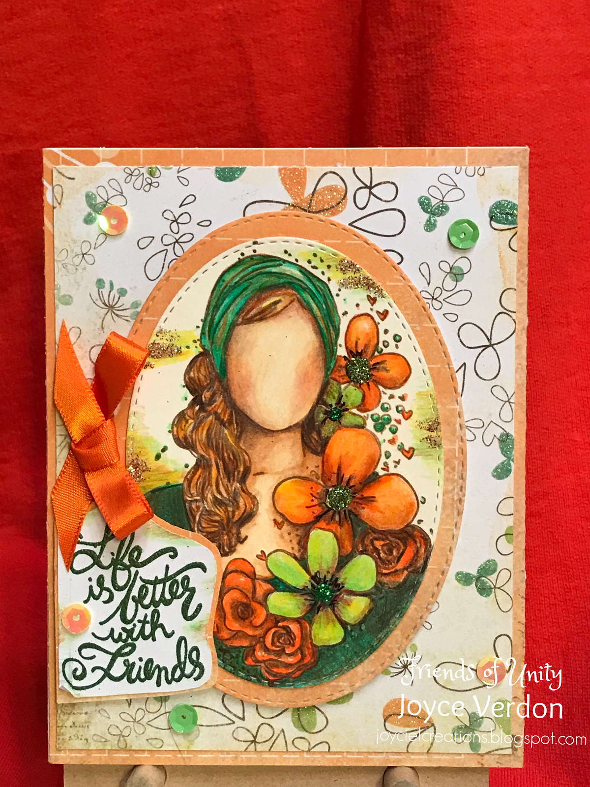
For this first card, I chose a fairly standard card design using the Whole Love Story girl with sentiments from the Life is Better kit, the December KOTM and the Hugs, Kisses and Birthday Wishes. I had picked up a paper kit with glitter on it from Tuesday Morning that I wanted to use. I decided to try matching the coloring of my girl using a very small Faber-Castell Polychromas pencil set. This is the first time I’ve tried these pencils...I forgot I even had this set. I had to use my Prismacolors for skin tone, but everywhere else I blended colors to get the right tones and shades. To match the paper further, I decided to add glitter to the flowers and the edges of the paper. I ended up using 2 greens for the flower centers, and mixing white, copper and gold glitter together for the edges. Added sequins and a ribbon to complete the card.
With the second card, I pulled the A Friend Like You Kit out. I also pulled out the Kaisercraft Everlasting pad, BoBunny Madeleine Collection pad and an American Crafts letter die cut set, I also picked up at Tuesday morning (loving the colors). As usual, I love my patterned papers. I ended up using the Kaisercraft paper for the 2 base levels and the Bo Bunny for the dress and border on the bottom. I stamped and pencil colored the girl right on the Kaisercraft paper. I stamped the sentiment using both pink and green Distress inks. I added eyelash ribbon, sticky pink strips and used the matching pink oxide ink on the wooden hearts.
Hope you enjoy these unusual cards and the others on this hop. Be sure to leave comments on each hop for your chance to win a giveaway. Just to remind everyone, we are not sponsored by Unity Stamp Co., but they do approve of this hop. I and my fellow crafters on this hop are keen users of their products and enjoy focusing our attention on monthly themes where we can showcase their products. We use our own stash as giveaways to share our inspiration and ideas with others. Hope you enjoy these efforts as much as we enjoy doing them! Have a great February, Happy Valentine’s Day and happy crafting! Now on to the hop:
At this point, I’d like to congratulate, Meg Crawford, for being my winner on last month’s hop! Congratulations, Meg! Please PM me providing your address within the next 2 weeks and I’ll gladly send out my giveaway!
For this first card, I chose a fairly standard card design using the Whole Love Story girl with sentiments from the Life is Better kit, the December KOTM and the Hugs, Kisses and Birthday Wishes. I had picked up a paper kit with glitter on it from Tuesday Morning that I wanted to use. I decided to try matching the coloring of my girl using a very small Faber-Castell Polychromas pencil set. This is the first time I’ve tried these pencils...I forgot I even had this set. I had to use my Prismacolors for skin tone, but everywhere else I blended colors to get the right tones and shades. To match the paper further, I decided to add glitter to the flowers and the edges of the paper. I ended up using 2 greens for the flower centers, and mixing white, copper and gold glitter together for the edges. Added sequins and a ribbon to complete the card.
You are here => Joyce Verdon
Subscribe to:
Posts (Atom)