For the first card, I used another Somerset Studio artist paper, as I very much enjoy the artistic look of them... a development skill I really want to acquire. Notice the script in the paper... which is where i got the idea for this card!
I decided to use the leaf from the Letting Go kit. Using purple, red and blue archival inks, I stamped the leaf out. I then added coordinating brighter/darker watercolors to the image. Using the 6/17 Be Fearless SMAK kit, I white embossed the script over the image and fussy cut it out.
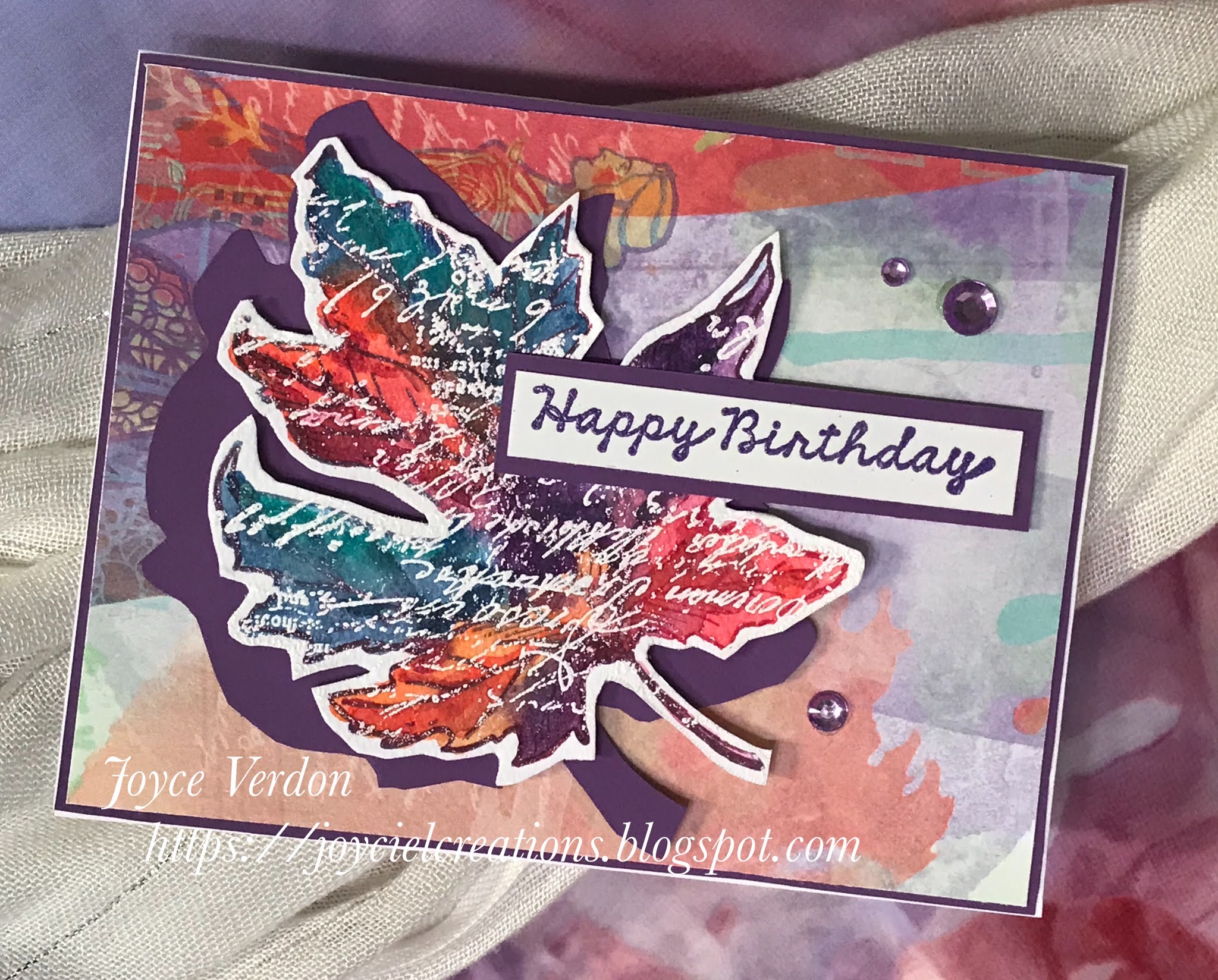
To make the card stand out, I used purple paper as a foundation, to frame a purple embossed random Unity birthday greeting, and as a fussy cut shadow for the leaf. I added purple crystals for accent.


The second card began with watercolor paper and 2 Altenew spray inks ihtn blue and green. I then used the wonderfully versatile Small Details background stamp with Coffee archival ink. I also randomly added some Dinged Dots using the archival ink as well. I then added the corner stamp from the Hello Beautiful kit using a brown Nuvo embossing powder.
Next, I turned to the main image, the car from the Consider Yourself Vintage kit. The image was embossed using Aqua Tinsel powder. After consideration, I decided just to use just one of the sentiments from the kit (knowing my audience). I pulled another sentiment from Slowly Turning Classic. I decided to use vintage ephemera to stamp the images on using Ground Espresso oxide ink. I also used a long stamp from an old kit to stamp around the sentiments. I then cut the sentiments down.
Having the base piece, car and the sentiments, I decided to pull Kraft cardstock and looked for a "road" like stamp. Found one in the The Ocean is Calling. I stamped it on the card stock and white embossed it on the background several times. I tore the Kraft cardstock, attached everything together onto a Kraft card base, and added crystals, studs and ribbon to complete the card.


Now, on to the hop! You should have come here from -
Now, follow on to -
If you need to start from the beginning, head over to -
Always love your color palettes!! So much depth and art to everything you make!
ReplyDeletegreat cards. There is so much detail in your background on the second one. Amazing
ReplyDeleteGorgeous cards, Joyce! Your first is so beautiful... I love the colors and that leaf! But your second card really caught my eye... one of my fave color combos! Gorgeous!!
ReplyDeleteYour first card seems to have many more layers than it actually does, thanks to your multi ink technique of the leaf. I like that you also made a more masculine card. We don't seem to see as much of those.
ReplyDeleteAwesome cards, I love your colour combos!
ReplyDeleteOh these are both so fabulous!
ReplyDeleteLove the colors in the leaf card!
ReplyDeleteI like both of your cards but that leaf one just blows me away. The script and colors are gorgeous
ReplyDeleteOH MY GOSH! Your two cards are sooooooo AWESOME! I absolutely love the colors for the leaf card! And that second card is so cool too!
ReplyDeleteHoly moly soooo pretty! The leaf is perfect for an autumnal birthday. Now that classic card is very very nice! I have an alter ego that thinks it knows how to do mixed media, but my other side just stares and it seems everything comes up cute and pink. I love the texture and studs and flow very very much. Might copy this to feed my alter ego. Fun!
ReplyDeleteLove the gorgeous
ReplyDeletefirst card! Great
design. The second
card is so fun.
Carla from Utah
Love your cards, especially the vintage look in the 2nd one! Love those colors together!
ReplyDeleteI love these! The colors on your leaves is so beautiful!
ReplyDeleteFabulous cards. I like the colors on both and the vintage look on the second.
ReplyDeleteLove everything about these beauties! The colors, the designs, the textures.
ReplyDeleteLove the script overtop of your leaf! Amazing cards Joyce, thanks for sharing!
ReplyDeleteAmazing cards, Joyce!
ReplyDeleteGreat cards! I especially love the leaf design!
ReplyDeleteTwo amazing cards! I love the script on the leaf; fabulous!
ReplyDeleteWow, love both of cards!!! Color scheme perfection! I will always love the stamp featured on the 2nd card. :)
ReplyDeleteSo cool! Love the color palette!
ReplyDeleteI love your work!
ReplyDeleteLinda Abel
The colors and textures on your cards really caught my eye!
ReplyDeleteYour cards are wonderful. Love the colors you chose
ReplyDeleteThe script in the leaf is stunning!
ReplyDeleteBoth cards are amazing! I love your work!
ReplyDeleteBoth of your card have awesome details.
ReplyDeleteI love your colors, layers, and all the little details. Just beautiful cards. Thanks for the inspiration!
ReplyDeleteWonderful cards! I love the colors on both. The purple shadow in the leaf card is a nice detail. Thanks for sharing masculine cards!
ReplyDelete