How fun is it that I get to enjoy another Growing in Unity week? Very, I say! Reminder: this week of my posted cards is sponsored by Unity Stamp Co. At the end of the week, I get to pick a winner from commenters here of store credit from Unity Stamp Co… so be sure to add your comments below! Let me know your likes and dislikes!
Today I a sharing a card I made using the stamp kit Falling Into Place. I was drawn to a Pinterest painting of a butterfly using grays and soft blues and tried to create version of it with this card. I used a watercolor paper and my Schmincke pan set on this one. I started by stamping the image using a black ink which on the textured paper produced a gray broken image and then watercolored it, including adding a soft wash and spatters in the background. I pulled out a black pen and detailed the flowers and darkened the black areas. I used gray and white pens to add wing details. I used negative painting, black pen marks and white gouache brush marks to create the illusion of stamens.


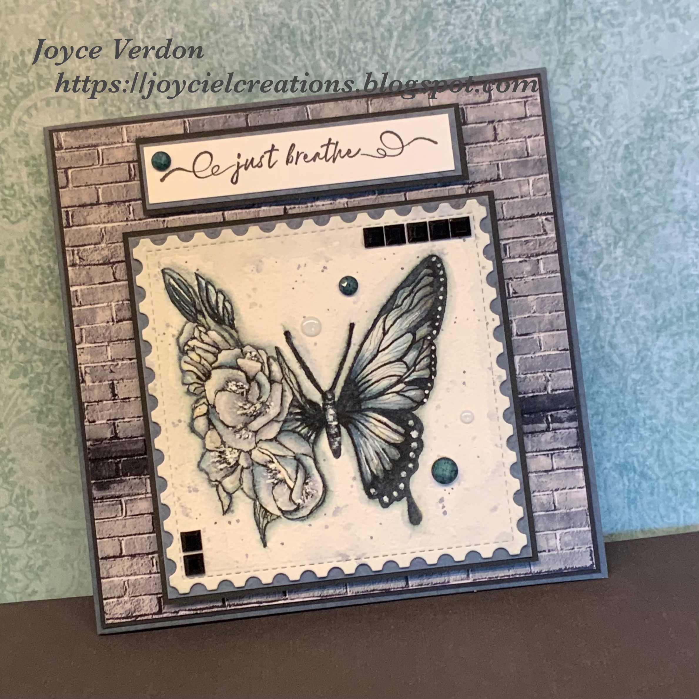
Must admit, I had fun trying to create the illusion of stamens with detailed negative painting brush strokes around the stamens. This stamp is so pretty and and the possibilities of colors and mediums used to create cards is endless!
Reminder, comment below for a chance at winning Unity stare credit! Thanks for stopping by!
Such a beautiful card! (But please explain what you mean by negative painting.)
ReplyDeleteThank you so much, Wilma! Negative painting is when you paint all around around an object…so you leave the white space to depict the actual object.
DeleteThank you for asking this Wilma 🤗
DeleteLove love this, the subtle colors of the blue and grey create such a peaceful feel. I am truly inspired by this color theme
ReplyDeleteThank you so much, Marla
DeleteBeautiful!
ReplyDeleteKaren adams
Thank you, Karen
DeleteBeautiful painting and how you put it all together. Gorgeous!!!
ReplyDeleteOops....didn't realize it was set to anonymous. Teresa Dechand
DeleteThank you very much, Teresa
DeleteBeautiful card! I enjoy your cards.
ReplyDeleteLinda Abel
Joyce this so subtle and exquisitely beautiful!! You have hit the ball out of park already at the beginning of your week. Looking forward to everything you will share ! 🩵🦋🩵
ReplyDeleteThank you very much, Dorothy 🩵🤍🩵
DeleteAbsolutely stunning! I love the black, white & grays used; almost looks like a light blue.
ReplyDeleteActually, there is blue paint in there just diluted with a little gray. So very muted. Thank you, Becca
DeleteSuch a pretty card! Love the soft colors and all the detailed touches.
ReplyDeleteThank you very much, Chris
DeleteBeautiful butterfly image! I love the layering and textures of your card!
ReplyDeleteThank you very much, Denise
DeleteThis is absolutely stunning!
ReplyDeleteThank you very much, Pam
DeleteThis is stunning! I love the soft look of the blues and greys. So pretty.
ReplyDeleteThank you very much, Amy
DeleteJoyce the black and gray butterfly is gorgeous! I love that image and your creativity!
ReplyDeleteSorry my response is set as anonymous. It is Lisa Jones.
DeleteThank you very much, Lisa🤍
DeleteJoyce, so very lovely. The color combination is so subtle yet entrancing at the same time.
ReplyDeleteThank you very much, Joan
DeleteSo beautiful! I love the softness of the colors.
ReplyDeleteThank you so much, Jodie
DeleteBeautiful - I love the monochromatic look, and your extra touches really personalize this gorgeous card.
ReplyDeleteThank you, Jan
DeleteVery pretty. Love the softness of the colors!
ReplyDeleteThank you very much, Debbie
DeleteWow, this is gorgeous!! Love it!!
ReplyDeleteThank you very much, Sandra
DeleteThat little touch of blue and the things you hand drew on the card take it right over the top!! Beautifully done Joyce!
ReplyDeleteThank you so much, Vannessa
DeleteYour card is so pretty with all of the soft gray tones.
ReplyDeleteThank you so much, Lucy
DeleteThis is absolutely gorgeous Joyce. I always feel like I have to color butterflies with bright colors but this subdued look is very effective!
ReplyDeleteMuted colors are fun to play with… thank you so much, Robin
DeleteAs so many have said, your subtle color s are gorgeous! Enjoy your GIU week and thanks for sharing your talents!
ReplyDeleteOh…thank you so much, Dawn
DeleteJoyce I've never seen anything like this! Amazingly beautiful work both stunning and so very unique. Can't wait to see what's next!
ReplyDeleteThank you so much, Pam
DeleteA stunning result Joyce
ReplyDeleteThank you so much, Glennis
DeleteSuch a unique stamp. Your design is beautiful.
ReplyDeleteThank you so much, Judy
DeleteGorgeous! I love your simple color palette which lets the beauty of the stamped image shine. Of course, your skill helped to make the beauty of the stamped image shine brightly. Great job! (Sue Nagata)
ReplyDeleteThank you so much for your kind words, Sue
DeleteThat really turned out so lovely! Love the muted colors and your coloring is splendid! Thanks for sharing!
ReplyDeleteThank you very much, Linda
DeleteWhat a beautiful card. I love everything about it.
ReplyDeleteThank you so much, Tricia
DeleteThis is stunning! Love this butterfly in muted colors. Great inspiration!
ReplyDeleteThank you!
DeleteWow! This is amazing! Thank you for sharing so much detail too.
ReplyDeleteThank you so much, Anne Marie
DeleteSimply gorgeous. Jean marmo mjmarmo@comcast.net
ReplyDeleteThank you, Jean
DeleteBeautiful card! I love the cool colors.
ReplyDeleteThank you very much, Kathy
DeleteJoyce, I love this card. That butterfly is so unique. I am glad you gave thorough instructions, but you are greatly advanced from me! Keep up the beautiful work.
ReplyDeleteOh… thank you so very much, Barbara
DeleteSee Jane Haurunen comments in Growing In Unity post.,
ReplyDeleteIt's been a HOT second since I've colored something in these tones, and not nearly as beautiful as yours looks here!!! 😍
ReplyDeleteI love the way you explained how you made each detail, and what negative coloring was!!! I like how the brick background makes it POP, and the sentiment is PERFECT!!!
GREAT WEEK Joyce (since I did this backwards, lol) 😆😉
Thank you so much, Michelle!
DeleteLovely card. I like how you describe your stamping process and supplies. I hadn't heard of negative color washing.
ReplyDeleteThank you very much
Delete