Hello again… welcome back to another hop! This month our focus is:

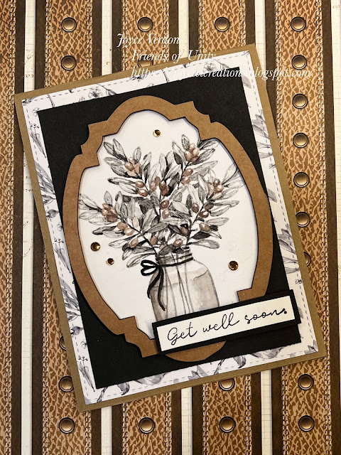
I started this card by pulling out a beautiful new paper pack from Paper Rose called, Monochrome Garden. I found the perfect floral stamp complement to the paper in my stash and stamped the vase from Unity’s Olive Branch kit using a light gray archival ink. I then watercolored the vase using gray and brown tones to match the patterned paper and Kraft card stock. As I’ve been cleaning up and decluttering my craft supplies all week, I found a chipboard frame that I could also use on the card. How fun!
I used Kraft card stock as the base and added black paper to offset the framed watercolor image. I stamped the sentiment and backed it with Kraft card stock, added crystals and called the card done. This card turned out perfect for my friend’s husband who is recovering from a triple bypass!
I, as well as others in the hop, will be doing another stamp set giveaway this month, so please be sure to leave a comment. I will post the winner in next month’s hop, so check back in April to see if you won!
Thanks for stopping by! Now, please check out all the talented crafters in the hop for theme based ideas! You should have arrived here from:
Next up is:
And, if you want to start from the beginning, check out:
Your card is gorgeous! I love kraft with black & white, but your subtle watercoloring has taken it over the top! ❤
ReplyDeleteJust beautiful, Joyce, and as always, your thoughtfulness in all of the elements used, and your water-coloring really are exceptional.
ReplyDeleteSo beautiful! I love the kraft color you added to your watercoloring and that frame you came across was a perfect addition! Thanks for sharing!!
ReplyDeleteVannessa Osbourn
He will love that card and it will surely give him comfort during his recovery. It is so so pretty and peaceful! That background makes a kinda frilly card very masculine, love that touch! I love when a stash find is the perfect sumpin I needed and didnt know it until it pops up. Wishing you peaceful moments, a calm restful time and a super cool forever crafty space when your Reno is over. Prayers for the world...
ReplyDeleteThis card is truly so elegant. I love that you stamped it in gray and watercolored it with the colors of the hop. Your coloring is amazing. I love the set too, as I don't remember seeing this one. Love the patterned paper and chipboard frame!
ReplyDeleteOne card or a hundred, they are always stunning eye candy from you. This is another elegant beauty.
ReplyDeleteA lovely card Joyce, the frame adds the perfect finishing touch
ReplyDeleteLovely card! The subtle watercoloring is superb, and the frame is the perfect accent.
ReplyDeleteThis card is beautiful! I love it! ❤️
ReplyDeleteBeautiful card, love
ReplyDeletethe background design!
Carla from Arizona
Your card is gorgeous! I love kraft and black but don’t often think to use it.
ReplyDeleteLinda Abel
Oh my that's pretty, and I love the subtle touch of brown in the flowers!!!
ReplyDeleteLovely!
ReplyDeleteThis comment has been removed by the author.
ReplyDeleteI love this and your coloring is perfect!
ReplyDeleteStunning card, Joyce! I love the frame around the beautiful image!
ReplyDeleteyour watercoloring is absolutely amazing! i am blown away by the detail!
ReplyDeleteWhat a stunning get well creation from the heart.
ReplyDeleteI am just in awe of your coloring skills, Joyce. Wow. The coloring detail on the olive branch and vase is pure perfection. goals.
ReplyDeleteYour card is so beautiful and serene, and I love the warm tones combined with black and gray for accents.
ReplyDeleteJoyce, this is gorgeous!
ReplyDeleteWow!! So much depth in one layer. I just love the warmth of this design.
ReplyDeleteReally pretty card! I love the layering and details! Beautiful design!
ReplyDeletethis is beautiful!!
ReplyDeleteGorgeous card. I love the design. And your coloring is amazing. Thanks for the inspiration!
ReplyDeleteThis card is a wonderful representation of the colors chosen for this month's hop. It is such a soothing look so the fact that it is a get well card is perfect!
ReplyDelete